Unfortunately I couldn’t make my Art Lab post on Friday, but I have time (and data XD) to do it today! In this post I’ll show you a few tips and tricks on lettering, plus show you plenty of font inspiration to copy or use to think up your own fonts. (Because I usually run out of ideas after, like, three fonts. XD) So. Ready? GO!
Technique: Hand Lettering
Hand lettering is super fun, and also very useful for when you want to spiff up an envelope or gift tag or any number of things.
Fonts
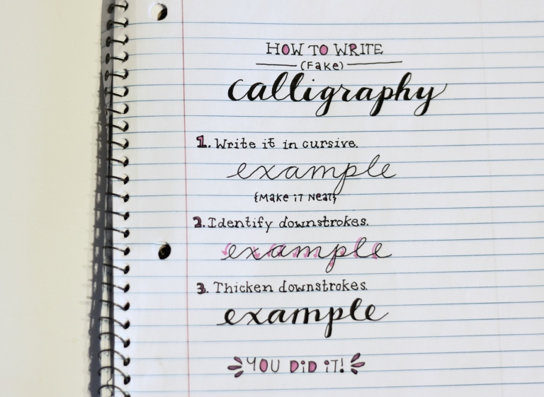
Let’s start with one of my the most common and prettiest fonts in handlettering: fake calligraphy. Lovely name, isn’t it? 😛 That’s because it allows you to get a calligraphy-like effect without using any special calligraphy tools. It’s also super simple to write. See?
Step One: Write out your desired words in the neatest cursive you can.
Step Two: Find the downstrokes. Downstrokes are the places in a letter where you move your pen down the paper, like the little pink arrows show in the picture.
Step Three: Widen and color in the downstrokes to get the look of a calligraphy pen. Ta-daa! Pretty, isn’t it?
This is a great base font, especially when paired with a simple sans or serif.
So basically sans doesn’t have the little “tags” on the ends of the letters and serif does. I like writing all caps sans and all lowercase serif. 🙂
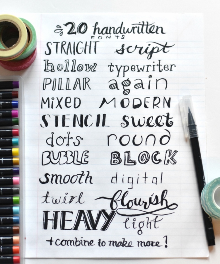
And now, here are a bunch more simple fonts I wrote out to look through and use as inspiration or copy yourself. Which is your favorite?
Accents
Now that you got some fonts under your… um, pen XD, it’s fun to add little accents and flourishes to fill in the space beside the lettering. Here are a few ideas to get you started, and you can find a bunch more on Pinterest and the “Doodly Accents” section of PicMonkey. 🙂
Inspiration
Still need some more ideas to get your creativity flowing? Here are a few of my recent (and not-so-recent) lettering pieces.
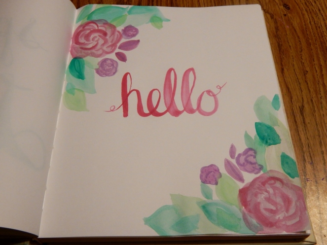
You can hand letter with any medium you wish! Here I used my watercolor brush pens which are super fun for lettering.
Quote from Jane Austen’s Emma
For this one I used a blue notebook marker + a blue ballpoint pen. I love adding vines to letters, but it does take a bit of time and patience. 😉 Another fun thing to do for fonts with thick, solid bars of color like below is to add zigzags or circles or other patterns inside the bars for more interest.
Quote from Nancy Pearcey’s Total Truth
This is the first page in my second bullet journal. I like how the mix of colored pencil and ballpoint pen looks together. 🙂
Not quite the right season for this, but hey, it’s lettering! XD I think it looks really neat to overlap some letters, like I did with the ‘y’ and the ‘o’. Also a little extra line of a different color beside the downstrokes adds a shadow effect and makes it look more special.
And lastly, a lovely Bible verse that I copied completely in blue ballpoint pen. (By the way, these Pilot G2 pens are practically THE BEST PENS EVERRR. They write super smoothly and you can get them in a range of point sizes.)
That’s all I have for today, so hopefully you’re inspired by now. 😀 If you did make some hand lettering inspired by this post, we’d love to see it! Check out how to help us fill our art gallery here.
I’ve been thinking of doing this post for quite a while now, but just haven’t posted, perhaps partly because there are so many other posts like this that I didn’t feel it was necessary. 😛 But I do enjoy looking at BuJo posts, plus it’s fun to see people’s different styles, so here I am!
I just got my second bullet journal the other day and it felt like I knew better how to set it up this time, so I thought it’d be a good time to show you guys.
What is a bullet journal? In brief, it’s a notebook to keep track of pretty much everything – to-do lists, habit trackers, favorite quotes, books to read, cleaning schedules – really whatever you need! They’re really more of a customizable system than a physical notebook. You can lean more about them here.
The hardest part of setting this up was finding a balance between pretty and practical. I love all the gorgeous bullet journal formats I’ve seen on Pinterest, but I also don’t really want to spend twenty minutes a day just on the header/design, you know? But since I’m who I am, I obviously wanted it to be at least a little bit aesthetic. XD
I’m pretty happy with the layout I ended up with. Hopefully it will help you guys too if you’re setting up a bullet journal for the first time! Although just a note: there is no one way to set up a bullet journal. That’s the great thing about these journals – they can be whatever you need them to be!
Oh wait, before I start, I bought this bullet grid journal from Amazon. You can see it here. It’s pretty, cheap, and also pretty cheap. 😛 The grids aren’t very precise (if you flip through the book, the dots move toward the left a little bit), and the paper is pretty thin, but it’s good enough for me. (I know I’m using “pretty” a lot but I don’t know what else to use. Help.) You can make any ol’ notebook into a BuJo, but I really like having the faint dots there to use as guidelines while they’re not as distracting as whole lines.
This is the first really customizable spread, after two pages of inspiration printed in the front of the notebook.
Your key basically helps you keep track of what different icons you use and what they mean. This is helpful for things like to-do lists especially. (Also “migrated” means moved to the next day/month/list/etc.)
Banners are a fun and easy way to spiff up your header. The grid format makes it easy to draw them. I wrote my header in flowy cursive and added a touch of purple colored pencil.
You’ll want to number your pages and write them in your index so you can quickly find whatever you need. That way if you think of a new list or topic you want to add, you can just use the next blank page and write it down in your index.
Of course I needed a pretty hand-lettered quote in here somewhere. XD
Okay, now we’re getting to the main part. Remember my discussion of pretty vs. practical? I decided to spend a little more time making the permanent pages pretty (like lists that will last me the whole time I have this journal), and keep the repetitive pages simple (like my daily entries). The beginning of my journal is mostly permanent lists.
I don’t particularly like this page’s layout, so I would suggest looking up a better one on Pinterest. XD But anyway, I really enjoy having a books-read-tracker so I can look back on how many and what books I’ve read in a month. So far I’ve only read one. Heh heh.
Oh, and since I filled my last journal in about six months, I formatted this to last the same amount of time. So I have six bookshelves for six months.
I use a task box instead of a bullet point so I can see the prayers God answers. ♥
I didn’t have this page in my last journal but I wanted to add it now. This is a pretty simple layout compared to some, but it’s still pretty (at least I think). Not perfect (UGH SMUDGES 😡 ), but nice. I’m planning to write the birthdays in the cupcake wrapper first and then in the icing if I fill that up. You could also write your family’s birthdays in one section and your friends’ in another.
I use this page a lot too, to record all the post ideas I have. (This is an incomplete list, by the way.) I decided to make two columns since I used up my last blogging page way too fast.
This one’s not very important, but it is fun. 🙂 Especially around the holidays. As you can see, I mostly want art stuff. XD
I use this page as a sort of big picture to-do list. It’s currently filled with art projects, although not in this picture. XD
And my last page is Notes. My thoughts/notes/ideas overflowed my allotted one page in my last BuJo, so I came better prepared this time. XD
Before we move on to the next section, I just wanted to say that I think it’s a good idea to keep a few pages blank before you start your daily or monthly section, just in case you want to add more lists later.
Okay, we’re done with the lists. I like to draw a little “cover” for each month. This is one of the parts I had trouble with in my last journal – when I came to the next month, I usually wasn’t ready to sit down and draw an elaborate header for it, so I just kind of scribbled something.
This time, I decided to write each month’s name in simple (fake) calligraphy in one corner so I could fill in the rest of the page later with a picture, or just add a small doodle like I did here.
My my, that “b” got a little out of hand. XD
Alright, now onto the daily section! I personally don’t have a need for a habit tracker or anything broader than a daily journal. I usually write the month, date, and day in cursive first. Then a bullet point and a few sentences to a paragraph about my day (no, I don’t record any secret thoughts or that sort of thing really XD). I also record what post I’ve written if I’ve posted, and my to-do list for the next day, which is my favorite part. 😉 The picture below is from… well October, obviously. Heh.
I find that it really helps me enjoy the day more and stay more focused if I have some goals to look forward to, however small. Sometimes I even just write “Draw” as one of my goals if I can’t think of anything more important. And here’s where I use my key.
I promise my days aren’t always that boring. XD
And that’s about it! I hope you enjoyed looking through my bullet journal! Did you find any good ideas or inspiration? Do you have any tips or inspiration for me? Do you have or want a bullet journal?
I’ve been playing with watercolors a lot lately – specifically with brush lettering – so I decided to show you some of my paintings. 🙂
Oh, I forgot to say…
Hello! 😀 This is one of my favorites.
I really like this one too – ’cause it took a while to make all those dots and vines. XD
Here’s a tip: a good brush makes all the difference! I got a waterbrush from an art giveaway (I’m not sure what brand the brush is), and it has a really nice point that’s good for making tiny details:
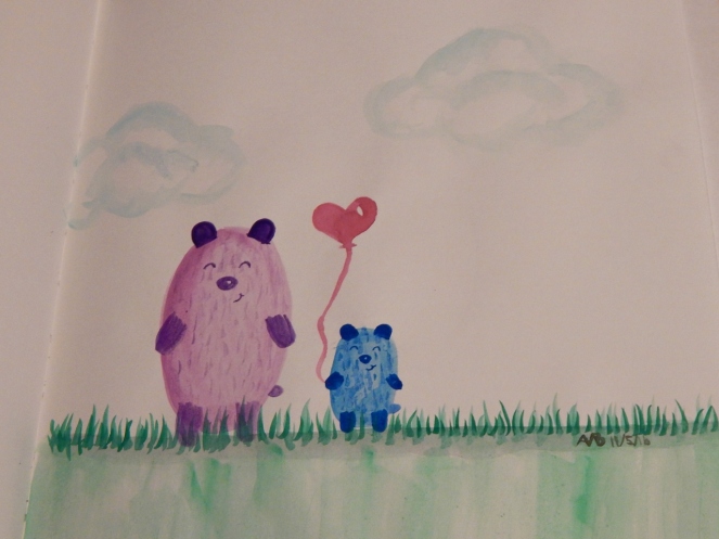
And last but not least, we have another one of my favorites… Esther and Eli! 😀
Which painting was your favorite? Do you like to watercolor or do lettering? What is your favorite thing to draw?
***Allison***
P. S. Did you notice my new header? Yep, I painted that too. 😉 So what do you think? Do you like it better, worse, or just the same as my last one?
P. P. S. Guess what I’m doing tomorrow? I’m… hopefully getting my driver’s license! O.o *Gulp* Prayers would be greatly appreciated! ♥