Can you believe it’s less than THREE WEEKS until Christmas?? I’ve been playing Christmas music and making fires in the fireplace and loving the Christmas decorations we put up (which I’ll hopefully post about soon!). Anyway, in honor of the season, today I’m going to show you guys a tutorial on how to make easy but beautiful Christmas-themed art.
I haven’t done a recent art post OR a giveaway for rather a while – I think it’s high time for both. 🙂 Today I’m going to show you guys some sketches, paintings, and LOTS of envelope art, and if you stick around to the end, there will be a fun little pen-pal/artsy giveaway which I’m so excited about! Continue reading →
Since I haven’t made a recent art post in a long time, I have quite a bit to show you today, including the remaining pages of an old sketchbook and the beginnings of a new one, decorated envelopes, and hand lettered quotes. Enjoy browsing through the drawings! 🙂
First we have the few remaining pages of my old sketchbook. I made these doodly mushrooms with the Micron pens I got for Christmas (see my mini review here), which are so fun to draw with!
This was a concept for Art Lab which I decided not to use after all. I watercolored the background, folded it down and smoothed it to make a mirror image, and then added the details.
This is NOT my usual style, but maybe I don’t have a style – I love all kinds. 🙂
I draw mandalas a lot because they’re just so pretty and I love circles. 😀 This was ALSO a plan/sketch/concept for the next piece of art..
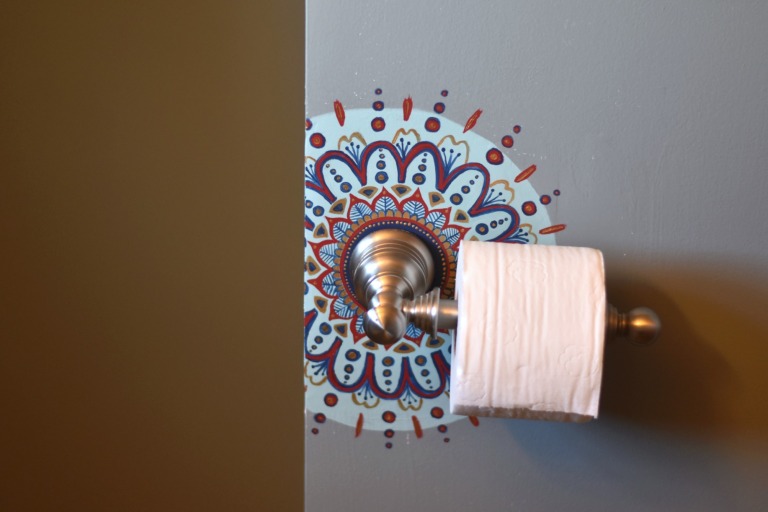
Hee hee, I’ve never done this before. The wall was rather rough and ugly behind the toilet paper holder, and since we didn’t have the wall paint color with which to cover the fresh plaster, Mom asked me to paint a design onto it. It took a while, but I’m pretty pleased with the result, even if it is a little weird. XD (Also it’s painted on a corner, which is why the picture looks cut in half.)
Goodness, most of these pieces are actually plans for something else! XD I might actually like this sketch better than the finished piece, unfortunately.
And now we’re ready for my new sketchbook which I also got for Christmas! I got to draw the logo for Dad’s business card/website, which was pretty neat. These were just practices (AGAIN); I ended up mostly tracing an edited picture to get the desired effect. Oh well, I kind of like the practices
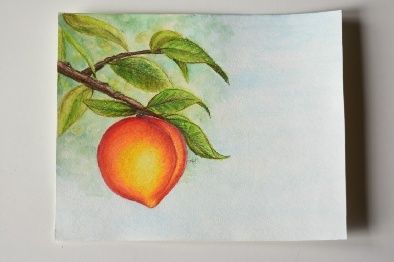
YAY, REAL ART. I was inspired by the first mushroom picture as well as the illustrations in a beautiful set of books (which I also got for Christmas). I think it turned out pretty cute, although I’m not normally a fan of earthy color schemes.
On the left we have the picture I drew for this Art Lab episode, and on the right we have a few lonely-looking watercolor bubbles.
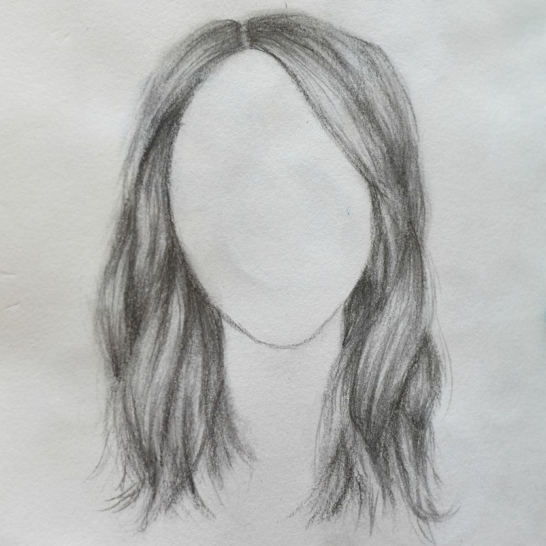
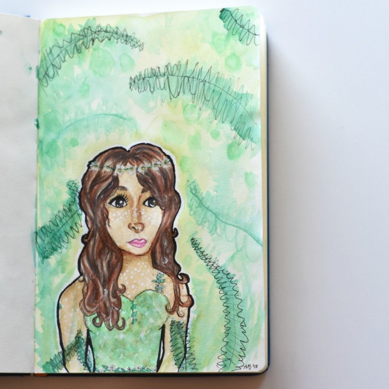
Guys, I am not good at drawing hair. I can draw eyes and most of the rest of the face okay, but the hair is always pretty boring and lackluster. Therefore I attempted to improve my skills with this great video, and I think I did… but they still need improvement. XD That’s okay, I’ll get there eventually. If I keep working on it, that is.
And here is the finished piece of the pencil-sketched girl I showed you a while ago. The idea was to make a girl who looks like a fawn without actually using any non-human features like deer-ears or antlers. It didn’t really work. XD The face got kind of skewed and I rushed the background which didn’t turn out well, but everything else is… tolerable. If you cover up her mouth she looks better. 😛
(By the way, that’s a great drawing tip: if you’re drawing something (particularly a face), covering up parts of the picture helps you see which feature is throwing everything off. I think it’s the mouth and chin here.)
Megan requested this camera for a blog project (picture by Megan). I rather like it because it’s PURPLE and it’s A CAMERA. 😀
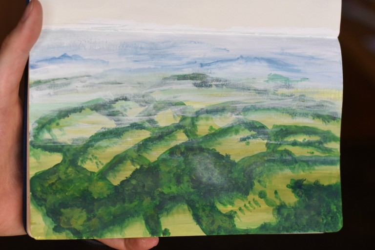
I drew this from a gorgeous aerial view of Ashdown Forest, the inspiration for The Hundred Acre Woods. The photo was prettier. XD
We have now come to the end of the sketchbooks so far, and will turn to various other artworks. First, envelopes. I absolutely LOVE decorating envelopes for my pen pals, and I think I prefer the recent envelope art I made to the stuff in the sketchbook.
Ooh, this is one of my favorites! Adding touches with the white gel pen really helped bring the scene together.
I was trying to decide how to decorate this envelope when I saw the pretty pattern on my Chemistry notebook and decided to use it as inspiration. What do you know, something nice can come of even Chemistry. XD
I made this envelope after reading The Laws Guide to Nature Drawing and Journaling, which has some great art tips and tutorials in it! (For instance: did you know that the three primary colors are not red, blue, and yellow, but magenta, cyan, and yellow?! I was astonished! But he showed and explained how it makes perfect sense.) I think it’s neat how a few pen lines can transform some abstract watercolor blobs into a landscape.
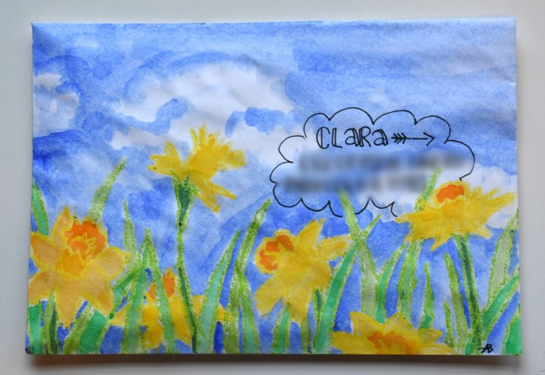
I outlined the daffodils with some lovely oil pastels my dear friend sent me, and then used the watercolor resist technique to fill them in. The colors are so bright and cheery, aren’t they? That’s why I love daffodils. 🙂
Ooh yes, another one of my favorites! ❤ I like the bright, summery colors and almost vintage-poster-like quality the sun rays give it.
My mom liked the envelope so much that she wanted me to make a real picture to frame, so I did!
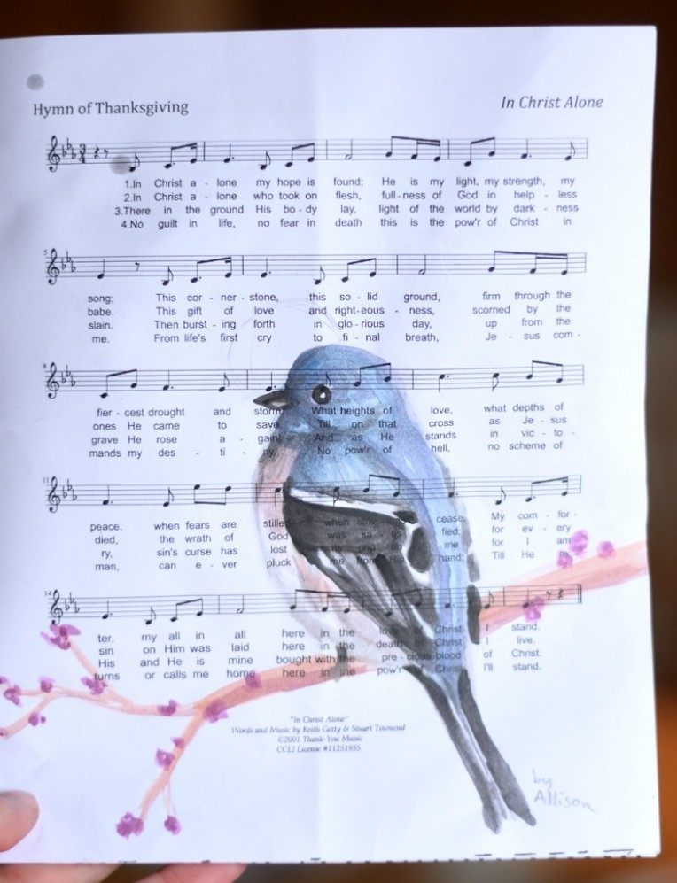
Okay, this is kind of strange, but Megan wanted me to draw on a church bulletin for one of her friends (don’t ask XD). I believe Megan took these three pictures. I like how the music notes show through the watercolor in this one. 🙂
This, um, didn’t work TOO well because I didn’t have enough time to finish the faces (particularly Megan’s on the right :[] )… but it was a good challenge to try, anyway.
I like this one better. 😉 Our friend loves snakes, so I drew this one, also loosely from the Nature Journaling book.
Here are a few more quotes I copied, for my pen pals. (The next few pictures are black and white because I took them in a rush and the lighting was HORRIBLE. XD)
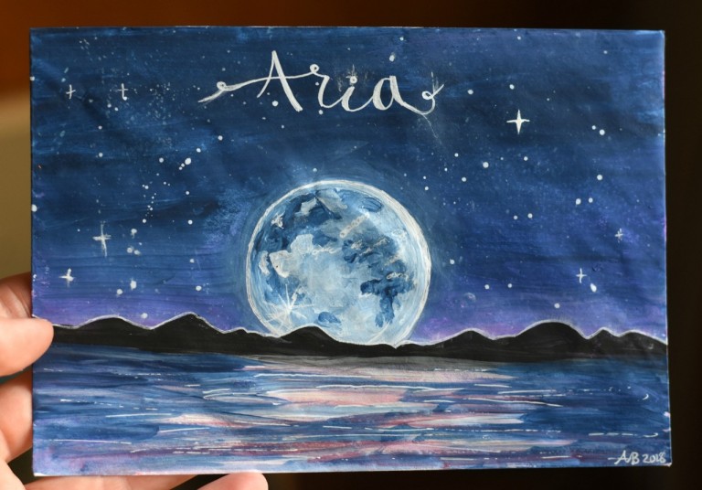
And last but not least…
And that’s all for now! Which piece of art was your favorite? Which do you prefer making: sketchbook art, envelope art, or hand lettering?
Thanks for reading, dears, and have a lovely day!
***Allison***
P. S. Also in case you’re wondering, I’m planning the post about the old letter next! I would have done it this time, but it’s taking a loooong time to translate. XD Stay tuned!
GUYS GUYS GUYS I AM SO INCREDIBLY EXCITED. Because, as you probably guessed, I’M GETTING AN ART STUDIO. 😀 I have wanted my own space for arts and crafts for practically forever, and I can’t believe I finally get to have one!
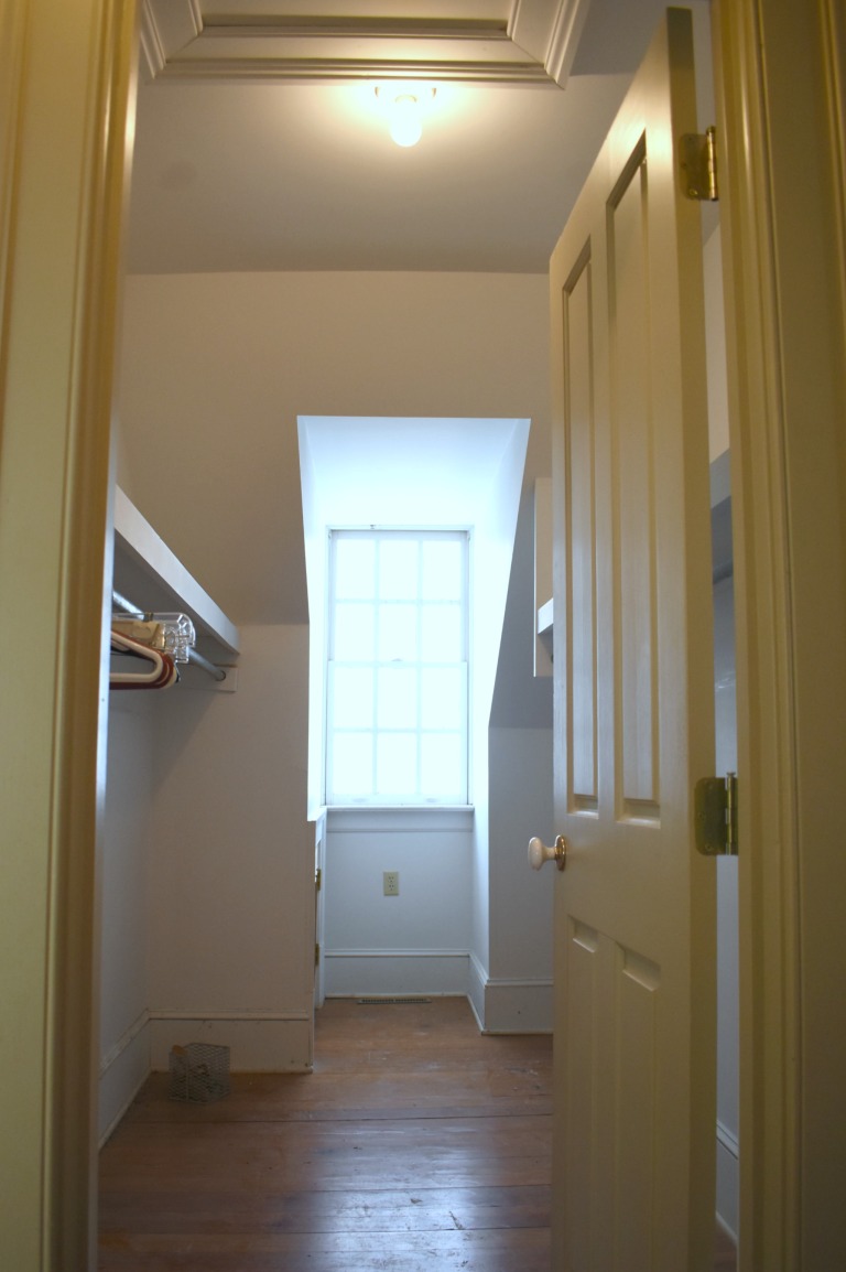
My new studio is actually in a closet. XD We definitely don’t need all four closets in our bedroom + bathroom at the new house, so Mom thought I could make the biggest walk-in closet into my studio!
It’s basically a small room, complete with a window and shelves for storage. It’s only about 60 square feet, but I think it will work great for just me. 🙂 However, it certainly wasn’t set up for a studio at first, and that’s what I’ll be showing you today: how I turned a closet into a space for a studio!
PLUS, Photowall contacted me and wondered if I wanted to do a review for them in exchange for a free product, and I was like, “OH YES PLEASE.” (I didn’t actually say that.) XD Are you as excited about this post as I am? I DOUBT IT. XD
Alright, let’s get started! First, this is how the closet looked to begin with:
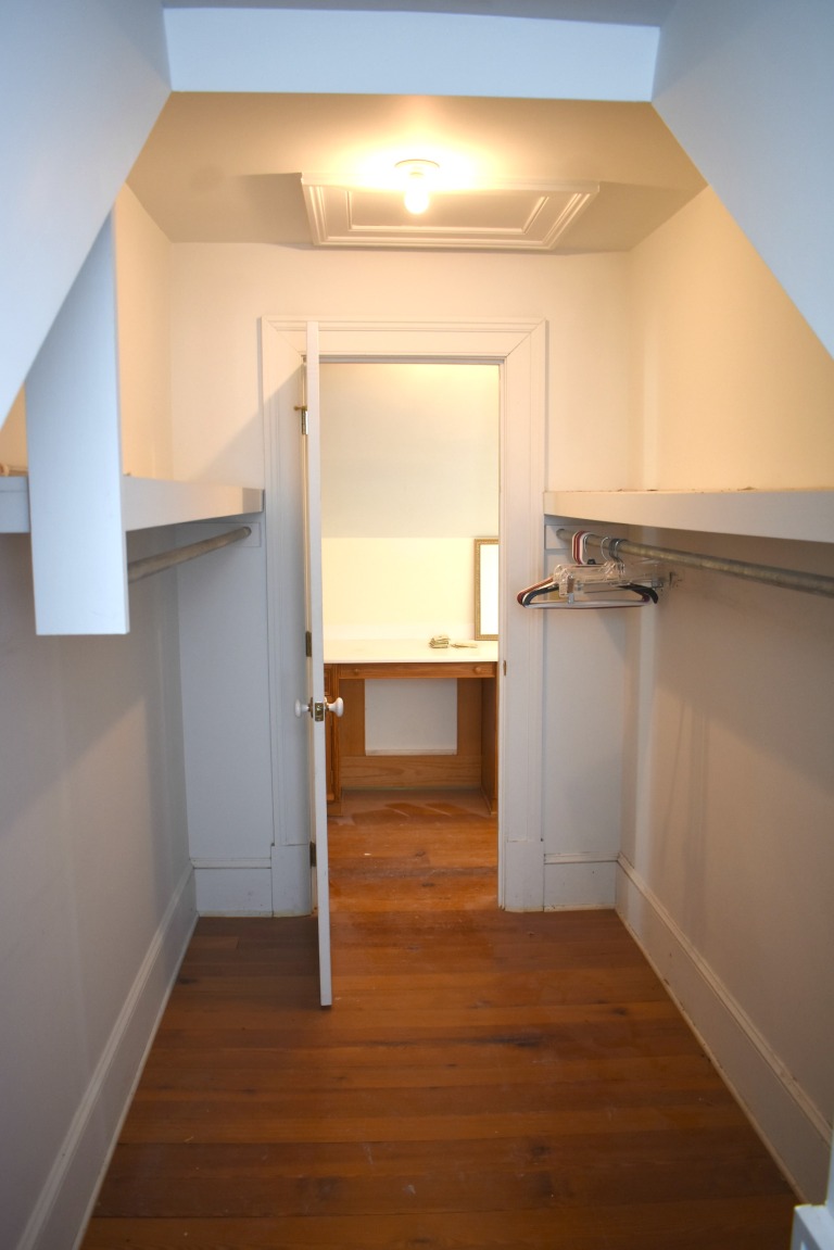
Doesn’t exactly look like a studio yet, huh? Well the first step toward that goal was to get rid of the shelves and to take off the door for more space. I decided to keep the shelves in that little cubby above because really, it was too small and had too low of a ceiling to turn into anything else.
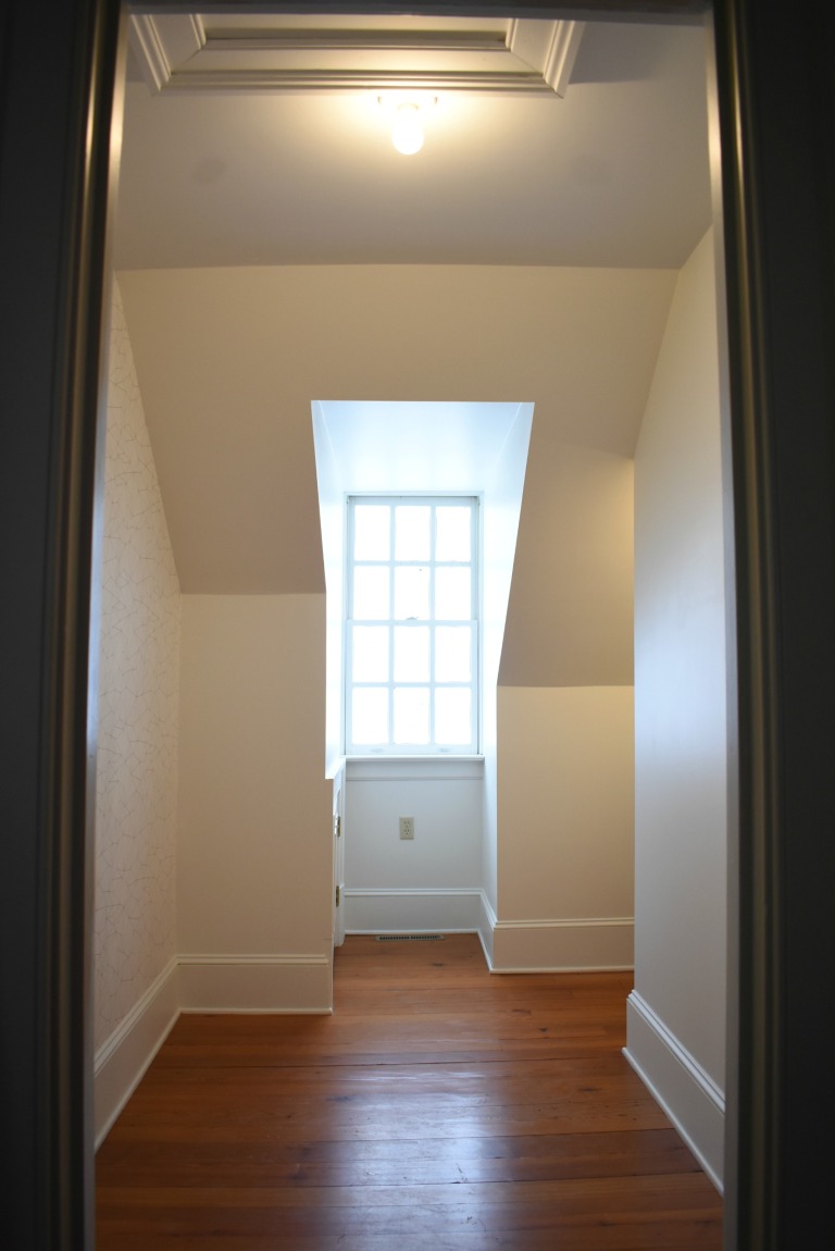
My brother Jeff helped me with the demo, and then Dad spackled (or plastered) over the marks where the shelves and hinges had been (and where Jeff had applied the crowbar a bit too vigorously, heh heh). After a few coats of plaster and some sanding, it was ready to be painted! I painted it in Valspar’s “Dove White” because I want the studio to look clean and bright, with pops of color.
I’ll get more into my color scheme and décor in a later post, but I’m thinking white, navy, purple, pink, and gold. ❤ Ahh, I can’t WAIT!
Anyway, here’s what it looked like after taking out the shelves and door, plastering, and painting. So much better already! Doesn’t it look a lot bigger?
Next, it was time to put up the wallpaper, and now it’s time for the review part of the post. As I said, I did get this product for free, but obviously I’m going to be honest about my likes and dislikes, because otherwise what use would a review be? 😉
Photowall is a Swedish design company that sells both canvases and wall murals/wallpaper. Also, one super neat part of their site is that you can upload your own image! So if you have a high-res picture, you can get wallpaper or a canvas with your own photo or art on it! I considered that, but decided to go with a more clean, modern look, like the White Grafo pattern I ended up choosing.
I went with the premium wallpaper instead of the standard, because hey, why not? It was wonderfully thick and almost rubbery-feeling, like it would wipe off easily. The pattern was printed beautifully as well.
I ordered about 6.7 square meters, which cost $243. Preeetty expensive, especially considering you can get wallpaper at Home Depot for $0.79/sq. ft., compared to $3.67/sq. ft. at Photowall. :[] I also ordered the wallpaper kit, which you can get separately for $20.
However the shipping was free – and super fast! The customer service was also great, in my experience. Here are the boxes the products were shipped in:
The wallpaper box included the following:
wallpaper (duh)
wallpaper paste powder
instructions
And as for the kit box, I was surprised at how many different things were included! It seriously has EVERY SINGLE THING you need to put up wallpaper, except supplies pertaining to mixing up the paste (water, a bucket, and a stir stick).
paste brush
wallpaper brush
trim guide
seam roller
spirit level
knife
pencil
And now for putting it up! It took a bit to mix up the paste and let it set, and it was definitely more work than using pre-pasted wallpaper (or so my mom tells me), but it seemed to work pretty well. Thanks to my mom for taking the next two pictures. 😉
One helpful feature of this wallpaper is that the panels are numbered. It’s not just one big sheet, it’s split into several sheets that you cut apart and then paste on. You do have to match up the seams, but it feels more manageable. 🙂 It still took about 2 ½ hours, though, with Mom and I putting it up together.
It looked SO good once we got it all up, eep! But one thing that really scared me was these brown patches that appeared on the paper as it was drying:
Yikes, what a terrible picture. :[]Thank goodness they don’t stay! It must just take a really long time to dry (more than three days, in fact), but that’s probably because it was cold in there and not super well ventilated. And now, this is how the studio looks thus far:
Thanks to my sister Megan for taking this picture. 🙂
AHHH I LOVE IT. The wallpaper actually made the space feel bigger for some strange reason, and it definitely made it feel more like a room than a closet. I’m really happy with my pattern choice and with the product itself. 🙂
To recap…
PROS
Fast, free shipping
Excellent quality wallpaper
ENORMOUS selection of beautiful prints and patterns
Easy-to-use website and instructions
Great customer service
CONS
Very pricey
Doesn’t come pre-pasted
Fairly long application and drying times (at least for the premium paper)
Basically, I absolutely love everything but the price. I would highly recommend the product and company itself – the wallpaper is beautiful, high quality resolution, and scratch/tear-resistant – but I personally would go with a cheaper option if I did it again and not for free.
If the price doesn’t worry you, though, or if you just want one of their beautiful and unique murals you can’t get anywhere else, then Photowall is the company to buy from! Even if you don’t need any wallpaper at the moment, you should totally check out their website – remember they also have a huge selection of canvases, and I’ve heard they’re pretty great too! 🙂
I hope you enjoyed reading this rather lengthy post, and stay tuned for Part 2! In the next art studio post, I’m going to furnish the studio and put up at least some of the decorations. ❤ YAY!
Thanks for stopping by, dears, and have a lovely day!
Wow, I haven’t had this long of a post gap for a long time. Okay, a week really isn’t “a long post gap.” XD But like I said, posting is going to be somewhat irregular because we’re moving! Before we do, there’s a good bit of work to be done in both the houses and the new farm in general, and that’s what we’re doing right now. Going down there for a couple of days a week keeps us pretty busy, phew!
Anyway, I thought I’d make a series of posts showing our process, with pictures that we can look back on as a sort of “before-and-after” of the whole project. Today I’ll be sharing our work on this house so far, which we call the Cedar House:Isn’t it cute? This is the second house on the farm, and the one we will use as a guest house (and possibly an Airbnb later!). We’re fixing it up first so we can stay there while we fix up the main house, which will need more big-picture repair, like the roof and ceilings.
But before we get to the renovations, I wanted to show you these pretty pictures from the drive there. I love mountains. ♥
This one is probably over-edited, but I like it. 🙂
The walls were marked up pretty badly and in definite need of a fresh coat of paint. Heh heh.It looks so much better now! We painted it “Intense White” from Benjamin Moore, but the name is rather misleading because it’s more like a nice, light gray. My grandmother (in the picture below) is super good at painting and she comes up and helps us often. 🙂 I rather like this picture. ♥Oh, and speaking of painting, we painted this popcorn ceiling (you can kind of see it in that picture) in an upstairs bedroom, and the next day, it was coming down. The popcorn texture was just peeling off the ceiling, so we had to scrape it all off and sand it down. AND THEN IT HAPPENED AGAIN in the living room. It was awful, especially the fact that plaster dust gets seriously everywhere. The house was coated in it after we were done, and we had to clean hard and long to get rid of it. Woohoo.
The dust doesn’t just get on the house, it gets on YOU. See? Poor Megan. XDMoral of the story: NEVER PUT UP POPCORN CEILINGS.
I, thankfully, didn’t have to sand because I was… um, very busily employed in doing other things. XD But don’t worry, I was working. My little sister Carmen and I cleaned out the kitchen and arranged and organized the few utensils and glasses and such that we had.
It’s so funny, but we both love organizing – and cleaning too, when we’re in the mood. That day we were so much in the mood that we went on to other parts of the house and cleaned windows and swept the deck and all sorts of things. It was quite satisfying. 😛We got creative and decided to decorate a jar and tin can with painter’s tape. XDIsn’t this next picture so cute? I just find it amusing that my seven-year-old sister would do this in her free time. :’)Strangely enough, there are ladybugs all over the house, especially in the corners of the walls. But hey, I’m not complaining – I’d much rather have ladybugs than flies or spiders or stinkbugs. *shrugs*One evening when we were getting a bedroom ready to be painted, we found these strange round stickers on the wall. We all wondered what they were there for, because they were scattered all over the room and kind of blended in with the paint – they didn’t really seem to serve a purpose. But then one of the kids (I think it was me 😛 ) thought to turn off the lights and it was beautiful! The stickers were glow-in-the-dark, and it felt like standing in space because there were so many “stars” on the walls.
It was REALLY hard to get a good picture of, which is probably why I didn’t. Heh. It was much more impressive in real life, believe me. 😉Since we (the kids) thought they were so neat, we peeled off all the stickers and put them on a basement wall in the main house. 🙂
Speaking of stars, you can see so many here! Even though we live out in the country at our current farm (well obviously XD), you can see seriously like five times more stars here! It’s less like individual pinpricks and more like a whole pot of silver glitter spilled across the sky. I love it. 🙂 And yes, I did take a picture, but it’s even worse than the one of the fake stars, so I’ll save it for… uh, never. XD
How ’bout a picture of frost crystals instead to end the post? Guys, it is SO cold at both farms. How’s the weather where you live?Well, that’s about it for this part. I have several more pictures and adventures for later, so stay tuned! 😉
Has you or your family ever renovated a house? Or maybe repainted a room or bedroom? I’m excited to decorate our new bedroom in the main house – and don’t worry, I’m sure I’ll post about that when we do. XD
Well, see you later, dears, and thanks for reading! Have a lovely day, and stay warm. 😉
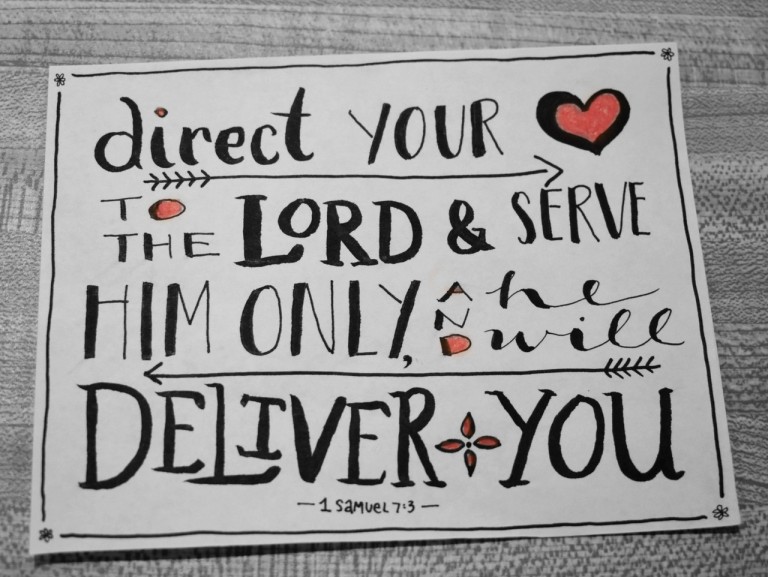
Yay, I’m so excited to show you this art today, guys! According to your requests, here is a tutorial for the technique I used to create the last envelope art in this post. It’s a super fun technique and the inspiration behind it is absolutely beautiful too. So let’s get started, shall we?
First of all, the…
Art Prompt:
I found this really amazing spray paint artist who has a YouTube channel called “Skech Art.” He is SO good! When I think of spray paint art I picture graffiti, but he makes actual paintings on canvases. Here’s the video:
Okay, so I could do without the unicorn (I think it kinda distracts from the gorgeous scenery), but isn’t it AMAZING?! There’s another equally amazing video here that you should really watch too. 🙂
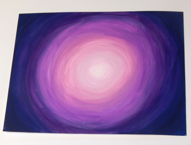
Alright, now for the tutorial. This technique is great for lots of things, like envelope art, ATCs, or just a painting on watercolor paper, but I think it would look especially nice on a canvas. (I used a piece of white cardboard, though, if you’re wondering.)
1. You’ll need a few different colors of acrylic paint that go together well, plus white and black. I used pink, a few different shades of purple, and a dark indigo.
Paint the outer ring with your darkest color. Don’t worry if it gets a little messy, like so. 😉
2. Blend a ring of the next darkest color (like dark purple) into the outer ring you just made, overlapping the paint colors so they blend.
3. Now just keep adding new rings of color, making a gradient from dark to light. Use white for the very center. Tip: Blending works a lot better if the paint is still wet, so try to do these rings all at once instead of letting them dry between circles.
Ahh, it’s looking so pretty, isn’t it?
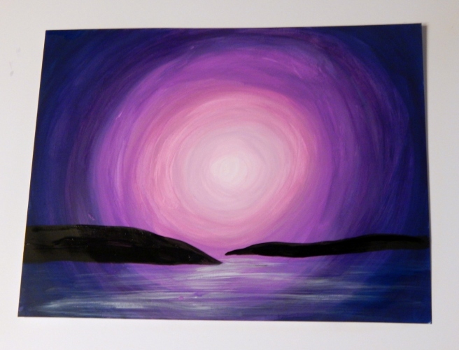
4. Add some long black blobs for islands to the bottom third of the picture, like so.
5. The islands kinda look like they’re floating, so we need to anchor them. Use your ugliest brush with coarse or frazzled bristles to paint some white streaks under the islands and create the illusion of water. Tip: Don’t use much paint and make sure your brush is nice and dry to create perfectly imperfect streaks.
6. The islands still need shadows to cement them into the picture. Paint some black streaks right under the islands to make their dark reflections. (Wow, that sounds scary. XD )
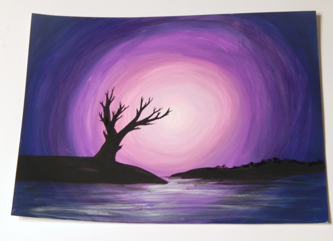
7. This is probably the hardest part: painting the tree. If you’re good at drawing trees, go right ahead and start painting, but if you’re not the best, like me, it might help to practice a few on a scrap piece of paper. My tree didn’t turn out quite as good as I had hoped, but you know what – that’s okay! You can always make a new and improved picture next time. 🙂 It also helps to look at some pictures of trees for inspiration.
Tip: I’ve found that it makes the branches look more realistic if they’re wider where they join the main branch and then taper to a point.
I also made a bumpy line for trees on the second island. 🙂
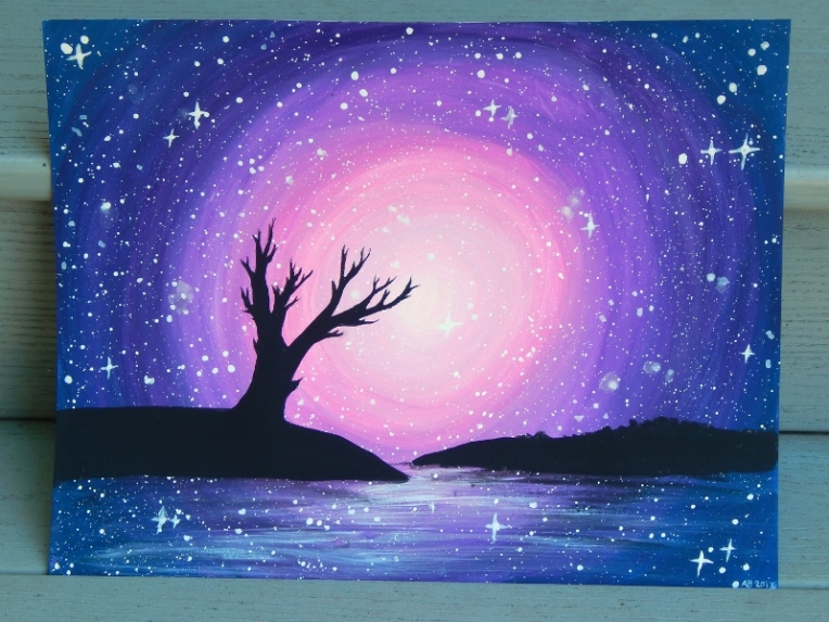
8. The stars are the finishing touch. Use your coarse paintbrush to splatter white paint all over your picture. Actually I should have done this part before I painted the islands, but I just painted over the black silhouettes and it turned out fine. 😉
Tip: It’s easier to splatter the white paint if you thin it with just a bit of water. Then tap the paintbrush handle on your finger to flick paint across the paper. If I do this again I think I’ll make slightly fewer stars because it can get overwhelming.
I also like to make a some twinkling stars by painting small crosses over a few of the dots.
Ta-daa! And there you have a beautiful galaxy-moonset-silhouette-ish picture. 😀
I hope you enjoyed this tutorial, my friends! Do you think you’ll give it a try? If you do, I’d love to see your artwork! Click here to see how to submit in your artwork to the Art Lab blog and help us fill our gallery.
Oh my, I think it’s past time for an Art Lab post, don’t you? Today I want to show you a beautiful piece of art and some art I made inspired by it. Here’s the prompt:
Ohhhh isn’t it gorgeous? I love it! And in case you don’t have mountains near you to look off of (you poor things XD ), I’ll give you a picture that I took of the real thing. (If you’re curious, it’s from this post.)
Photo Prompt:
I love this. ♥
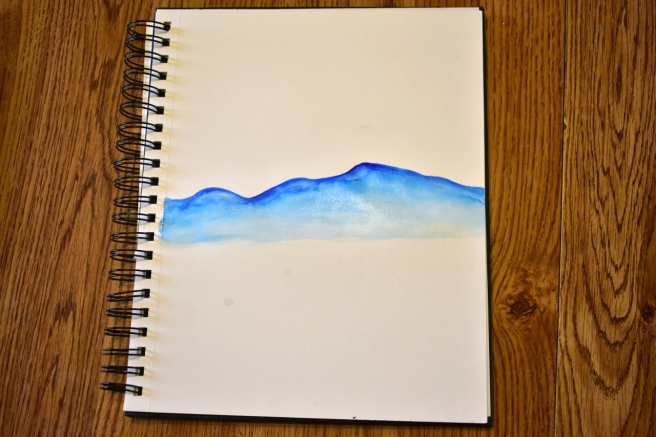
Now are you ready to break out the watercolors? Here’s how I made my mountainscape…
Step 1:
(The proper way would probably be to start with the background, but I started with the mountains because I didn’t know quite how far back they would go. 🙂 )
Use a really deep blue for the foreground mountains. Paint an irregular, medium-wet line of dark watercolor and draw it downwards, lightening it with more water as you go. (Okay that sounded really complicated, but basically just play around with it until you get dark at the top and light at the bottom. XD )
Step 2:
Use a different, lighter blue for the mountain ridge behind it, and do the same thing. Keep going until the mountains fade away to barely visible. I also decided to add a few more ridges in the foreground, like so:
Step 3:
Next you can work on the hills. Use a few different greens, and gradient your color from dark at the top to light at the bottom like you did with the mountains. Looking great!
Step 4:
Now for the sky. Again, start with a dark blue at the top and fade it downwards (are you starting to see a theme here? XD ). I dabbed off some of the paint with a paper towel to make puffy clouds.
And you’re done! So pretty! 🙂
I also made an ATC kind of like my painting but without the hills.
So, do you like this idea? Which was your favorite, the main painting or the ATC? Do you have mountains where you live?
To see more art inspiration like this, check out the official Art Lab blog right here. If you made a piece of art inspired by this post, we’d love to see it! Click here to see how to enter your artwork into our Art Lab gallery.
Halloo, my friends! I’ve been drawing a lot lately, so I decided to show you what I’ve been working on…
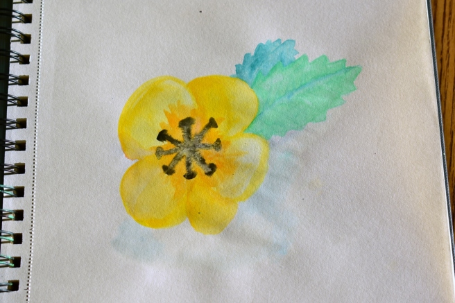
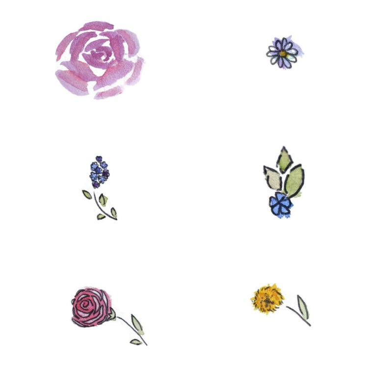
Like a random watercolor flower. XD
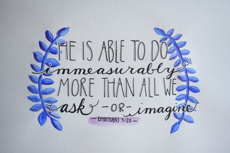
I’m kinda proud of this quote because it took me like ten tries to get the lettering right. XD Well actually it isn’t really a quote because I made it up, but you know… 😛
Hee hee! Isn’t this one funny? I made it for an Art Class assignment – art inspired by your favorite smell.
A not too interesting but pretty landscape…
Ugh, the sun was a bit harsh so there are way too many shadows on this picture, but oh well. This is a mixed media piece with tissues for the curtains and rug ( XD ), piano book pages for the sun rays, scrapbook paper for the bedcovers, and duct tape for the window. The rest is just drawing or watercolor.
Another art assignment. 🙂 (Actually a lot of these are art assignments.) We were supposed to do Pop Art, so I did a gummy bear because we were eating them in class anyway. XD
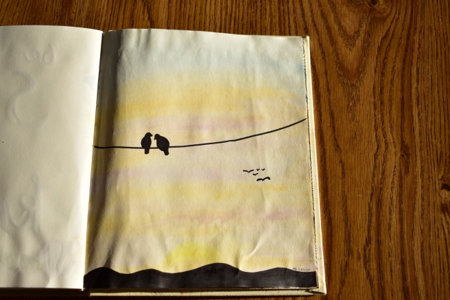
Random birds on a wire. 🙂
Ooh, this is one of my favorites! I really like how the pattern turned out 3-D-ish.
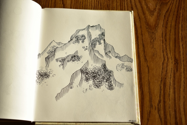
For some reason I felt like drawing mountains…
And more mountains…
I don’t really know why I drew this… XD
This was a “Forced Perspective” piece for art class.
Excuse my fingers. 😛
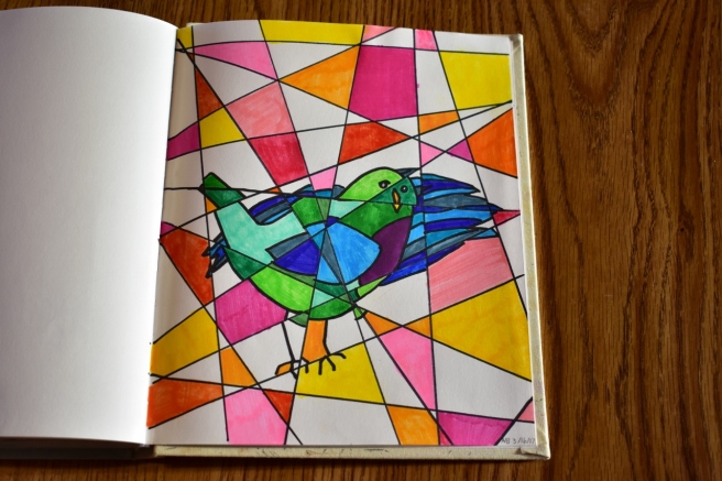
Weird cubism bird…
I decided to include this even though I already posted about here for Art Lab. 😉 I think this is one of my favorite pieces of art I’ve ever done!
Yikes, this is a terrible picture! Oh well, you get the point. I did a mixed media quote/hymn thingy. 🙂 I used tissue paper, book pages, buttons, paint, and even paper clips and corn kernels to make the flowers and leaves! XD
I felt like drawing a girl. Not much other explanation. XD
This is another of my very favorites! I really like the Zentangle/doodle type of art.
It’s kind of hard to take a picture of the whole thing, so here’s just the head so you can see it a bit better. 🙂
One reason why I like this so much is because it took FOREVER to make. XD Especially the mane – I made a herringbone pattern with a super fine-tip pen. It was fun, but quite time consuming. XD
Which do you see first, a face or two trees and a moon?
I got inspiration from Pinterest for this one (and for some of these other art pieces too). I like how it turned out!
That was fun. 🙂 As you can see, I rather like art! Do you? Which of those pictures was your favorite? What is your favorite art medium to use?
I’ve been playing with watercolors a lot lately – specifically with brush lettering – so I decided to show you some of my paintings. 🙂
Oh, I forgot to say…
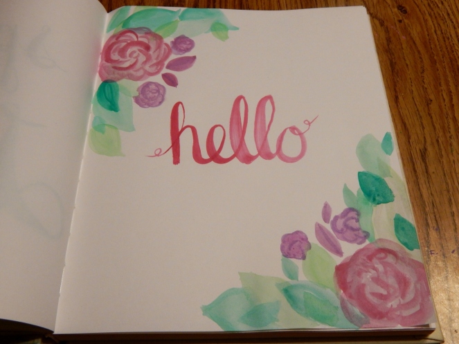
Hello! 😀 This is one of my favorites.
I really like this one too – ’cause it took a while to make all those dots and vines. XD
Here’s a tip: a good brush makes all the difference! I got a waterbrush from an art giveaway (I’m not sure what brand the brush is), and it has a really nice point that’s good for making tiny details:
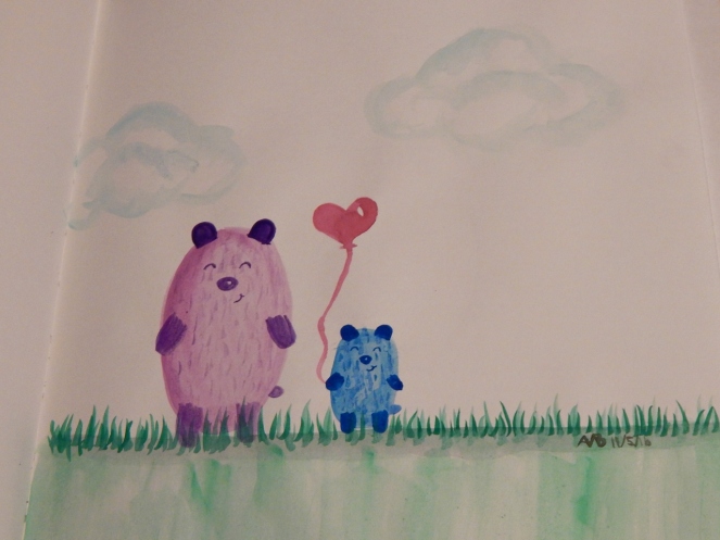
And last but not least, we have another one of my favorites… Esther and Eli! 😀
Which painting was your favorite? Do you like to watercolor or do lettering? What is your favorite thing to draw?
***Allison***
P. S. Did you notice my new header? Yep, I painted that too. 😉 So what do you think? Do you like it better, worse, or just the same as my last one?
P. P. S. Guess what I’m doing tomorrow? I’m… hopefully getting my driver’s license! O.o *Gulp* Prayers would be greatly appreciated! ♥


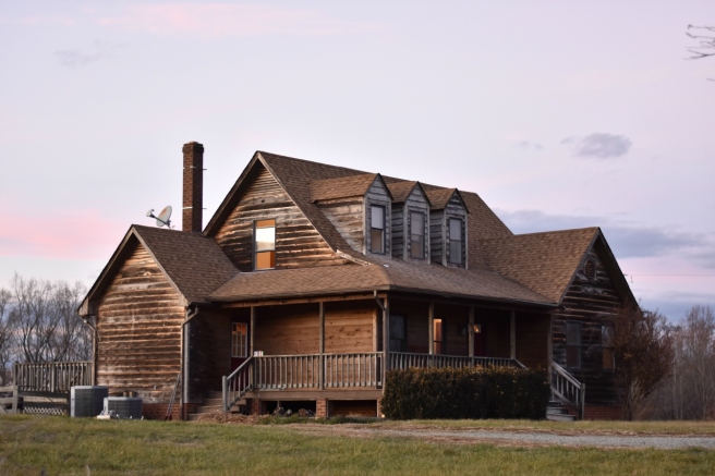 Isn’t it cute? This is the second house on the farm, and the one we will use as a guest house (and possibly an Airbnb later!). We’re fixing it up first so we can stay there while we fix up the main house, which will need more big-picture repair, like the roof and ceilings.


 The walls were marked up pretty badly and in definite need of a fresh coat of paint. Heh heh.
 It looks so much better now! We painted it “Intense White” from Benjamin Moore, but the name is rather misleading because it’s more like a nice, light gray. My grandmother (in the picture below) is super good at painting and she comes up and helps us often. 🙂 I rather like this picture. ♥
 Oh, and speaking of painting, we painted this popcorn ceiling (you can kind of see it in that picture) in an upstairs bedroom, and the next day, it was coming down. The popcorn texture was just peeling off the ceiling, so we had to scrape it all off and sand it down. AND THEN IT HAPPENED AGAIN in the living room. It was awful, especially the fact that plaster dust gets seriously everywhere. The house was coated in it after we were done, and we had to clean hard and long to get rid of it. Woohoo.
 Moral of the story: NEVER PUT UP POPCORN CEILINGS.
 We got creative and decided to decorate a jar and tin can with painter’s tape. XD
 Isn’t this next picture so cute? I just find it amusing that my seven-year-old sister would do this in her free time. :’)
 Strangely enough, there are ladybugs all over the house, especially in the corners of the walls. But hey, I’m not complaining – I’d much rather have ladybugs than flies or spiders or stinkbugs. *shrugs*
 One evening when we were getting a bedroom ready to be painted, we found these strange round stickers on the wall. We all wondered what they were there for, because they were scattered all over the room and kind of blended in with the paint – they didn’t really seem to serve a purpose. But then one of the kids (I think it was me 😛 ) thought to turn off the lights and it was beautiful! The stickers were glow-in-the-dark, and it felt like standing in space because there were so many “stars” on the walls.
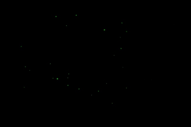 Since we (the kids) thought they were so neat, we peeled off all the stickers and put them on a basement wall in the main house. 🙂
 Well, that’s about it for this part. I have several more pictures and adventures for later, so stay tuned! 😉