I’m back with another edition of the photo editing series I’m doing! 😀 (Click here to see part one, and here to see part two.) Today I want to go over how to use PicMonkey to touch up a portrait of a person, as well as some clever tricks to use the touch-up tools in unexpected ways. I’ll also talk about how to use PicMonkey to create the perfect book character portrait for those of my blogging friends who love writing. 😉 I hope you find this helpful!
To begin with, let’s go over some common problems and how to fix them with the tools in PicMonkey’s “Touch Up” tab.
Blemishes: Well obviously you can use the “Blemish Fix” tool, but you can also use the “Clone” tool if that doesn’t work (because sometimes it doesn’t). If Blemish Fix doesn’t work and you don’t have Royale, you can fix small blemishes with the “Draw” tool from the Effects tab. Set the hardness to zero and use the dropper to select the skin color surrounding the blemish. Then paint over the blemish, like you’re using concealer.
Erasing Flyaways and Frizzy Hair: I learned this tip from the PicMonkey blog! Use the “Wrinkle Remover” tool to erase that annoying halo of frizz around your subject’s head. Wrinkle Remover softens whatever it’s painted on to, so it basically blurs the stray hairs (and wrinkle lines) into their surroundings. On a related note, you can shape eyebrows with wrinkle remover too – just don’t overdo it! XD
Brightening Eyes and Other Shiny Things: The “Eye Brighten” tool is one of my favorites in the touch up tab because it’s so versatile. Use it to, duh, brighten peoples’ eyes, but also to brighten the eyes of animals and pets. Cat’s eyes, especially benefit from a little brightening to make them pop. Eye Brighten is good for other shiny things too, like jewelry, cameras, and watches, that are shiny in real life but are dull in the picture. Oh, and one more thing! Paint Eye Brighten onto the eyelashes, eyebrows, and any other parts of the face you want to sharpen and darken.
“Ironing” Wrinkly Clothing: You can actually smooth out wrinkles in clothing with Wrinkle Remover too! Imagine that. 🙂
Whiten Eyeballs: You can brighten the whites of your subjects eyes with Teeth Whiten! You can also use Clone to erase blood vessels or other blemishes.
Now that you know a few tricks, let me show you some examples.
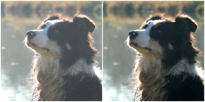
I have to say, I did use the Exposure tab first (mainly Highlights), since this photo was so dark to begin with. But after that, I used a little bit of blemish remover/clone; some eye brighten (for eyes, camera, and watch); wrinkle remover to tame Megan’s flyaways, blur the background, unwrinkle her shirt, and smooth her eyebrows;and I think some airbrush too. Looking good!
photo credit via abarefootgal.wordpress.com
Here I used wrinkle remover again to erase my flyaways and a few wrinkles in my shirt; and then eye brighten on my eyes, eyebrows, and Lily’s eye. 🙂
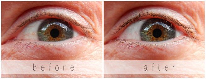
This is my Dad’s eye. 🙂 I chose not to erase the wrinkles completely, but I did smooth them just a tad. I also used Teeth Whiten and Clone to whiten the whites of his eyes, Mascara ( XD ) to darken his eyelashes, and Eye Brighten to brighten his eyes and darken his eyelashes as well.
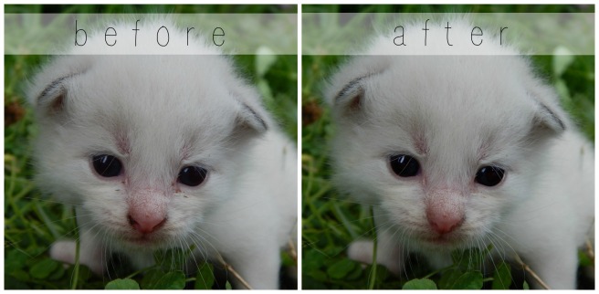
Here’s an example of using “Touch Up” to edit photos of your pets. This little kitten was so cute, but it’s face was kind of dirty. The only things I used here were Blemish Fix and Eye Brighten.
Now for the other part of the post…
How to Create the Perfect Book Character Portrait With PicMonkey
What happens when you know exactly what your character should look like, but you can’t find any pictures on Pinterest to match? That’s a terrible problem. 😛 But never fear – here’s how to fix it. Start with the best photo inspiration you have of your character, the photo that’s the closest thing to the picture in your mind. Try to find a picture where the structure of the face and hair is right, even if the colors are wrong. Then change the color of the character’s eyes, hair, lips, skin, etc. on PicMonkey!
Here’s an example I did. I’ve been trying to find the perfect picture for a character I have in mind, but I just couldn’t find it. This was a close one, but the eyes and eyebrows needed to be darker and the hair lighter. I touched this photo up on PicMonkey, and voila! (original photo via)
I used Highlights and Clone to lighten her hair, Eyebrow Pencil to darken her eyebrows, Spray Tan to turn her irises brown, and Mascara and Eye Brighten to darken her eyes and eyelashes. It’s a lot of fun to edit pictures like that because they turn out so different than the original!
Before we finish, here’s a few miscellaneous tips:
Don’t Overdo It! This is one of the most important things to remember when editing portraits. You might be tempted to make your subject’s skin look perfectly smooth and their eyes look super shiny, but that looks fake. Stick to realistic edits unless, like for book characters, you’re purposely making them look different.
Go Royale: Unfortunately, a lot of the Touch Up tab is Royale. If you take pictures of people a lot, you might want to consider upgrading to Royale to get these and many more features. I have Royale, and I love it! It is, however, 30 something dollars a year, so I would recommend thinking about how much you’ll use it before buying it.
Improvise: If you don’t have Royale, you can often concoct your own Touch Up tools from various free effects and features elsewhere in PicMonkey. (For instance, using “Draw” instead of Clone.) The more you use PicMonkey, the more you’ll be able to master it.
So that’s about it! Many of the tools I didn’t talk about are self explanatory, so have fun experimenting by yourself! 🙂 If you have any questions, I’d be happy to hear them I’ll try and help you the best I can.
I’m so happy that you guys liked the first part of this series! (If you missed Part 1 or would like to review it, click here.) Are you ready for Part 2? Today I’m going to show you how to use some beautiful and fun effects, along with a few tips and tricks as well.
Again, I’m going to be working with the PicMonkey editing site, so go ahead and open that up on your web browser and choose the photo you want to edit. Last time we used the Basic Edits section of PicMonkey, but today we’re going to use the Effects tab. It’s represented as a little sparkly wand symbol on the left hand sidebar of the PicMonkey Editor, just below the Basic Edits tab.
Alrighty, let’s do this!
How to Add Effects
To be honest, I don’t use effects that terribly much, but there are a few very helpful tools in the effects section of PicMonkey – and all of the effects are just so fun to play with! I’m going to edit a picture and walk you through the steps so you can do it too.
Here’s our starting picture. ♥
To begin with, I used the Focal /soften tool. This is a very useful effect, especially if you don’t have a DSLR or if your camera doesn’t allow you to adjust aperture. See, by adjusting the aperture to a smaller or lower f-stop, you can make the subject sharp and in focus while the background is beautifully soft and blurry. Personally, I LOVE this effect, and so do a lot of other people. It looks professional. But if you take photos with your phone or a little pocket camera, it’s not easy to get a blurred background. But that’s why you’re here, my friends! 😉 Let me show you how…
First, find the “Focal Soften” Tab. It’s toward the bottom.
If you’re a little overwhelmed by all the different sliders, don’t worry! Trust me, it’s not as complicated as it looks. I’m pretty sure you could all figure it out by just playing around with the sliders, but in case you want some more detailed information, here it is. 😉
The Blur slider simply adjusts how soft or blurry it is around your subject. Tip: Be careful not to add too much blur or the effect will look fake. Focal size adjusts the size of the part of the photo which is sharp, or in focus. Edge Harden determines how distinct the edge is between the blurry and non-blurry parts of the photo. Tip: I suggest normally sliding the edge hardness to zero or close to zero. This provides a smoother, more natural transition. And lastly, the Fade slider controls how much of the whole effect, Focal Soften, shows up on your picture.
Okay, next I used the “Boost” effect.
Tip: A little “Boost” can go a long way. You will quickly see this if you play with the slider. I used 8% boost for my picture, just to make the colors more vibrant.
I also added a teensy bit of the HDR effect.
This is yet another effect to use sparingly – although it’s really fun to play with the sliders and create weird and wonderful artistic effects. HDR is basically a more interesting, advanced form of the “Sharpen” tab in Basic Effects.
Lastly, I finished it off with another of my favorites: the Miniature effect.
Now, as you can see by that little yellow crown up there, this effect can only be used by Royale members. Like I mentioned in Part 1, Royale is an upgraded version of PicMonkey that gives you access to more effects, more graphics, and generally more features all around. I have Royale and I love it! You really get a lot of fun and useful stuff when you buy the package, including this Miniature effect. Tip: If you’re not sure whether to get Royale or not, you can always try out PicMonkey’s free trial!
Ahem, getting back to the effect… The Miniature effect is kind of like a combination of Focal Soften and Boost, but it’s a little different from either. For one thing, you can choose whether to make the focal shape linear or circular – in other words, make the in-focus part of the picture a rectangular section or a circular section. For landscapes and such, it works best to use the linear option, but for close-ups and individual objects, use circular. Adjust the Boost and Impact sliders to control the saturation and blur of the effect respectively.
Alright, I’m finished! Here’s the before and after photo: (before on the left and right on the right side)
So pretty!
I’m going to go through these next photos a little faster now that you know basically how the effects work.
Black and White
The classic B&W. 🙂 I like to use this effect when 1.) my photos are cluttered or have a distracting background, and 2.) when I want the photo to have a special, nostalgic feel. PicMonkey seriously has like 7 different black and white effects, and they’re all a bit different. Tip: Start with classic Black and White, then add some toned-down Super B&W or Tri-X to make your photo pop. If you use the Fade slider on Super B&W or Tri-X without first making the photo black and white, you’ll end up with a bunch of washed out colors instead of true black and white. Which, incidentally, is another neat editing technique of its own.
Here are some black and white photos I edited.
As you can tell, this isn’t completely black and white. If you click the little paintbrush symbol on the Black and White tab, a little menu with even more sliders pops up! Choose “Effect” at the top of the menu to paint on the effect you’re using, and “Original” to erase it off. I erased the black and white effect off of only the cupcakes here, for a fun pop of color.
This is an example of B&W used to create a nostalgic or special atmosphere. Black and white is great for preserving special memories or sweet moments like this. Isn’t is adorable? ♥ (By the way, the original picture was from this post.)
Clone
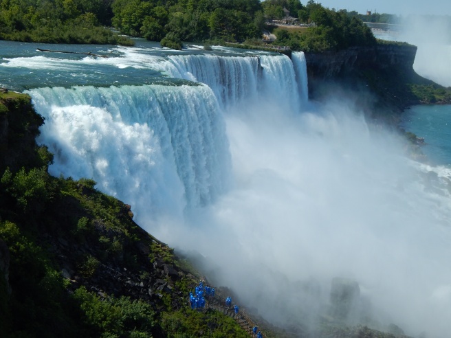
This is a VERY useful tool, but sadly, it is a Royale feature. 😦 Clone can be used to erase unwanted items right out of a picture – from power lines to trash – as long as the unwanted object is fairly small. Simply click on the part of the photo close to the unwanted object, and start erasing. This tool takes a bit of practice to master, but it is quite helpful once you do. Take this photo, for example:
Gorgeous Niagara Falls, right? And annoying blue people, huh? Well we can whisk those people far, far away with the Clone tool. Ta-daa!
Isn’t that amazing? I simply copied the bushes and rocks from around the people and painted over all that blue.
Other Tools and Tips
Two other very useful tools which I didn’t show are “Dodge” and “Burn.” Both are located at the bottom of the Effects page, and both require Royale membership to use. Use Dodge to brighten specific areas of your photo; use Burn to darken specific areas of your photo. Tip: Dodge is helpful when the face of your subject is dark or cast in shadow.
A really neat feature which PicMonkey added recently is the ability to create your own effect by layering other effects together. It’s a little button labeled “Save custom effect” up at the top of the Effects tab. But… you guessed it, it’s a Royale feature too. I actually don’t use it that much anymore, but it’s really fun to play with. 🙂 Tip: Mix up your own custom effect to provide the photos for your blog or business with one cohesive (and personalized) look.
Be creative! I encourage you to try out all the effects in the tab and play around with the sliders. Even if you don’t have Royale, PicMonkey at least lets you preview the Royale effects.
One last tip: have fun with editing, but don’t go overboard! Sometimes over-edited photos are much worse than the original. Think of the effects like make-up – use them to enhance your photo’s natural beauty, not plaster them on until your photo is unrecognizable and fake-looking. Unless, of course, you’re doing an artistic effect on purpose.
Phew! That was a lot to take in, but I hope you guys found it helpful! Let me know if you have any questions about that, and I’ll do my best to answer them. 🙂
Grace recently wondered if I could do a tutorial on how to edit photos, and I thought that was a great idea! I decided to make this a mini-series, covering basic photo editing, adding effects, touching up photos of people, and maybe a little bit of graphic design and collaging too. I’m really excited!
Anyway, let’s get started. Today I’m going to go over the basic photo editing tools and then show you how to use those tools to fix two common photo problems.
Introduction
I use PicMonkey for pretty much all of my photo editing, and I highly recommend it! It’s very easy to use, and it’s free – although you can pay to upgrade to Royale and get some extra features. (I have Royale, by the way, and I would definitely recommend it if you edit photos a lot. I’ll talk more about Royale later in the series.) But don’t worry about that for now. All the tools I’m going to go over today are completely free.
So, open PicMonkey, and hover over the bar at the top of the page where it says “Edit.” Open the photo you want to work on. The section of the editor that pops up is called “Basic Edits,” and that’s what we’ll be using today.
Basic Edits
Crop: The first tab of the “Basic Edits” section is “Crop.” Cropping is quite a valuable tool that allows you to cut out ugly surroundings from the corners of your pictures, make the composition of your photo more interesting, or simply zoom in closer to the subject.
Canvas Color: This just covers your whole picture with one color. You won’t use it to edit your photos, although it’s great for graphic designing.
Rotate: The rotate tab allows you to flip your picture any way you want. It also allows you to straighten your photo, which is very helpful if you were accidentally holding your camera crooked and your subject looks like it’s sliding off the picture. 😀
Exposure: In my opinion, this is the most important tab in the Basic Edits section (well, maybe it’s tied with “Crop”). You can work wonders simply by adjusting the exposure of a photo, and we’ll be using this tab a lot, later in this post.
Colors: This tab includes sliders for saturation and temperature, as well as a mysterious button called “Neutral Picker.” Actually, it’s not that mysterious. 🙂 Basically, when you click on the parts of your photo that should be white, the Neutral Picker auto-adjusts the temperature to turn those off-colored spots white again. Temperature controls how warm or cool a photo is – in other words, whether it has a red (warm) tint or a blue (cool) tint. And saturation, as you probably already know, makes the colors of your photo more saturated and bright.
Sharpen: Sharpness and Clarity actually ARE different – just a bit. My unscientific description is that Sharpness yields a more subtle effect and focuses on sharpening the details, while Clarity is bolder and boosts the contrast of your photo while giving it a gritty effect at the same time.
Resize: This simply downsizes your photo to a smaller file size so it takes up less space on your computer (or blog). Anywhere between 800 and 1280 (and even a bit larger) would be a good size for sharing online. One thing to keep in mind is the smaller the size, the lower the quality of the picture.
Using Your Tools
Now that you know what everything does, let’s put your tools to use! I’m just going to show you a few examples and walk you through what I did. (Note: the “before” pictures are on the left, and the “after” pictures on the right. Just in case you couldn’t tell. 😉 )
Isn’t it amazing what the Shadows slider can do? That’s seriously all I did. I moved the “Shadows” slider to -44, and that’s it.
This is a more subtle edit, but I think the “after” picture definitely looks more vibrant. The photo on the left is kind of drab and gray, so I upped the saturation a bit and adjusted the exposure. I also straightened the photo so the ocean isn’t tipped to one side like that. (And hmm, I might have lowered the temperature also, but I can’t recall for sure. Oops. XD )
The main difference in this photo is that now you can actually see the cute wittle kitten instead of losing him in the surrounding scenery. I told you cropping was a helpful tool! 😀 I also straightened the photo so the kitten wasn’t falling off the face of the earth, upped the “Sharpness” slider, and adjusted the exposure just a tad.
Wow, so much better! This picture was washed out to begin with, but by lowering the brightness and shadows, and adding a little bit of contrast, it looks bright and beautiful again like it’s supposed to. And speaking of over-exposed photos, we should move on to the fixer upper part of this post. (By the way, I l♥ve the show Fixer Upper! Have you ever watched it? It’s sooo good. Ahem…)
How to Fix an Over-Exposed Photo
An over-exposed photo is one of my most common problems. But thankfully it’s easy and fun to fix!
This is the photo we’ll start with:
Eh. The content is good, but the lighting is off: it’s too bright and has a sort of bland grayish-white wash over everything. We must rescue this poor photo in distress!
Pretty much everything you need to fix an over-exposed photo is in the Exposure tab, so go ahead and open that up. The two main things to do for an over-exposed picture are to lower the brightness and lower the shadows. Here’s a screenshot of what I did:
You can tell from the sliders that I lowered the brightness and shadows significantly (to -14 and -18 respectively) and added a tiny bit of contrast and highlights. And that’s pretty much it! (Note: I did also use the “Burn” tool to darken a few spots in the photo, but I’ll talk about that more in another post. For now, just concentrate on using the “Exposure” tab.)
Before and after. So much better!
How to Whiten a Photo
Sometimes photos have a weird yellowish or bluish tint, especially on the light parts of a picture.
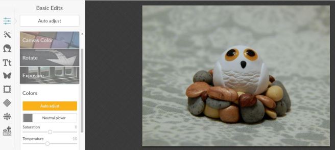
Like in this photo:
This really isn’t a bad picture, but you can see a slight orangish tinge over everything, which makes it look dingy rather than fresh and clean. It’s especially important to get good, clean-looking photos of products you sell, and this owl just so happens to be in my Etsy shop. So, let’s clean him up a bit, shall we?
First, open the “Exposure” tab.
The main thing you need to do here is bump up the highlight slider, but I also messed with the brightness and shadows slider a bit too. Here’s a tip: use mostly highlights instead of brightness to brighten up a photo, because too much brightness will make the photo look washed out. “Highlights” brightens just the white parts instead of the whole photo.
Next I opened up the “Colors” tab. Since my picture is too red, I moved the Temperature slider down to -10, which added some blue to even it out.
And here’s the before and after. A subtle difference, but do you see how the one on the right looks cleaner, fresher, and more appealing?
Well, I guess that’s it! I give you a pat on the back and a virtual bag of chocolates if you read that whole thing. O.o XD
Heh heh. I hope that was helpful to you! Feel free to ask me any questions in the comments if you didn’t understand something. 🙂
I finally finished this birthday haul post a month after my birthday. XD It’s not really a birthday haul post, actually. It’s more just reviews of some of the things I got for my birthday. Get ready for a really long post!
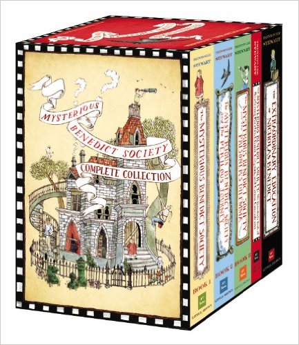
(The link is for the hardcover collection which I have. You can also get a paperback collection on Amazon.)
I absolutely LOVE this series by Trenton Lee Stewart. It’s probably my favorite series! “The Mysterious Benedict Society” is a group of extraordinary children who are sent on several extraordinary missions. The characters are so fun to read about – there’s Reynie, Sticky (you’ll understand his name when you read the books), Kate, and Constance. Once you pick up these books, it’s hard to put them down! They’re filled with exciting action, surprising plot twists, hilarious anecdotes, and riddles and puzzles that will stretch your brain.
Notes: The synopses are not actual back-of-the-book summaries, I just wrote them myself. Also, the pictures of each book are from their Amazon listing. If you click on the “via” links, it will take you to the listing. Some of the covers on the books below are a little different than mine, but mainly the same.
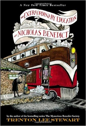
This book is a prequel to the series although you don’t necessarily have to read it first. (I didn’t.) Like in the rest of the series, the plot twists, clues, and riddles throughout the book keep your brain whirling. There are a bunch of mysteries in this book, and some of their conclusions may surprise you. It’s exciting to read how Nicholas uses his genius mind to solve problems and outsmart the Spiders and other fearsome foes. Nicholas also has a condition called narcolepsy (which is real by the way), which means he falls asleep at random times.
Synopsis: This story covers about a year in the childhood of Nicholas Benedict, the man behind The Mysterious Benedict Society. Nicholas moves to a new orphanage filled with surprises – from a huge library to a secret overlook, tough bullies to loyal friends, and maybe even a treasure! Nicholas will need all of his talents and genius to unpack the mysteries surrounding him – and to do so before it’s too late.
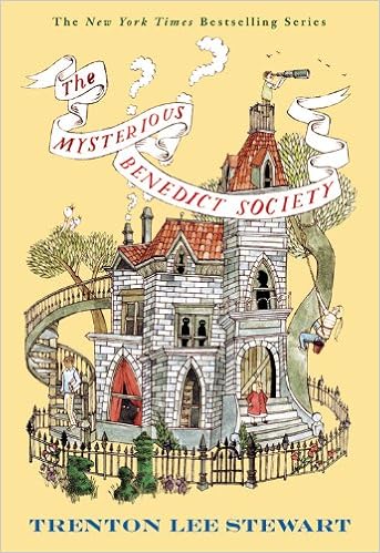
This is probably my favorite book in the series. I especially love the beginning when everything is so mysterious and there are gobs of strange riddles and puzzles that bend your brain. The book is exciting and clever, and some of the plot twists just blow you away. At the end you learn something totally unexpected and funny about Constance. You HAVE to read this, guys!
Synopsis: An advertisement in the newspaper starts it all: “Are you a gifted child looking for special opportunities?” Join Reynie, Sticky, Kate, and Constance on the adventure of their lives. After passing a series of mind-bending tests, they are sent on a very important mission: to save the world from an evil genius with a terrifying plan to control the world – and the minds of everyone in it. They will have to work as a team and put all of their extraordinary gifts to use after arriving at a strange institute. What is Mr. Curtain’s evil plan? Who is Milligan really? What is the Whisperer? These are just a few of the puzzling questions the Mysterious Benedict Society has to answer.
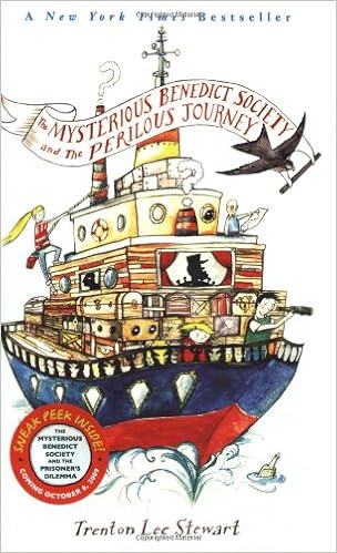
The Mysterious Benedict Society and the Perilous Journey
This isn’t my favorite book of the series, but it’s still great. I love that you learn something new about Constance in this book. Her newly discovered talent really adds to her personality. You also meet some new characters like Cannonball and the Bullfrogs. The duskwort plot thread is really interesting and exciting too. (See synopsis.) Here is a quote I like from this book: (Cannonball is comforting Constance, who is quite short, by the way.)
” ‘You know what I like about buttons?… They’re very small things that hold bigger things together. Awfully important, buttons – little but strong.’ ” – page 154
Isn’t that sweet? “Little but strong.” 😀
Synopsis: After a year apart the Mysterious Benedict Society reconvenes. They have been anticipating a surprise Mr. Benedict planned for them when they find out that someone has unpleasantly surprised him. Their beloved Mr. Benedict is in danger! Will the scavenger hunt lead them to their heart’s desire, or into a trap? In the meantime, Constance discovers a new talent, and a plant named duskwort is of imminent importance. If the duskwort falls into the wrong hands, everyone is doomed.
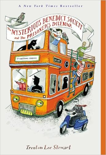
The Mysterious Benedict Society and the Prisoner’s Dilemma
The Prisoner’s Dilemma is the last book in the series. (Except for the puzzle book, but that doesn’t really count.) I really like it! It’s fun and suspenseful to follow the clues with the Mysterious Benedict Society gang, but not everything is as simple as it seems. You might be surprised – actually you probably will be! The end is quite satisfactory. 😀
Synopsis:
The Mysterious Benedict Society is bored, bored, bored. They have been cooped up together in Mr. Benedict’s house for months because it’s not safe to leave: Mr. Curtain will do anything to get back his precious Whisperer, including snatching up certain children in his way. But when Constance disappears after an appointment with the Whisperer, boredom is flung to the winds. Reynie, Sticky, and Kate are on a race against time to find their grumpy companion before the Ten Men do. They must decode secret messages and follow curiously easy clues… that lead them to an unexpected place. This adventure includes two brave girls and two smart boys, a Salamander, a missing friend, sneaky clues, a couple of “S” pies, a red bucket, and a few daring leaps.
The Mysterious Benedict Society – Mr. Benedict’s Book of Perplexing Puzzles, Elusive Enigmas, and Curious Conundrums
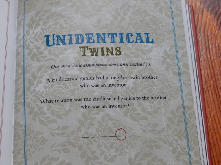
Whew! Why do the titles have to be so long? XD I’ll just abbreviate it “Perplexing Puzzles.” Perplexing Puzzles is a really fun book filled with… well, riddles and puzzles. It is a gorgeous book – it’s printed on glossy pages and the whole book is in color instead of black and white. Most of the puzzles are quite hard, but a few of them are easy. (There are hints in the back of the book to help you along. If you need another hint, I might be able to help you too! 😀 ) Scattered throughout the book are quotes from the series, illustrations and profiles, and other “archival materials” as it says. I love the a riddle at the very end that requires you to use letters and numbers from previous puzzles to reveal a last secret message.
Here is one of the riddles: (your answer has to fit in the blanks)
Umm… I can’t really do a synopsis of this one. XD
************************
Pros and cons: The covers all have delightful illustrations on them, and the books are all beautiful and well-made. Like I said, the Perplexing Puzzles book is particularly gorgeous. The box that they come in is really nice too! The inside looks like it has been plastered with newspaper clippings from the first puzzle in Perplexing Puzzles. Umm… there aren’t many cons. 😀 Of course I liked some books better than others, but I enjoyed them all. The one problem is that it’s a little hard to pry a book out of the case, but that’s okay. 🙂 I highly recommend both this series and this hardcover collection.
(I’m pretty sure you can find a pack like this for cheaper if you shop around Amazon or stores like Michael’s or Hobby Lobby, but this is the listing I found.)
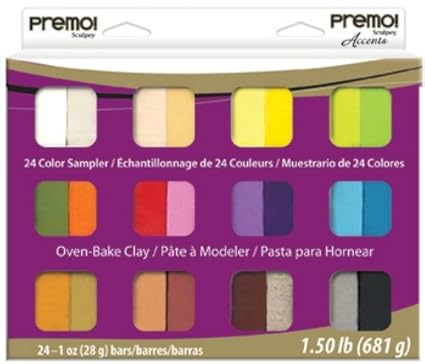
Premo brand polymer clay is a very good quality clay. (At least in my opinion and from what I’ve read.) You can see lots of things I made with it here.
Let me compare and contrast it with Sculpey III, a popular brand of clay made by the same company. Premo is more of a professional clay, while Sculpey III is more of a recreational, hobby-type clay, not meant to be super durable. Premo is much stronger when baked than Sculpey III, and not as gooey and hard to work with as Sculpey III can be. (But see “Pros and cons.”) Although I do think Sculpey III has more colors available. They are both good for different reasons, but I prefer Premo to Sculpey III.
Pros and cons: Usually I love this brand of polymer clay, but the pack I got this time was a lot softer than normal. That is really helpful for conditioning and mixing clay, but not so good for sculpting. Normally though, it’s a really great clay – not too hard, not too soft – and this sampler pack comes with some really neat options, such as translucent clay (which looks transparent-ish when you brush a gloss over it), and faux rock clay which really looks like rock! The sampler pack lasts a long time if you make small things, like I do, but I found it helpful to get an extra pack of white Premo clay because I use white a lot. Even though the changeable pliability is annoying, I would still recommend this product.
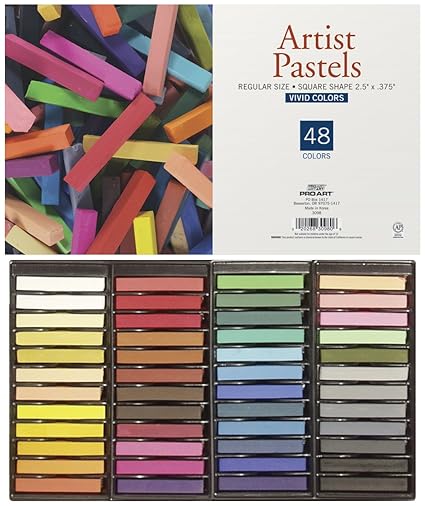
I requested these to use on polymer clay. They’re kind of like chalk. First you scrape them on paper to obtain colored powder, then you use a paintbrush to paint the powder onto baked or unbaked clay for more realistic shading effects. It’s kind of like paint, only more subtle. Pastels work very well for shading miniature food. The cookie on the left is not shaded with artist’s pastels, and the one on the right is. (Sorry, it’s not a very good picture, but trust me, some clay artists can do amazing things with artist’s pastels! Like Tracey, for instance.)
Pros and cons: Certain shades of brown are missing that would be helpful, but at least you can mix colors. I haven’t had much experience with artist’s pastels, but these work quite well for my purposes! I would recommend this product.
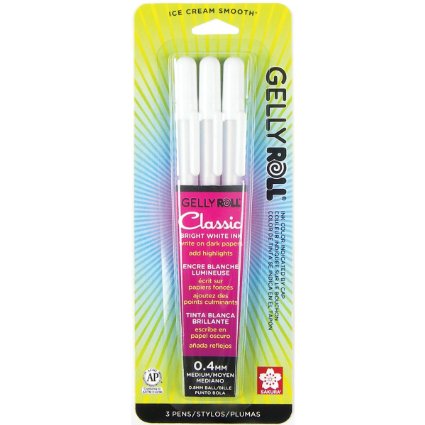
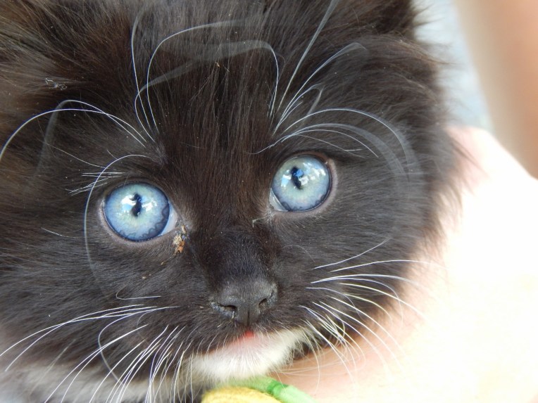
These pens are really nice! Not to mention there are three of them, so they should last me a while. 🙂 They have a fairly fine tip and write smoothly as long as you don’t write too fast. You can use them to mark highlights on your drawings, for things such as hair and eyes:
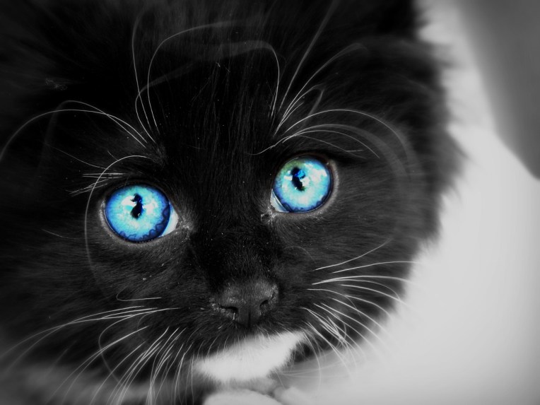
The ink is almost marker-resistant – you can see on the left of her hair one of the squiggles is slightly more muted. That’s where I drew over it with marker and the gel pen still showed through. When you draw on top of marker, the marker ink bleeds a tiny bit with the gel pen ink, so it’s usually not quite completely white. (In the picture above, the ink turned a little grayish.)
The white ink looks stunning on black paper! Here is an ATC I made with one of the gel pens:
Pros and cons: The pens write quite smoothly unless you write fast; then they’re a little scratchy. The optimum background seems to be black paper. The ink will smudge if you’re not careful, but it’s not super smudge-prone. I would recommend this product.
I was really excited about getting this, because I use PicMonkey a lot. (Royale gives you access to lots more features – extra effects, overlays, collage options, and more. But you do have to pay for Royale. 😉 ) Three of my favorite things about PicMonkey Royale are the “Custom Effect” feature, Clone feature, and the Royale collage options. You make a custom effect by adding different effects to a photo like usual, then saving all the things you did as one effect that you can use over and over again.
Here is a photo I edited with Royale: (More kitten pictures coming soon! 😀 )
BeforeAfter
I used clone to “wipe off” some dirt, Miniature Effect, Eye Brighten, and then several other non-Royale effects and features. So cute!
Pros and cons: It’s definitely nice to be able to use features like clone, Custom Effect, extra Overlays and Collage layouts, and more. Pretty much the only con is the price. If you don’t use PicMonkey a lot, or don’t use it much besides the basic touch-ups which are free, you probably won’t need this. However, if you love photo-editing or PicMonkey or both, I recommend this feature!
Of course I got a bunch more things for my birthday, but it would take a few more months to review them all at this rate. XD I hope you enjoyed this! Which was your favorite item? Do you have any of these things?
Hey guys! I hope you’re not getting tired of contest entry posts. 😦 I’ll hopefully do a photography post tomorrow. (I still have WAY too many photos to show you!)
Anywho, I’m participating in Misty’s really fun writing challenge, Aspiring Authors Writing Challenge, or AAWC for short. (Read about it here.) (And see my other entries here.) The word prompt for this challenge was “Broken.” I can collect two extra points for my team if I work my team mascot (I’m on Team Swan) into the story, so I did! (Although I just mentioned it a little bit – does that still count, Misty?)
I took a photo of my friend’s eye recently and super-edited it. I included it because it fits perfectly with the story. In fact, the photo was kind of like an extra prompt for me.
And now, I present…
______________________________________________
Blue Eyes
I am Nadia. I am average – average height, average weight, average everything – except for my eyes. They are blue. Blue like the sky of long ago, my grandparents tell me. And that is why I leave tomorrow.
Mati and Pati, my grandparents, often tell us an old legend about our land back when it was bursting with color…
Our land was once beautiful and bountiful, the envy of every kingdom for miles around. But then the storm came. This was no puny rain shower; this was a storm. Dark gray clouds swept furiously across the sky, rumbling and grumbling with every step forward. They ripped themselves apart and drenched the land with their angry tears. It rained for days, then weeks, a long gray drizzle. Finally it stopped. Everyone rushed outside into the dimness, waiting for the sun to break through at last and turn the darkness into dancing, shining, living color again. But it never happened. The sun came out, true, but it was pale and peaked as if it had been through a long illness. It did not bring color with it. The storm had killed the color, crushed it, and shattered it. Ever since there has been no color in our land.
Besides the blue of my eyes, these are the only colors I know: black like midnight without stars, white like the swan that eats our breadcrumbs tossed into the lake, and the infinite shades and tints of gray in between. My eyes are the only spots of color in our otherwise colorless land. Our world is broken and no one can fix it.
Except for… me.
My grandparents always tell me at the end of their story, “You are the only one who can mend our broken land with your blue, blue eyes. You are the only one who can keep color alive.”
So I leave tomorrow, after I turn ten years old. I will make the long journey over the gray mountains alone, and I will bring color home. I remember exactly what I must do: I must fill my cupped hands to overflowing with color, and carry my precious burden carefully homeward, sustaining the color and keeping it alive with occasional glances from my blue eyes through the colorless grayness. I must bring healthy color home, and lay it gently on the ground. Then, Mati and Pati say that the color will take root like a flower, and grow and spread throughout the land until at last, there will be dancing, shining, living color again.
That is my mission: to mend my broken land with my blue, blue eyes. And I will carry it out.
____________________________________________
I am terribly glad that our world is not like Nadia’s! Wouldn’t it be so sad if God hadn’t made our world colorful? (Well, of course we wouldn’t know any better then, but still…)
I hope you enjoyed reading this! Have a colorful day!
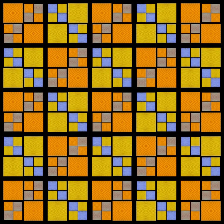
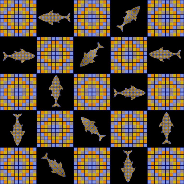
I have been having a LOT of fun recently making “quilts” on PicMonkey. Of course, you can’t really make quilts on a photo editing program – they are really more like photo mosaics.
I started with a few simple photos of colored corrugated cardboard, like this:
and combined and multiplied and rotated and collaged them a bunch of times in a bunch of ways, to make mosaics! Here is one of the “quilts” I made just using PicMonkey and four different pictures of corrugated cardboard:
Isn’t it so neat? I don’t really like the colors, but I like the design. Since they are so fun to make, I decided to share the fun with you too! Here is a sort-of-kind-of tutorial on how to make photo mosaics.
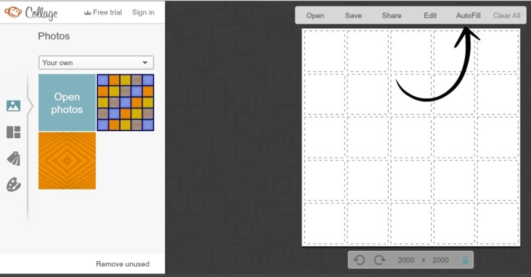
You can take your own pictures, or use any of these “quilt patches” below that I already made. (But please don’t use any of my other pictures without my permission. 🙂 ) Just right click the pictures you want, and save them to your computer.
Go to PicMonkey, hover over the ‘Collage’ button at the top of the page, choose ‘Computer’ and open the photos you want to use for your “quilt.” Click the ‘Layouts’ symbol on the left sidebar, click ‘Square Deal,’ and choose one of the last two options. The more squares the layout has, the more complicated and interesting the quilt can be!
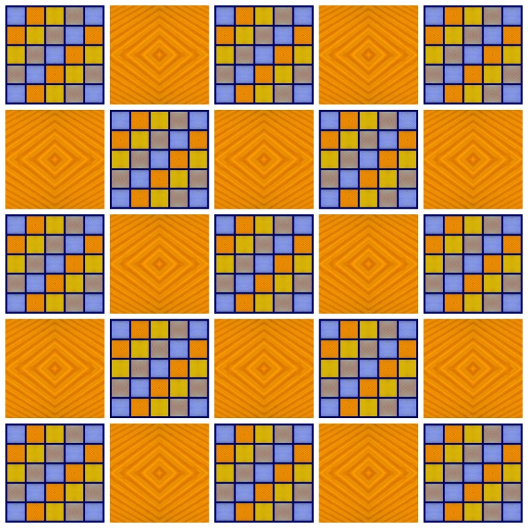
Click and drag the “quilt patches” to the squares, and rotate them to make all sorts of interesting patterns! (See this mirroring tutorial on the PicMonkey blog for more details on how to rotate images.) You can use ‘Auto Fill’ (at the top bar) to make interesting patterns without much work. (You have to click ‘Auto Fill’ a couple of times until the quilt is filled up with squares.)
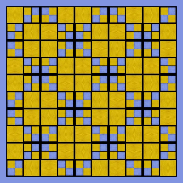
And ta-daa! This is a quilt I made by auto-filling like in the picture above.
Here are some more “quilts” I made.
I really wish I took pictures of prettier-colored cardboard, because the colors don’t really go together in the quilts, but it’s really fun anyway.
I hope you enjoyed this random post, and tell me if you make any “quilts!”