Wow, I haven’t done a recent art post in ages! I’ve been making a TON of art in the past few months, and I’m excited to show you guys what I’ve been up to. Today I’ll be showing you a couple of sketchbooks/art journals I’ve been working on, plus some Etsy art and other miscellaneous pieces. Enjoy browsing through these pictures! Hopefully you’ll gain a little inspiration for your own art as well – I know I always do after reading art posts. 🙂
Heyyyy, guys! Goodness it’s been far too long since I’ve done a recent art post. I have been sprinkling in a few pictures for CPC and Art Lab and such, I guess, but today I want to do a round-up of (most of) the pictures I’ve drawn in my sketchbook since the last art post, along with miscellaneous other art. I hope you enjoy browsing through the pictures! 😀
My current sketchbook is almost filled with drawings and crinkly painted pages, so I put a new sketchbook on my Christmas list. 😉 Filled up sketchbooks are so satisfying!
Alright, I’m going to go in chronological order because it’s the easiest. XD Just note that I did make a few more drawings than this, but I didn’t want to you every single one or the post would get even more ridiculously long than it is. 😛 Anyway, this first drawing is just a fun, stylized, pen-and-colored-pencil doodle. I rather like the quote.
One night I was bored so I decided to try the three marker challenge (drawing a picture with only three colors) with Sharpies. I like some parts of it, but… well, it’s certainly not my best work, heh heh. Oh dear.
Um, this is a super strange drawing of a mini world on someone’s finger??
Now this drawing I actually like. I drew it from a picture in one of Loren‘s posts which is sadly eluding me. HELP. If anyone knows which one it was, could you tell me please? Thank you muchly. UPDATE: Katie found the post for me! Thank you SO much, Katie. 🙂 Here it is.
I told you I liked the quote… XD I was trying out sketching with a colored pencil instead of a normal pencil and I like how it turned out!
WARNING. VERY CREEPY DRAWING AHEAD. Okay so apparently I have a REALLY hard time drawing deer (at least without a reference). SORRY GUYS. I did draw some better deer, but that will come later on.
*Sigh* Two bad drawings in a row? DON’T WORRY GUYS, IT GETS BETTER THAN THIS, I PROMISE. Anyway, this was a drawing that I tried to do for a CPC story (which you can read here), but it, um, didn’t turn out. But hey, it goes to show that although bad art is inevitable, that doesn’t mean you should give up. ART IS TOO AMAZING TO GIVE UP.
Ahem. Oh yes, I drew this little flurry for an online magazine I contribute to! Some are good and some are bad, but hey, you can tell they’re snowflakes. Does anyone else have a hard time making snowflakes symmetrical?
I like how this looks so far (it’s a vast improvement on some of my other hair drawings), but I don’t know if I’ll ever finish it. Oh well. 🙂
I really like this little guy, hee hee! Megan and I ordered a shirt for my brother that said “I FROGET” since that’s the punchline to one of his favorite terrible jokes which I cannot remember at the moment. XD There are plenty of online sites where you can design your own t-shirts, so I made the art and Megan did the rest of the designing.
Now we’re getting into some Christmas drawings. (By the way, CAN YOU BELIEVE IT’S DECEMBER?! I CAN FINALLY DO CHRISTMAS STUFF.) These next two I also made for the aforementioned magazine. I used my watercolor brush pens for this one…
And acrylic paints + a white gel pen for this one. I love how the painting turned out!
Here we have a lovely bad quality picture of a NeedtoBreathe quote, also for the magazine…
This is just a random Thanksgiving doodle with my watercolor brush pens again…
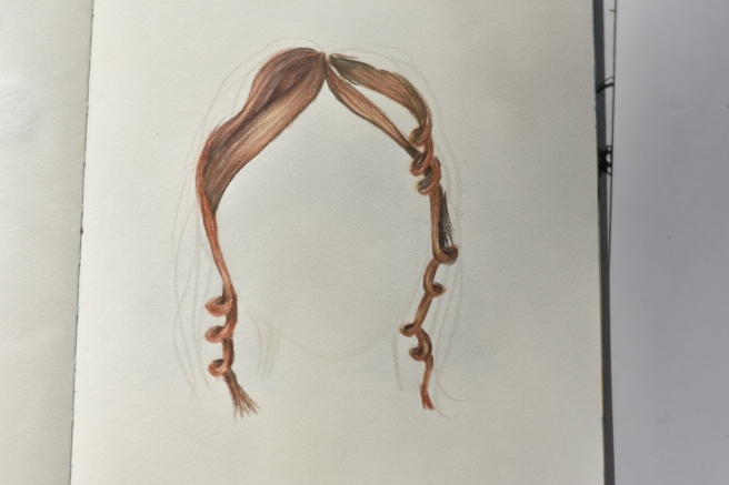
A strange-looking hawk I drew using one of my brother’s other shirts as a reference. 😛
And now we’re caught up with my sketchbook! Next we have the “Beyond the Sketchbook” part, a.k.a miscellaneous drawings.
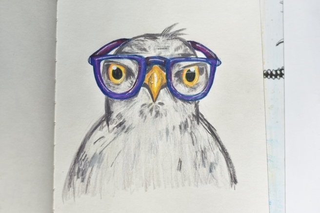
I drew this wrapping paper for our cousins’ birthday because they put these pets on their list (though they obviously knew they wouldn’t get them 😉 ).
Ooh, I really like the next one! I saw a photograph like this on Pinterest (right here) and thought it would be a fun challenge to draw. It was! It turned out a bit streaky, but I’m pretty proud of the lips, which are usually hard for me. XD
I’m pleased with this one too! I drew this for the custom art in my recent giveaway, from photos Gracie gave me. Isn’t Gracie’s cat so pretty? ♥ I love her blue eyes.
This card was for my grandma who was recently in the hospital. I’m happy to say that she’s home now, though, and recovering well! ♥
Megan wanted me to draw this card for one of our friends. We always like to debate about… well, a lot of things, so we gave her a handy reminder of the right way to say and use things. 😛 (Note: the border is scrapbook paper – I didn’t draw that part, heh heh.)
OH, YAY! Next is my favorite of all of these pictures! Probably one of my favorites I’ve ever done, just because it took SO LONG to draw. XD My friend Aria commissioned me to draw a vintage-looking NYC poster from some photos she took while she was there, plus various other details she wanted, like song lyrics from one of her favorite songs for the border.
I believe this is the biggest art project I have ever done, both in size and effort. :O
Aha, here we have the better deer picture. XD I painted this for my Etsy shop, The Color Box Studio, where you can buy the original.
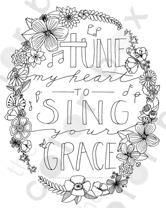
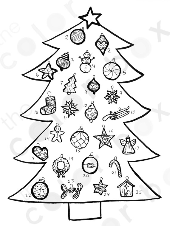
And lastly we have two coloring pages, also in my Etsy shop. I want to start making more of these because they’re fun to use and inexpensive to buy, not to mention you can print them out as many times as you want!
I made this as a custom page, but after she orders it I plan to make it available to everyone (for a lower price). 🙂 You can see the listing here.
And this is the newest addition, and Christmas countdown coloring page! You’re supposed to color an ornament each day. I rather like how it turned out. 🙂
Phew, you did it! Thank you so much for reading this super long post – I hope you enjoyed! Which piece of art was your favorite? ARE YOU EXCITED FOR CHRISTMAS?
***Allison***
P. S. LOOK, IT’S SNOWING! ON MY BLOG! I love that effect. 🙂 If you’re reading this through email or your Reader, you’ll have to actually visit my blog to see it. 😉
YAY, I am so excited to share some of my recent art with you guys! I’ve been drawing a lot lately, and I think I’ve really been improving, so that’s good. 😉
Also, before we start I wanted to mention this super good video (which I’ll show you in a moment) by Hullo Alice that talks about why it’s okay if not every piece of art turns out perfect. I thought it was such a good message!
Sometimes when people try to make art and it doesn’t end up looking like the idea in their head or they search the web and find soooo many better artists out there, they just give up, and think, “I’ll never be good at art, so what’s the use of trying?” The use of trying is that you WILL get good at art if you give yourself a chance. You might not ever get as good as the professional art you love looking at on Pinterest, but you’ll certainly be a terrible artist if you never try.
Listen, before you make some good art, you’re going to make (a lot of) bad art. That’s just how it works with anything – art, music, math, anything you try to learn. And that’s okay. Making bad art is part of the process of getting to be a good artist. If the piece you’re working on is terrible, just let it go, turn the page, and start again. You’ll get better if you keep trying over and over again, I can promise you that.
Okay, now that that little rant was over and you (hopefully) watched the video, I can show you my art. 🙂 I decided to include some of my “bad art” (although not my worst XD) in this post too.
Let’s get started!
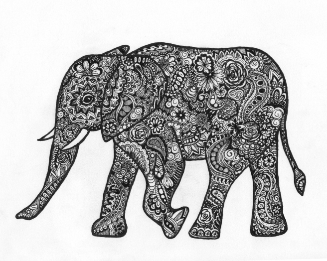
I shall start with some of my favorite art I’ve created – a zentangle elephant. 🙂 It took me FOREVER to draw this, as you can probably guess. XD I had just purchased a new fine-tip pen at Hobby Lobby, and it was great for detailed work like this!
I also made a mandala in a similar style. I think it turned out so pretty! It’s probably the best mandala I’ve done, because usually they get pretty skewed. XD
Another mandala.. YIKES sorry for the terrible picture. O.o
Next up we have a little design I made for Livy’s magazine here (which you should totally check out!)
I’m also submitting this for the next issue of her magazine. 🙂 I had a lot of fun with this one!
I’m not really sure what I think of the next piece… I guess it’s neat, but it didn’t really turn out like I was hoping. Oh well! Waterfalls are really hard to draw, aren’t they?
OOH! I love this drawing I did of the lovely Aria from purrfectlyinspired.com. It’s the best portrait I’ve done, I think!
Okay, here’s something I drew from you guys’ suggestions: a fairy. In the spirit of the post, I shall show you the two horrible renditions it took before I got it to turn out right. XD (I used them for testing pens and stuff, in case you were wondering. 😉 )
Actually the first sketch isn’t that bad… just, well, a sketch.
AHH SO CREEPY. Her face got smudged and made it look even more awful. XD
But finally that bad art enabled me to draw a good piece. Muuuuch better, yes? I hope you like the fairy, Sylvia!
So for this one I was trying to draw something interesting without using any reference photos. Well I sure paid for that with how her legs turned out. XD YUCK. I could NOT get the foreshortening and angle and all that stuff right, so I just called it good enough and finished the picture. 😛 I like the rest of it, though!
Some little water drop doodles from this amazing tutorial. You might think these are good until you see what I was looking off of. XD
Here’s a (pretty rough) concept sketch I did for a possible WordCrafters cover. What do you think? Do you like the idea of all the characters lined up like that? Also I need a better tagline. XD Tell me your ideas! I’ll also do a more in-depth post when I’m ready to start editing WordCrafters.
Heh heh, do you like my play on words? Unfortunately the ink ran all over the place, but it’s okay because it wasn’t my best picture or anything. (It looks like the horse is shooting ink out of her nostrils. XD)
Ooh, this one is funny! I made this birthday card for my sister Megan who loves donkeys.
Ha ha! Yeah, I had fun with that. Although it took quite a while to draw the donkeys inside the card. O.o
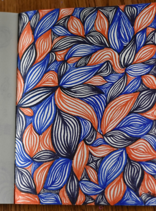
Next we have a page of doodles. I picked a couple of random colors from my watercolor brush pen set and drew this. WHY DO THINGS LIKE THIS ALWAYS TAKE SO LONG?!
Here’s some bad-ish art. It got kind of all blurred together.
BWAHAHA this did NOT turn out right. Poor, failed pineapple. XD
Lookee it’s a cute wittle hedgehog from Clara’s suggestions! 🙂
Random watercolor doodle…
Blech, some more bad art. I very much dislike the color scheme – or lack of one.
I’m really happy with this one, though! I thought it turned out pretty cute. 🙂 My watercolor brush pens are so fun for drawings like this.
A doodle/test page.
I haven’t finished this one and don’t know if I will or not, but this was drawn from a photograph of dew drops on a flower.
I really like how this turned out! My best horse picture so far, definitely. It’s a picture of my friend K. A.‘s horse, Gadget.
few more pages from my Bible journal… (would you like to see another whole post about it?)
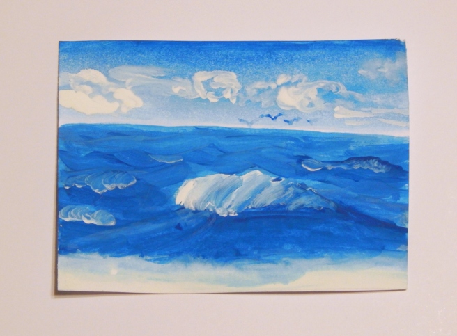
And lastly, we have another rendition of the moonrise galaxy painting I did here.
And that’s about it! As for the bad art, some of you are probably rolling your eyes and saying, “Allison, seriously? You call that bad art?” Well I’ve done worse art – believe me. I just didn’t show it. XD Anyway, I know the feeling. I see “bad art” from other artists and I’m like “WHOA I wish I could draw that well!” And so you see, it depends on your perspective. Your bad art might be more beautiful than you think. ♥
I hope you enjoyed this post! Which pieces were you favorite? Do you have any suggestions for what I should draw next?
Halloo, guys! I’m excited to present a simple tutorial for drawing faces! 😀 I’ve heard a lot of you say “I CANNOT draw people” or “faces are SO hard,” and you know what? I kinda agree. People can be really hard to draw. But you can do it! Today I’m going to show you an easy way to draw a face with just a pencil and paper, and then I’ll show you some different combinations you can use to get all sorts of interesting characters. 🙂
So. To begin, here’s how to draw an average, boring face without looking off a photo of a person. XD (I – and probably you too – can draw a better face when looking off of a picture, but sometimes you just want to make up something, right?)
Ahem.
Technique: Drawing Faces
Step One:
Sketch out an upside-down egg shape for the face and two short curved lines below for a neck. A grid like this is nice if you need help with the placement of the features (like I do). Just draw a vertical line down the middle of the face and a horizontal one between a half and a third down the face. You can see that my sketch is far from perfect, but that’s okay. We’ll touch it up as we go.
Step Two:
Using the grid, draw two oval or almond-shaped eyes. (You can add more grid lines if you like, but you don’t need to.) Eyes are usually smaller than you think, at least in my case. I drew these a bit too big. Getting them symmetrical is hard, but you know what? In reality, no one’s eyes are perfectly symmetrical – look in the mirror!
Step Three:
One common mistake made when drawing eyes is to draw the iris as a whole circle. Unless you are surprised or unusually pop-eyed, you won’t be able to see the whole iris. So make your circle go off the eyeball, like this:
Step Four:
Draw a tiny circle towards one side for the highlight, and a bigger, filled-in circle (or dot) for the pupil. Also draw a curved line above and below each eye for the eyelids.
Step Five:
Draw the eyelashes. This can be pretty tricky, and I think I drew too many eyelashes here. From far away, you can only see a few individual spikes of eyelashes, not a whole fringe. (Again, look in the mirror if you need help.)
Step Six:
Heh heh, this would usually be where you color in the irises, but I kind of forgot about it until step ten. XD You can skip to there now if you’d like or just do it later.
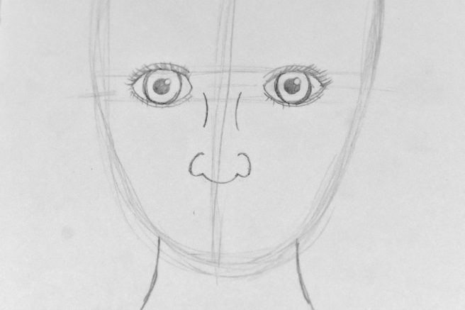
Anyway, now we need the nose. Draw two curved lines (kind of like you did with the neck) for the bridge of the nose, and two parentheses-like curved lines below it. How far apart you make them determines how big the nose is, as well as how far down on the face you put them.
Step Seven:
Curve your parentheses around a bit more to look like “C’s” facing each other. Then connect the bottoms with a wide curve or “U.”
Step Eight:
For the top of the lips, make a flattened “M” shape, which I think looks kind of like a flying bird. 🙂
Step Nine:
Connect the two ends of the “M” with a long curve. You can make it almost flat or very arched depending on how full you want the lips to be. Draw a line in the middle that echoes the curves of the top lip line.
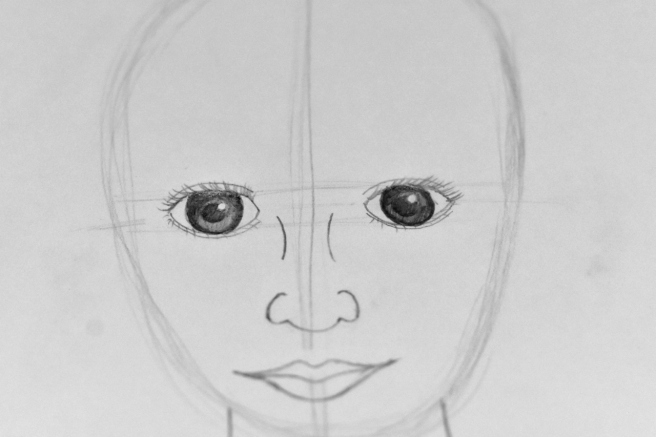
Step Ten:
Now I remembered to color in the eyes. XD A simple way to do this is to color a dark line around the outside of the iris and fill it in with lighter pencil. Make sure to darken especially the top of the iris to make it look more realistic.
Step Eleven:
Now for the hair, which I am pretty terrible at. XD Oh well, you can tell it’s hair at least.
Using the face shape sketch you did at the very beginning, curve the hair around the head like so. (I decided to make the head a little shorter than I had originally sketched.) For this hairstyle, I kind of drew two elongated teardrop or comma shapes that meet at the middle line of the face grid.
Also now is the time to define the face shape at the jaw and chin. You kind of just have to play around with this part and experiment. A more round, curved jawline will look like a younger face, and a sharper, more angular jawline will look older or more masculine.
Step Twelve:
Start shading the hair. WAIT, DON’T PANIC BECAUSE I SAID SHADING. This is very simple. Draw darker, closer together lines beside the neck and at the top of the head, and lighter, farther apart lines for the rest of the hair. Don’t draw many lines at all at the top sides of the head, which will make the hair look more shiny and highlighted. Leave a little gap where the two sides of the hair meet for a part. Or just look at the picture and figure it out for yourself. XD
Step Thirteen:
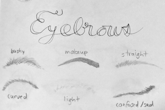
Finish shading the hair. Also *facepalm* I almost forgot the eyebrows. XD Oh well, you can add those sooner or later, it doesn’t really matter. But you should add them or the face will look kind of weird and blank. Eyebrows are simple: just draw a bunch or really short, slightly curved lines. Or you can draw just a single curved line for an even simpler, less realistic version.
Lastly, erase any grid lines and smudges, add shading around the face and under the neck if you want to (you don’t have to), and you’re done! Ta-da!
To tell the truth, this isn’t my best portrait. The face is too round, the eyes are too big… but that’s alright. This is what you have to do – if it doesn’t turn out good the first time, do it a second… and a third, and a fourth. 🙂
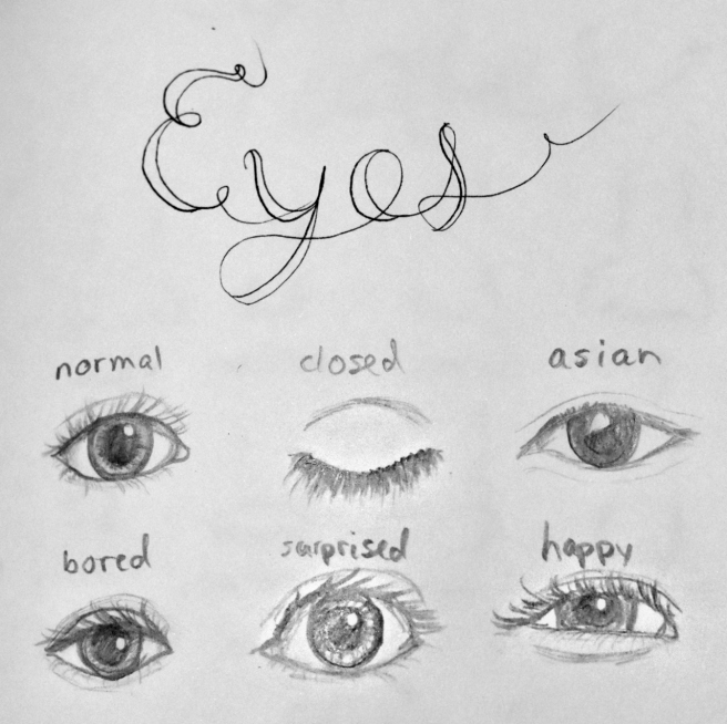
Now since you know how to put everything together, here are some ways to change up the facial features. It’s so fun to try different combinations!
Here’s another Art Lab post I did on how to draw eyes: Episode 23.
Have fun mixing and matching! Also before you go, I wanted to show you a colored pencil face drawing I did off of different pictures. You can tell I do a lot better when I look off of something. XD
Which little cutie is your favorite?
Well, I hope you found this tutorial helpful! Would you like me to do another face tutorial, like maybe how to do colored pencil portraits or profile portraits or an easier or harder version? What do you want to learn how to draw? Maybe I can do the next Art Lab from one of your suggestions!