Art Lab, Episode 26

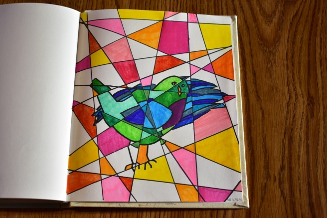
Yay, I’m so excited to show you this art today, guys! According to your requests, here is a tutorial for the technique I used to create the last envelope art in this post. It’s a super fun technique and the inspiration behind it is absolutely beautiful too. So let’s get started, shall we?

First of all, the…

Art Prompt:

I found this really amazing spray paint artist who has a YouTube channel called “Skech Art.” He is SO good! When I think of spray paint art I picture graffiti, but he makes actual paintings on canvases. Here’s the video:

Okay, so I could do without the unicorn (I think it kinda distracts from the gorgeous scenery), but isn’t it AMAZING?! There’s another equally amazing video here that you should really watch too. 🙂

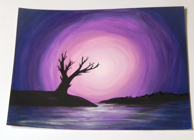
Alright, now for the tutorial. This technique is great for lots of things, like envelope art, ATCs, or just a painting on watercolor paper, but I think it would look especially nice on a canvas. (I used a piece of white cardboard, though, if you’re wondering.)

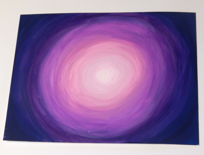
1. You’ll need a few different colors of acrylic paint that go together well, plus white and black. I used pink, a few different shades of purple, and a dark indigo.

Paint the outer ring with your darkest color. Don’t worry if it gets a little messy, like so. 😉

art 1 (1280x974)

2. Blend a ring of the next darkest color (like dark purple) into the outer ring you just made, overlapping the paint colors so they blend.

art 2 (1280x960)

3. Now just keep adding new rings of color, making a gradient from dark to light. Use white for the very center. Tip: Blending works a lot better if the paint is still wet, so try to do these rings all at once instead of letting them dry between circles.

Ahh, it’s looking so pretty, isn’t it?

art 3 (1280x973)

4. Add some long black blobs for islands to the bottom third of the picture, like so.

art 4 (1280x960)

5. The islands kinda look like they’re floating, so we need to anchor them. Use your ugliest brush with coarse or frazzled bristles to paint some white streaks under the islands and create the illusion of water. Tip: Don’t use much paint and make sure your brush is nice and dry to create perfectly imperfect streaks.

art 5 (1280x979)

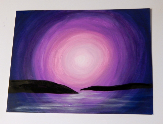
6.  The islands still need shadows to cement them into the picture. Paint some black streaks right under the islands to make their dark reflections. (Wow, that sounds scary. XD )

art 6 (1280x960)

7. This is probably the hardest part: painting the tree. If you’re good at drawing trees, go right ahead and start painting, but if you’re not the best, like me, it might help to practice a few on a scrap piece of paper. My tree didn’t turn out quite as good as I had hoped, but you know what – that’s okay! You can always make a new and improved picture next time. 🙂 It also helps to look at some pictures of trees for inspiration.

Tip: I’ve found that it makes the branches look more realistic if they’re wider where they join the main branch and then taper to a point.

I also made a bumpy line for trees on the second island. 🙂

art 7 (1280x929)

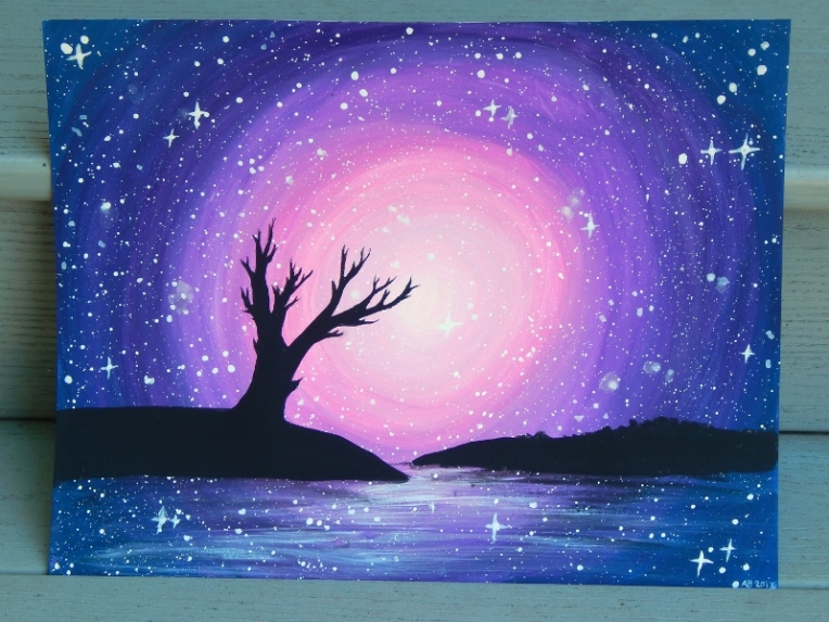
8. The stars are the finishing touch. Use your coarse paintbrush to splatter white paint all over your picture. Actually I should have done this part before I painted the islands, but I just painted over the black silhouettes and it turned out fine. 😉

Tip: It’s easier to splatter the white paint if you thin it with just a bit of water. Then tap the paintbrush handle on your finger to flick paint across the paper. If I do this again I think I’ll make slightly fewer stars because it can get overwhelming.

I also like to make a some twinkling stars by painting small crosses over a few of the dots.

art 9 (1280x960)

Ta-daa! And there you have a beautiful galaxy-moonset-silhouette-ish picture. 😀

galaxy silhouette 1 (800x600).jpg

I hope you enjoyed this tutorial, my friends! Do you think you’ll give it a try? If you do, I’d love to see your artwork! Click here to see how to submit in your artwork to the Art Lab blog and help us fill our gallery.

Thanks for reading, dears!

***Allison***

Envelope Art

I absolutely adore writing letters to my amazing pen(cil) pal, Charis, and also decorating envelopes to put them in. Today I decided to do a round-up of the envelopes I’ve decorated so far. I hope you enjoy! Also, you should really check out the lovely assortment of decorated envelopes and art Charis has made here! 🙂

envelope (8) (1280x901)

I think this is my first envelope. It’s okay, but thankfully they have improved since then. XD

envelope (7) (1280x960)

Aww, this is one of my favorites! It’s simple, but so cute.

envelope (1) (1280x940)

Sorry, I didn’t mean to startle you there! XD My family wondered what the mail lady thought when she saw this. 😛 It’s not my best eye ever, but it was quite fun to draw, especially the iris. I drew this because Charis has blue eyes, and I love drawing eyes!

envelope (2) (1280x853)

As you can tell, this was from Christmas. 😉

envelope (4) (1280x854)

The light blue marker stopped working on the sky, but the faded effect turned out kinda neat.

envelope (5) (1280x840)

A galaxy envelope from when I first learned how to draw galaxies. 🙂

envelope (6) (1280x960)

Eh. This one’s okay but the lines from the other side of the envelope kind of mess it up. (The weird splotches on the leaves are to cover up addresses.)

envelope (3) (1280x1093)

And last but not least, my most recent and possibly my favorite! I love how this turned out, with the colors and everything! Would anyone like an Art Lab post about the inspiration behind this and a tutorial on how to make it?

Well I hope you enjoyed that, dear readers. Which envelope was your favorite? Do you like decorating envelopes?

Thanks for reading!

***Allison***

The Art Lab, Episode 25: Art Inspiration

Heh heh, so some of you are probably like, “What?! She just published this post!” Well yeah, I did… but I didn’t mean to. XD I accidentally hit the publish button before I finished. Oops. 😛 Now that I have explained all that, let’s get on with the real stuff. 🙂

Guys, guys, guys, look! It’s the 25th Art Lab post! WOOP WOOP! And today I’m doing something a little different, to celebrate. Okay, not really to celebrate – it’s mostly because I wanted to, but we can say it’s to celebrate, right? 😛 Ahem. As I was saying before I so rudely interrupted myself, today I’m just going to post some pictures of some of my recent art rather than using someone else’s art as inspiration. I’m always inspired when I look through bloggers’ art posts, so I hope this post inspires you to sit down and start drawing! 😀

First up I have a few ATCs. (If you don’t know what Arist Trading Cards are, I highly recommend you click here to find out! They’re so much fun!) Some of these are recent and some are not so recent.

YAY doughnuts! Yummy. I really like this one. 🙂

art (21) (1280x853)

I did these watercolor cherries from a tutorial on Pinterest (which you can see here). They turned out great – if you don’t look at the cherries on the tutorial, that is. XD

art (22) (1280x853)

I love this quote/verse thingy, and have a canvas with these words on my bed.

art (23) (1280x853)

We learned about geraniums in Nature Study, so I decided to draw one on an ATC.

art (24) (1280x853)

I made this ATC ages ago, but I still love it. 🙂

art (25) (1280x853)

This is the first page (besides the title page) in my new sketchbook. Eh, could be better, but it least it’s welcoming. XD

art (15) (1280x853)

It’s a rainbow lion! It didn’t turn out quite like I had hoped, but I still like it.

art (11) (1280x853)

I liked drawing the lion’s eyes so much that I did another one on a separate page.

art (12) (1280x853)

Ahhhh, I love this one! I wish our roosters looked this pretty. 😛 I actually just finished this today with my new Prismacolor colored pencil set. It took me several days to draw this, but I’m very pleased with how it turned out! (And in case you’re wondering, I did look off of a photo.)

art (16) (1280x853)

This is another of my absolute favorites! On my birthday I decided I wanted to draw a fox. I had a picture in my mind, and what do you know – I got it down on paper and it actually looked good! XD I didn’t copy anything but I did look off of some photos and drawings for reference. She’s such a cute wittle thing, don’t you agree?

art (17) (1280x853)

I drew this for my horse-loving friends, and for those of you who requested a horse drawing. Here you go, girls!

art (18) (1280x853)

Here’s another ATC which I drew a long time ago. I think it’s so funny but neat. XD

art (19) (1280x853)

Another mandala ATC…

art (20) (1280x853)

I drew this for art class because my art teacher wanted me to experiment with an art medium I’d never used before. I was like, “Um… I can’t really think of any art supplies that I have at home but have never used.” XD Finally we came up with artist’s pastels! It was fun to experiment, but I don’t especially like how easily they smudge.

art (5) (1280x853)
My little sister thinks this picture is so weird. XD


art (4) (1280x853)
And this one too. 😛 Well they’re kind of SUPPOSED to be weird, so…


art (6) (1280x853)

I haven’t finished this one yet and probably won’t for a long time, but I wanted to show you guys how it looks so far. I had the idea to make a collage of barcodes, and I think it’s looking really neat! I’m only using the ones off of receipts, so it’s going to take a while to collect enough to cover the whole page. Heh heh.

art (7) (1280x853)

A random Sharpie doodle…

art (8) (1280x853)

I love how this one turned out. I’m kind of proud that I could get the highlights to look fairly realistic because I usually have trouble with them. 😛

art (10) (1280x853)
Just in case you were wondering, my little sister LOVES this one. XD

We were playing around with charcoal in Art Class, and this is what my practice page turned out like:

art (2) (1280x853)


Here’s my actual drawing made with charcoal:

art (3) (1280x853)

And last but not least, one of my very favorite favorites, a picture I drew of Bethany from a photo Loren’s gorgeous post. I just LOVE how it turned out! The background was inspired by a super good teenage artist named Sydney Nielsen that I follow on Instagram. She also has a YouTube channel here. You should check it out – she’s really amazing!

art (13) (1280x853)

Are you inspired yet? XD I hope so! Which was your favorite piece of art from this post?

Also, I wondered if you have any drawing requests for me! I’m not guaranteeing I’ll draw whatever you ask, but I’d sure love to hear your suggestions and I’ll definitely try some of them!

Thanks for reading, dears, and have a lovely day (or night). ♥

***Allison***

The Art Lab, Episode 24: Watercolor Mountains

Oh my, I think it’s past time for an Art Lab post, don’t you? Today I want to show you a beautiful piece of art and some art I made inspired by it. Here’s the prompt:

Art Prompt:

Blue Ridge Mountains Watercolor Print / Nature от RainStain:

{via}

Ohhhh isn’t it gorgeous? I love it! And in case you don’t have mountains near you to look off of (you poor things XD ), I’ll give you a picture that I took of the real thing. (If you’re curious, it’s from this post.)

Photo Prompt:

sunset 3 (1280x960)
I love this. ♥


 Now are you ready to break out the watercolors? Here’s how I made my mountainscape…

Step 1:

mountain 1 (1280x853)

(The proper way would probably be to start with the background, but I started with the mountains because I didn’t know quite how far back they would go. 🙂 )

Use a really deep blue for the foreground mountains. Paint an irregular, medium-wet line of dark watercolor and draw it downwards, lightening it with more water as you go. (Okay that sounded really complicated, but basically just play around with it until you get dark at the top and light at the bottom. XD )

Step 2:

mountain 2 (1280x853)

Use a different, lighter blue for the mountain ridge behind it, and do the same thing. Keep going until the mountains fade away to barely visible. I also decided to add a few more ridges in the foreground, like so:

mountain 3 (1280x853)

Step 3:

mountain 4 (1280x853)

Next you can work on the hills. Use a few different greens, and gradient your color from dark at the top to light at the bottom like you did with the mountains. Looking great!

Step 4:

mountain 5 (1280x853)

Now for the sky. Again, start with a dark blue at the top and fade it downwards (are you starting to see a theme here? XD ). I dabbed off some of the paint with a paper towel to make puffy clouds.

And you’re done! So pretty! 🙂

mountain 7 (800x800)

I also made an ATC kind of like my painting but without the hills.

mountain 8 (1280x853)

So, do you like this idea? Which was your favorite, the main painting or the ATC? Do you have mountains where you live?

To see more art inspiration like this, check out the official Art Lab blog right here. If you made a piece of art inspired by this post, we’d love to see it! Click here to see how to enter your artwork into our Art Lab gallery.

Thanks for reading, my friends!

***Allison***

More Art :)

Halloo, my friends! I’ve been drawing a lot lately, so I decided to show you what I’ve been working on…

Like a random watercolor flower. XD

DSC_1417 (1280x853)

I’m kinda proud of this quote because it took me like ten tries to get the lettering right. XD Well actually it isn’t really a quote because I made it up, but you know… 😛

DSC_1421 (1280x853)

Hee hee! Isn’t this one funny? I made it for an Art Class assignment – art inspired by your favorite smell.

DSC_1424 (1280x853)

A not too interesting but pretty landscape…

DSC_1426 (1280x853)

Ugh, the sun was a bit harsh so there are way too many shadows on this picture, but oh well. This is a mixed media piece with tissues for the curtains and rug ( XD ), piano book pages for the sun rays, scrapbook paper for the bedcovers, and duct tape for the window. The rest is just drawing or watercolor.

DSC_1433 (1280x853)

Another art assignment. 🙂 (Actually a lot of these are art assignments.) We were supposed to do Pop Art, so I did a gummy bear because we were eating them in class anyway. XD

DSC_1435 (1280x853)

Random birds on a wire. 🙂

DSC_1439 (1280x853)

Ooh, this is one of my favorites! I really like how the pattern turned out 3-D-ish.

DSC_1442 (1280x853)

For some reason I felt like drawing mountains…

DSC_1443 (1280x853)

And more mountains…

DSC_1445 (1280x853)

I don’t really know why I drew this… XD

DSC_1450 (1280x853)

This was a “Forced Perspective” piece for art class.

DSC_1455 (1280x853)
Excuse my fingers. 😛

Weird cubism bird…

DSC_1456 (1280x853)


I decided to include this even though I already posted about here for Art Lab. 😉 I think this is one of my favorite pieces of art I’ve ever done!

DSC_1459 (1280x853)

Yikes, this is a terrible picture! Oh well, you get the point. I did a mixed media quote/hymn thingy. 🙂 I used tissue paper, book pages, buttons, paint, and even paper clips and corn kernels to make the flowers and leaves! XD

DSC_1474 (1280x1259)

I felt like drawing a girl. Not much other explanation. XD

DSC_1460 (1280x960)

This is another of my very favorites! I really like the Zentangle/doodle type of art.

DSC_1461 (853x1280)

It’s kind of hard to take a picture of the whole thing, so here’s just the head so you can see it a bit better. 🙂

DSC_1463 (1280x853)
One reason why I like this so much is because it took FOREVER to make. XD Especially the mane – I made a herringbone pattern with a super fine-tip pen. It was fun, but quite time consuming. XD

Which do you see first, a face or two trees and a moon?

DSC_1472 (1280x853)

I got inspiration from Pinterest for this one (and for some of these other art pieces too). I like how it turned out!

DSC_1449 (1280x853)

That was fun. 🙂 As you can see, I rather like art! Do you? Which of those pictures was your favorite? What is your favorite art medium to use?

***Allison***