Drawings and Such + Why It’s Okay to Make Bad Art

YAY, I am so excited to share some of my recent art with you guys! I’ve been drawing a lot lately, and I think I’ve really been improving, so that’s good. 😉

Also, before we start I wanted to mention this super good video (which I’ll show you in a moment) by Hullo Alice that talks about why it’s okay if not every piece of art turns out perfect. I thought it was such a good message!

Sometimes when people try to make art and it doesn’t end up looking like the idea in their head or they search the web and find soooo many better artists out there, they just give up, and think, “I’ll never be good at art, so what’s the use of trying?” The use of trying is that you WILL get good at art if you give yourself a chance. You might not ever get as good as the professional art you love looking at on Pinterest, but you’ll certainly be a terrible artist if you never try.

Listen, before you make some good art, you’re going to make (a lot of) bad art. That’s just how it works with anything – art, music, math, anything you try to learn. And that’s okay. Making bad art is part of the process of getting to be a good artist. If the piece you’re working on is terrible, just let it go, turn the page, and start again. You’ll get better if you keep trying over and over again, I can promise you that.

Okay, now that that little rant was over and you (hopefully) watched the video, I can show you my art. 🙂 I decided to include some of my “bad art” (although not my worst XD) in this post too.

Let’s get started!

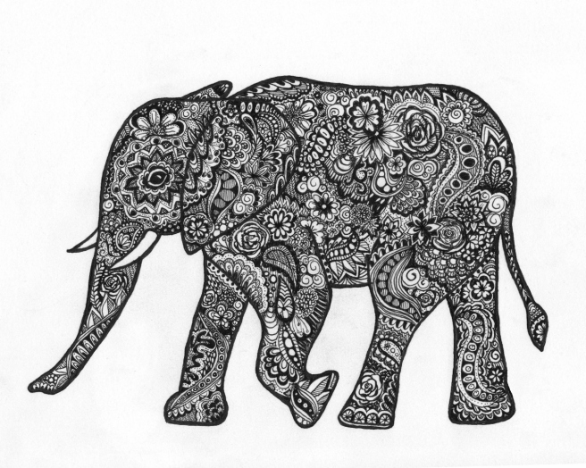
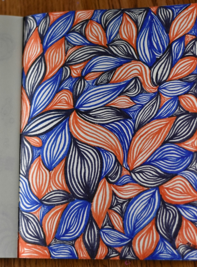
I shall start with some of my favorite art I’ve created – a zentangle elephant. 🙂 It took me FOREVER to draw this, as you can probably guess. XD I had just purchased a new fine-tip pen at Hobby Lobby, and it was great for detailed work like this!

elephant art (1280x1024)

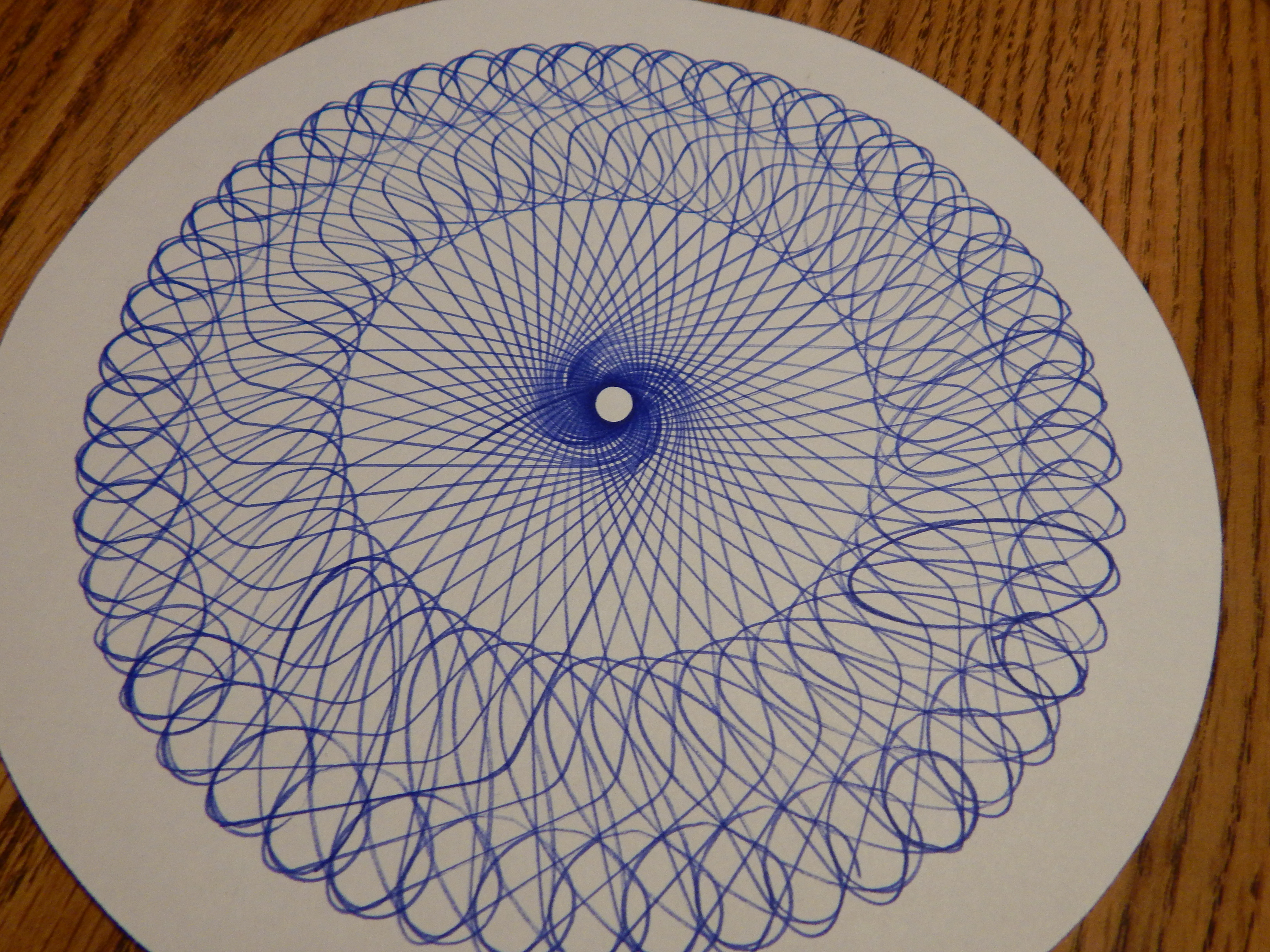
I also made a mandala in a similar style. I think it turned out so pretty! It’s probably the best mandala I’ve done, because usually they get pretty skewed. XDmandala art

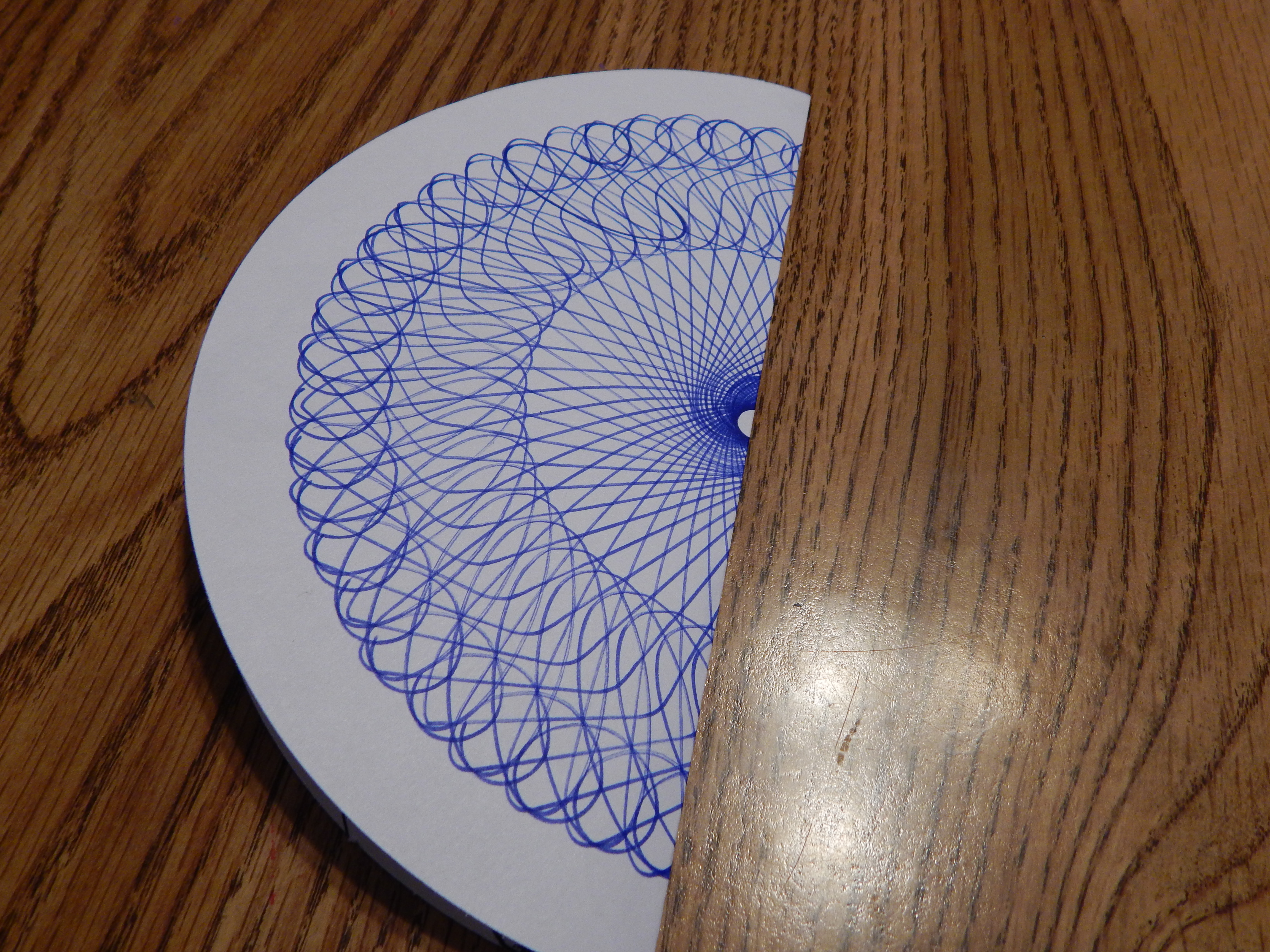
Another mandala.. YIKES sorry for the terrible picture. O.o

art 3

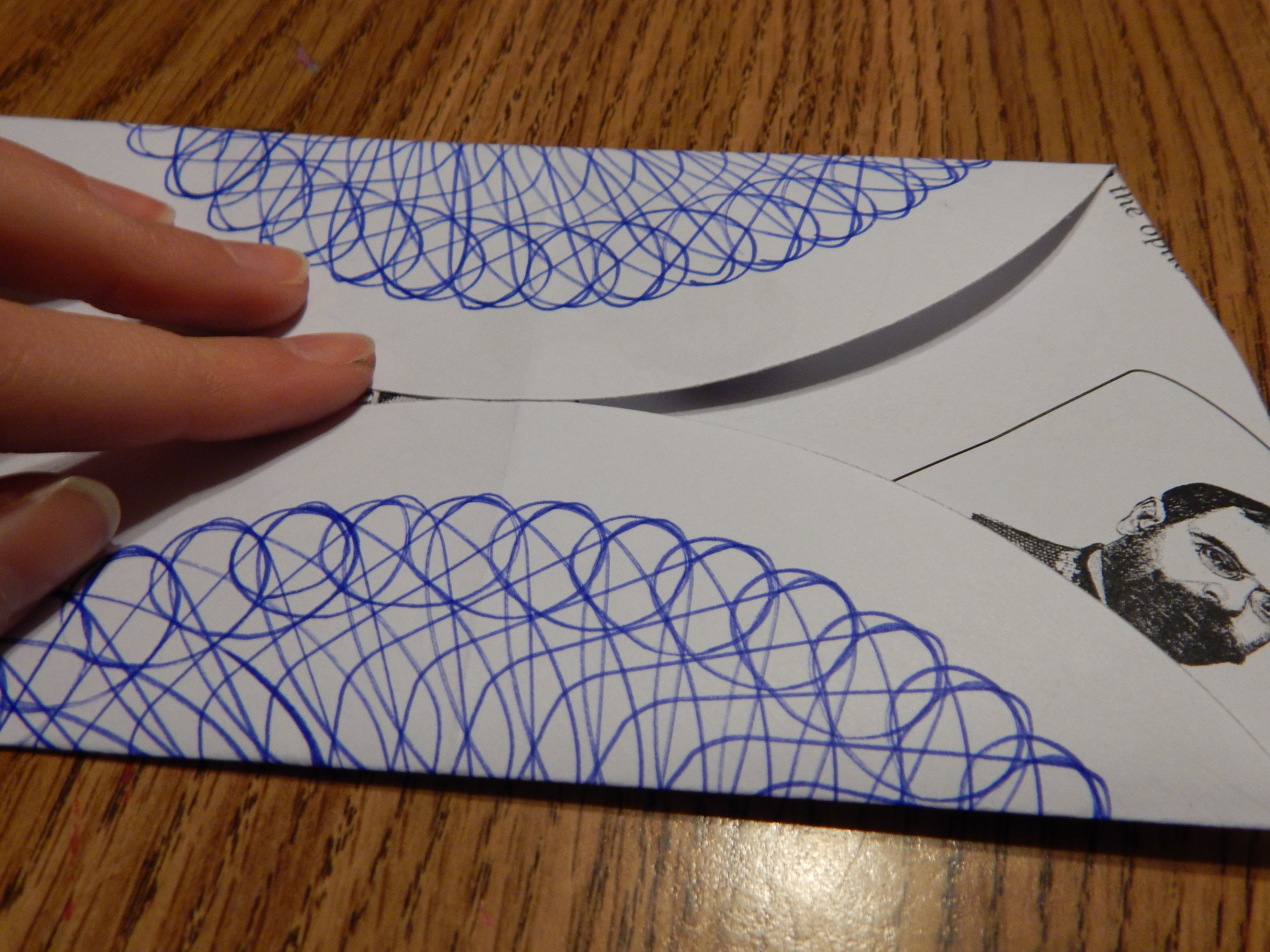
Next up we have a little design I made for Livy’s magazine here (which you should totally check out!)

encourage (700x525)

I’m also submitting this for the next issue of her magazine. 🙂 I had a lot of fun with this one!

art 12 (1280x706)

I’m not really sure what I think of the next piece… I guess it’s neat, but it didn’t really turn out like I was hoping. :/ Oh well! Waterfalls are really hard to draw, aren’t they?

art 5 (1280x854)

OOH! I love this drawing I did of the lovely Aria from purrfectlyinspired.com. It’s the best portrait I’ve done, I think!

drawing (1280x1040)drawing 2 (1280x1040)

Okay, here’s something I drew from you guys’ suggestions: a fairy. In the spirit of the post, I shall show you the two horrible renditions it took before I got it to turn out right. XD (I used them for testing pens and stuff, in case you were wondering. 😉 )

Actually the first sketch isn’t that bad… just, well, a sketch.

DSC_1880 (853x1280)

AHH SO CREEPY. Her face got smudged and made it look even more awful. XD

DSC_1882 (853x1280)

But finally that bad art enabled me to draw a good piece. Muuuuch better, yes? I hope you like the fairy, Sylvia!

art 4

So for this one I was trying to draw something interesting without using any reference photos. Well I sure paid for that with how her legs turned out. XD YUCK. I could NOT get the foreshortening and angle and all that stuff right, so I just called it good enough and finished the picture. 😛 I like the rest of it, though!

art 1 (799x1084)

Some little water drop doodles from this amazing tutorial. You might think these are good until you see what I was looking off of. XD

art 6 (853x1280)

Here’s a (pretty rough) concept sketch I did for a possible WordCrafters cover. What do you think? Do you like the idea of all the characters lined up like that? Also I need a better tagline. XD Tell me your ideas! I’ll also do a more in-depth post when I’m ready to start editing WordCrafters.

art 7 (999x1280)

Heh heh, do you like my play on words? Unfortunately the ink ran all over the place, but it’s okay because it wasn’t my best picture or anything. (It looks like the horse is shooting ink out of her nostrils. XD)

art 8 (985x1280)

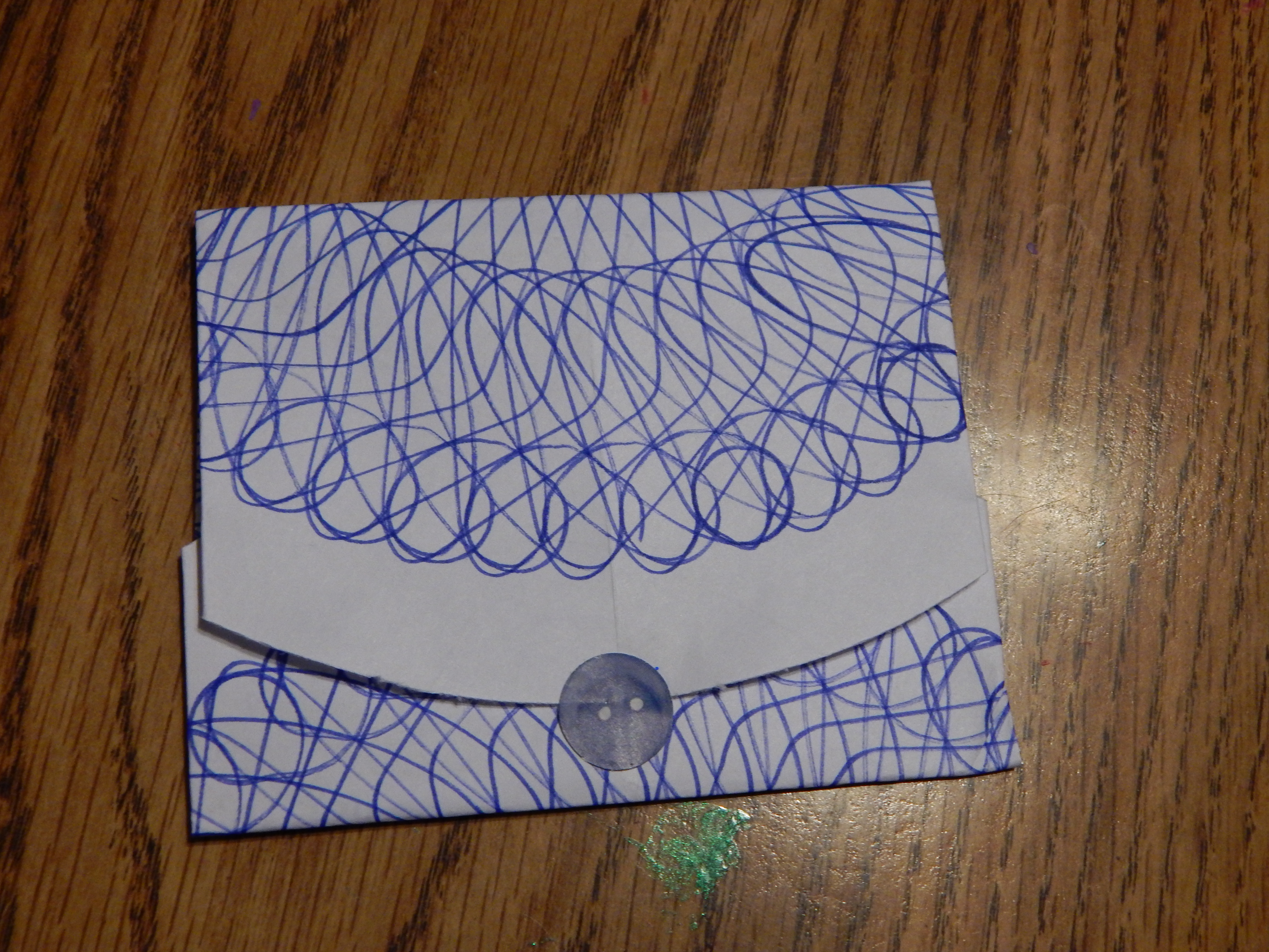
Ooh, this one is funny! I made this birthday card for my sister Megan who loves donkeys.

art 9 (847x1280)art 10 (1280x998)

DSC_1906 (853x1280)

Ha ha! Yeah, I had fun with that. Although it took quite a while to draw the donkeys inside the card. O.o

Next we have a page of doodles. I picked a couple of random colors from my watercolor brush pen set and drew this. WHY DO THINGS LIKE THIS ALWAYS TAKE SO LONG?!

art 11 (942x1280)

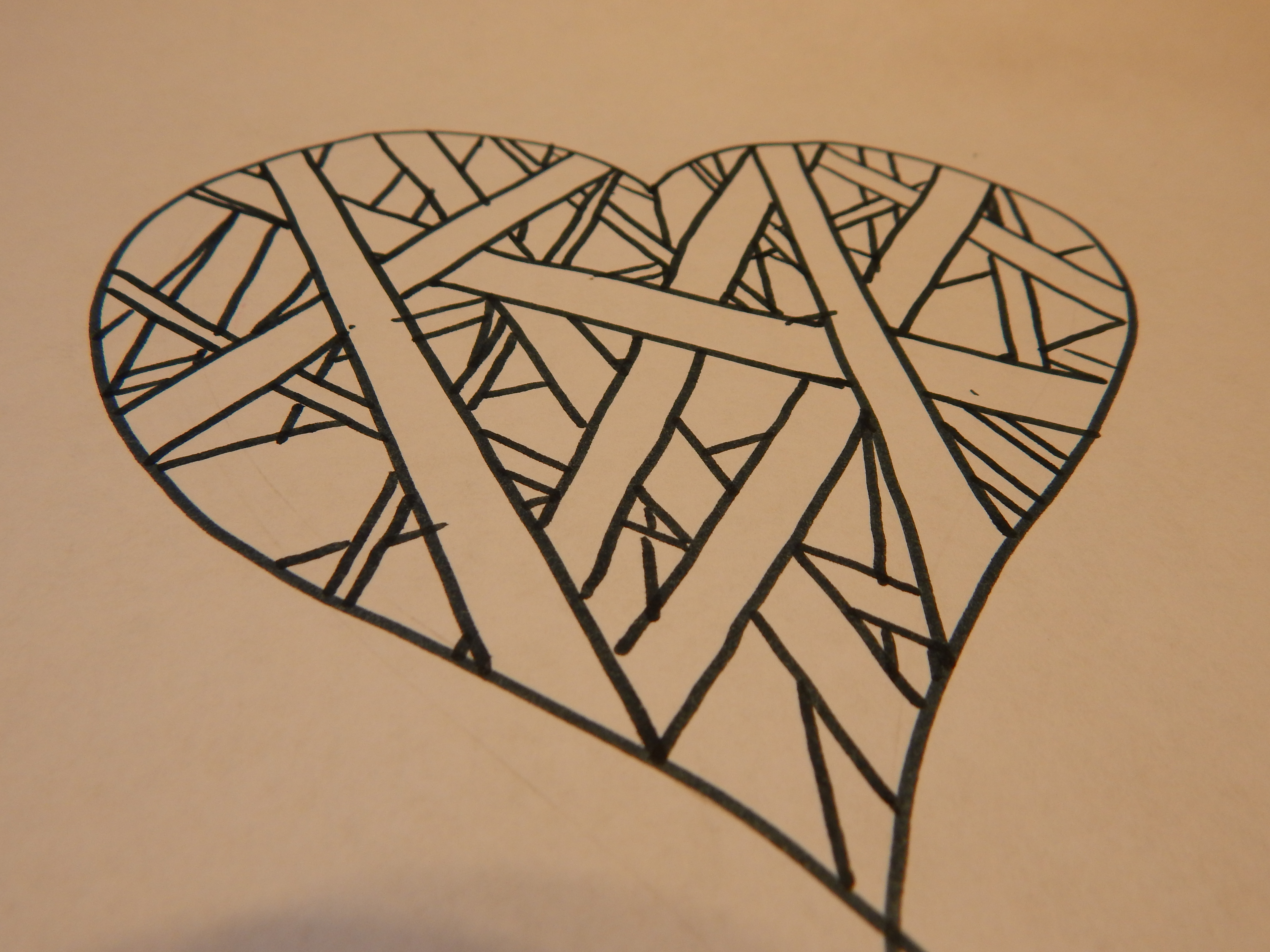
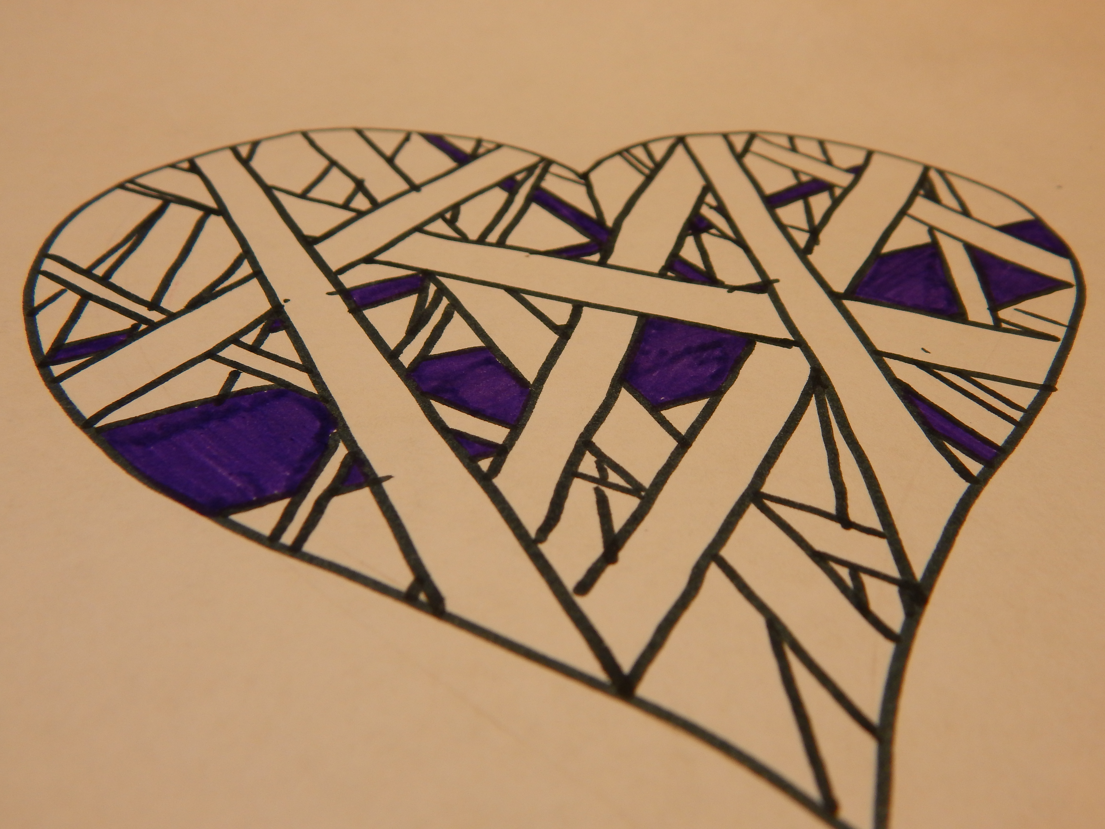
Here’s some bad-ish art. It got kind of all blurred together. :/

DSC_1891 (1280x853)

BWAHAHA this did NOT turn out right. Poor, failed pineapple. XD

DSC_1893 (853x1280)

Lookee it’s a cute wittle hedgehog from Clara’s suggestions! 🙂

DSC_1995 (1280x853)

Random watercolor doodle…

DSC_1997 (853x1280)

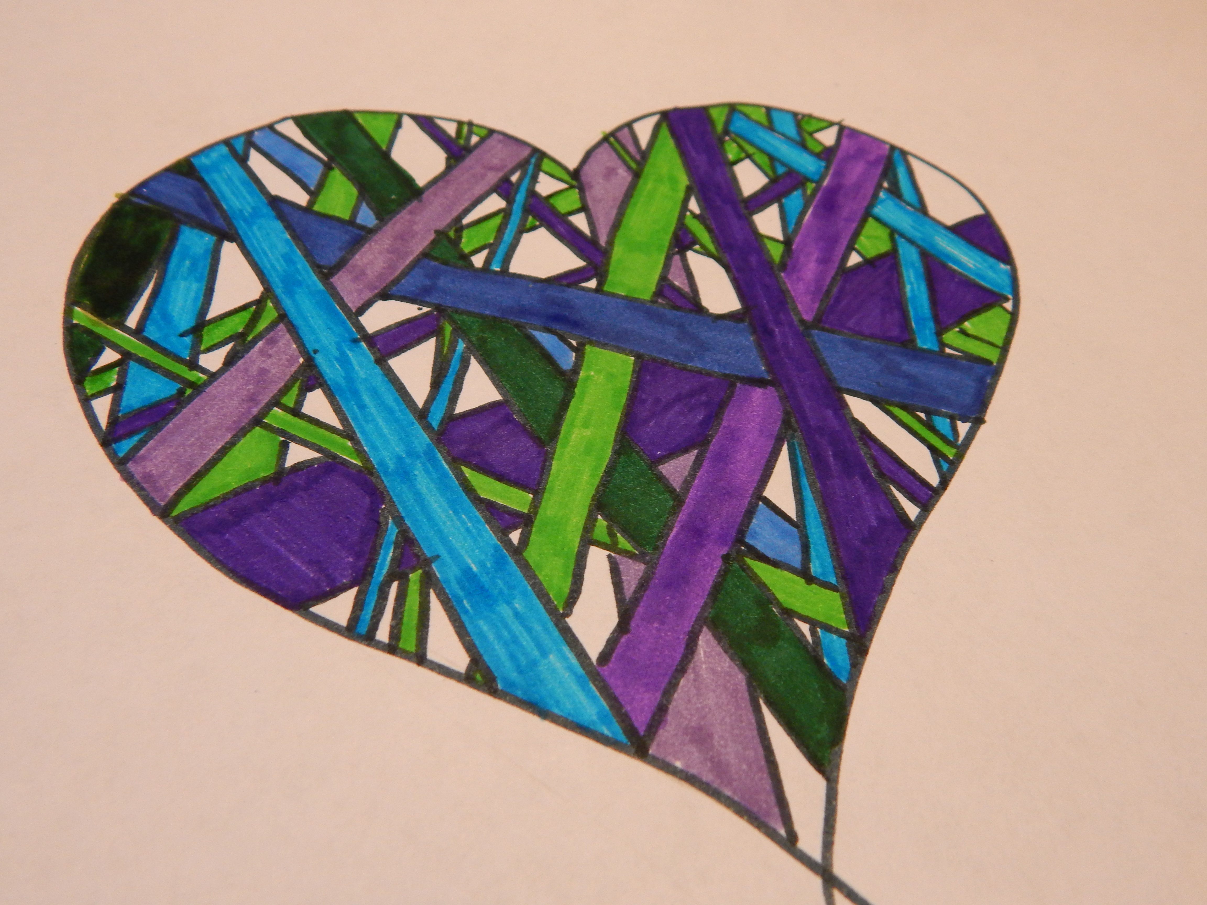
Blech, some more bad art. I very much dislike the color scheme – or lack of one.

DSC_1998 (853x1280)

I’m really happy with this one, though! I thought it turned out pretty cute. 🙂 My watercolor brush pens are so fun for drawings like this.

DSC_1999 (853x1280)

A doodle/test page.

DSC_2000 (853x1280)

I haven’t finished this one and don’t know if I will or not, but this was drawn from a photograph of dew drops on a flower.

DSC_2003 (1280x853)

I really like how this turned out! My best horse picture so far, definitely. It’s a picture of my friend K. A.‘s horse, Gadget.

art 10

few more pages from my Bible journal… (would you like to see another whole post about it?)

bible journal 2 (1280x1177)Bible journal 3 (1193x1280)Bible journal 4 (1280x1203)Bible journal 5 (1272x1280)

Here are the ATCs I made for Hayley’s ATC trade (now closed).

ATC 1 (1135x1280)

ATC 2 (1280x903)

ATC 3 (1280x943)

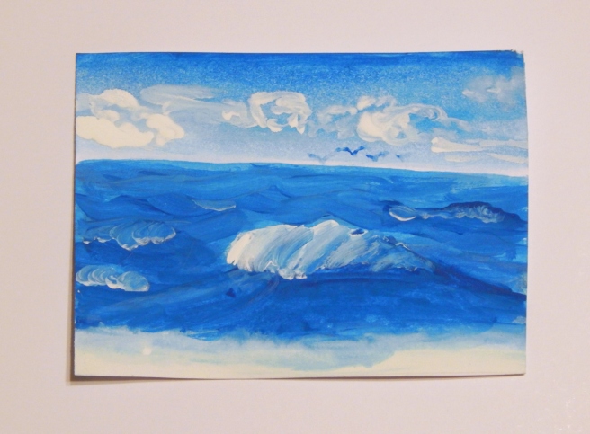
And lastly, we have another rendition of the moonrise galaxy painting I did here.

moonrise galaxy (1280x948)

And that’s about it! As for the bad art, some of you are probably rolling your eyes and saying, “Allison, seriously? You call that bad art?” Well I’ve done worse art – believe me. I just didn’t show it. XD Anyway, I know the feeling. I see “bad art” from other artists and I’m like “WHOA I wish I could draw that well!” And so you see, it depends on your perspective. Your bad art might be more beautiful than you think. ♥

I hope you enjoyed this post! Which pieces were you favorite? Do you have any suggestions for what I should draw next?

***Allison***

P. S. My county fair post is coming up next! 🙂

Advertisement

Art Lab, Episode #2: Dewdrops

I’m back with another episode of ArtLab!

If you recall, Hayley and I just recently started a collab series called Art Lab, where we post art inspiration and our art. (Read our first post here.) It’s my turn to post today, so I present… Episode 2: Dewdrops!

_____________________________________________________________

I have both a word prompt and a photo prompt for today’s inspiration. Bonus point! XD

Prompts:

The word prompt is *drum roll please* dewdrops! I love dewdrops!

The photo prompt is a picture I took recently of grass bedecked with dew drops. Ahh…. 😀 (See more dew pictures in this post.)

-Allison(arboretum) 007.JPG

Art:

This card I made looks sort of like the photo prompt, only I didn’t see the words “Happy Birthday” floating in the grass photo. XD

009 (1280x960)

010 (1280x960)

004 (1280x960)005 (1280x960) (2)

Here are a few tips for making the card:

  • Hang a dewdrop from any curved part of a letter, and if you really want to sprinkled them on, add some to a horizontal line as well (like on the cross of the “H”).
  • Once you’ve colored the grass with different green colored pencils, you may need to trace over some of the grass blades again with a pencil to sharpen their outlines.
  • To make the grass in the front look closer to you, make the dewdrops sharper and darker, and make the ones hanging from the back grass more faded.

________________

I also drew this snail-on-a-leaf ATC which uses the word prompt.

047

A few tips for drawing this:

  • I drew this using different “levels” of pencils. I used a 5B pencil for some of the darker parts, like the shading of the dewdrops and the leaf stem. The higher up you go in B pencils, the softer and darker they will draw, and the higher up you go in H pencils, the harder and lighter they will draw. (For instance, a 6B pencil has a really soft lead that draws a fuzzy, dark line. A 9H pencil has a really hard lead that draws a sharp, faint line. Normal pencils are usually somewhere in the middle of the two.)
  • Play around with the design inside of the snail’s shell.
  • You don’t have to do this in pencil! Try using markers, watercolors, or colored pencils.

Thanks for joining me! I hope you were inspired to go make some art!

_____________________________________________________

***Allison***

Spirograph Envelopes

I made these a long time ago but never posted about it, so here they are now! You know those Spirograph machines? You can’t do much with the finished spirographs except hang them on the refrigerator, right? Wrong. You can use them (or any other circular piece of paper, really) to make a beautiful envelope to hold, say, a gift card. They are very simple to make.

First, take a finished spirograph…-Allison (Nov. snow, hidden pictures) 007… and fold it in half.-Allison (Nov. snow, hidden pictures) 008Open it up and fold the two sides to meet the center crease. (I used scrap paper; that’s why there’s a random picture of a man on the inside of the envelope. I recommend using plain paper. ☻)

-Allison (Nov. snow, hidden pictures) 009

Now fold one end of the of the spirograph a little less than halfway up.

-Allison (Nov. snow, hidden pictures) 010

Fold the other end down so it overlaps the bottom of the envelope, tuck your card or gift card inside, and seal with a sticker.

-Allison (Nov. snow, hidden pictures) 013

-Allison (Nov. snow, hidden pictures) 014

Ta-daaa! Here are the backs of two finished envelopes.

-Allison (Nov. snow, hidden pictures) 016***Allison***

Tutorial: Personalized Name Photo Card

Today I will show you how to make a name-letter-photography-accordion-card-thingy.  Umm, let’s try that again.  Today I will show you how to make a personalized name photo card.  Much better.  See, it’s this neat card that you accordion-fold, then paste pictures of letters onto it so… *sigh* this isn’t going too well.  I guess I’ll have to show you a picture.

-Allison(name picture card, game) 006

Ahh, there we go.  That is what we’ll be making today.  If you want to make another name or word besides “Grandaddy,” you may have to fold and assemble more or accordion folds, depending on the number of letters in the word.  As you can see, “grandaddy” has nine letters (I know right, I can count all the way up to nine!) so I needed nine blank rectangular sections of paper – one for each letter.

Let’s get started!

You will need:

Paper – if you have any long, stiff paper like brown craft paper or thick wrapping paper, you could use that, but I will show you how to make this out of just plain cardstock.

• A camera

• A printer (or some method of getting your photos on paper)

Scissors or a papercutter

Tape or a glue stick

Colored pencils, markers, etc. if you want to decorate or write on the front of the card

Now then, here’s how to make it.

  1. Take pictures of things that look like letters.  I found my “n” on an inside wall of a barn, the “a” from the lower half of a pair of vicegrips, and the “g” from a bungee cord.  For some of the letters I used a beach towel for the background.  (Please don’t use my actual pictures, but I certainly don’t mind if you use them for inspiration.  If you have any questions, feel free to ask me in the comments.)
  2. Turn the pictures black and white. Black and white or sepia tones just make the pictures more uniform, and lets you focus on the letter instead of the background.  I turned mine black and white on my camera, but you can use a photo editing program if you want.
  3. Print and cut out your pictures.  I pasted my pictures onto a Microsoft Word document.  Then for each picture I right clicked on the photo, clicked “size and position” on the pop-up, changed the height to 2 inches, and pressed enter.  And hopefully you already know how to cut out pictures.-Allison(name picture card, game) 001
  4. Prepare your card.  For this step I cut a sheet of cardstock into 3 equal pieces, and accordion folded each piece into 3 equal sections, with a little extra tab on the end.-Allison(name picture card, game) 002
  5. Assemble your card.  Put tape on the little tab at the end of two of the accordion folded sections, and cut the tab off of the last one.  Use the taped tabs to connect all of the folded sections into one long piece.  Now tape or glue the letter pictures onto each blank rectangle on one side of the paper strip.
  6. Decorate your card.  Using whatever materials you wish, decorate the other side of the card.  The front of the card, the part that you see when you fold it up, will be on the back of the first letter (in my case on the back of the “g”).-Allison(name picture card, game) 005
  7. Put on the finishing touches!  Fold the card so the message is the first thing you see (like in the picture above), with all the letters following in order when you open it up.  And you’re done!

-Allison(name picture card, game) 007 -Allison(name picture card, game) 006

This is a great gift for anyone, and you could even do the words of a bible verse, random words like “family,” “I love my cat Snuffles,” whatever!  It would also be neat to take pictures for all the letters in the alphabet (which would be super hard) and leave the letter that begins your name colored instead of black and white.  Have fun with this!

***Allison***

Doodle Fun: Heartstrings

-Allison(Heart doodle) 016

I like this technique of doodling.  I’m sure other people have already thought of it, but I found it out myself one day and liked it.  I decided to show you how to doodle it so you could have fun with it too.  Here we go!

First, make any shape you like (it doesn’t have to be a heart).

-Allison(Heart doodle) 010

Next, start drawing columns within the borders of your shape.

-Allison(Heart doodle) 011  Don’t draw the columns over top of each other, just let the go under each other.

-Allison(Heart doodle) 012

It looks neat to make the columns different sizes too.

-Allison(Heart doodle) 013

Now for the coloring part! (Yaay!)  I just chose three main colors, but you can choose more if you like – try it with rainbow colors! You can also use different shades of each color, especially if you don’t have very many colors.

-Allison(Heart doodle) 014-Allison(Heart doodle) 015

I left the background behind the columns white so the columns would stand out a little more.

Ta-daa!  Can you tell why I called it “heartstrings”?

-Allison(Heart doodle) 016

There you go! Have fun with it, customize it, change it how you like.  This technique would be good for cards, bookmarks, etc.

Hope you enjoy!

***Allison***