Recent Art {+ GIVEAWAY!}

Hello, dears!

I haven’t done a recent art post OR a giveaway for rather a while – I think it’s high time for both. 🙂 Today I’m going to show you guys some sketches, paintings, and LOTS of envelope art, and if you stick around to the end, there will be a fun little pen-pal/artsy giveaway which I’m so excited about! Continue reading

Advertisement

The Art Lab, Episode 49: Popsicles Forever

Hello, dears!

Welcome back to another episode of The Art Lab! It’s a bit late because I kind of got the posting schedule confused but ANYWAY, here we go! Today I’m going to show you how to draw cute, summery popsicles inspired by some popsicle stamps Megan bought at the post office the other day. (They’re forever stamps – thus the strange post title. 😛 ) Here’s our art inspiration for this post:

{via}

And here’s what you’ll need to re-create it:

  • Some sort of paper to draw on (I used an ATC)
  • watercolor crayons (you can also use watercolor colored pencils or just plain watercolors)
  • a pencil
  • brown colored pencil (optional)
  • a normal or white gel pen (optional)

Ahem. We are now ready to start the tutorial.

  1. Sketch out three popsicle shapes + corresponding popsicle sticks on your paper. The shape is up to you, but I like making ones with a flat base that taper slightly up to a rounded oval or square top. If you want, draw a bite taken out of one of them. popsicles forever (2)
  2. Sketch in some details on your popsicles. There are SO many options for this, so have fun and be creative! I mainly did varying degrees and sizes of squiggles to separate the different colors (I mean flavors) later.popsicles forever (3)
  3. I penciled in the popsicles darker than they should have been so you guys could see them. If your sketch is like mine, erase it for the most part until it’s barely visible. You don’t want to see pencil lines under the paint later on. Next, choose a limited color scheme of colors that go well together and won’t make brown if they get mixed. I chose a summery palette of warm colors + white.popsicles forever (4)
  4. Loosely color in your sketches with your crayons (or whatever you’re using). Cover the space, but don’t worry about getting it perfect. For the middle popsicle, I got an ombre effect by blending gradually less and less coral with more and more white.popsicles forever (5)
  5. Now the fun part: add water and watch the magic! If you want to blend colors, I suggest starting with the lighter colors and blending into the darker. If you do the opposite, the lighter color might disappear under the more dominant darker one.popsicles forever (6)
  6. Draw two parallel lines in the center of the popsicle, about the same distance apart as the popsicle stick is wide. (This is the bump where the popsicle stick is inside the ice.) Use a darker color (I used red), and blend it out with water to soften the shadows.popsicles forever (7)
  7. Next we’ll add shadows to the popsicle sticks. When you’re drawing from a reference, it helps to think in terms of simple shapes. If you look at the stamps, the shadows on the sticks are basically brown triangles. So make brown triangles! You can also faintly outline the whole stick in brown. You can certainly use your watercolors for this part, but I used a brown colored pencil for more precision. popsicles forever (9)
  8. Finally, add some details with a white gel pen. I added squiggles to the first, shiny highlights to the second, and cute sprinkles to the third, but you can add whatever you want.popsicles forever (10)

Ta-daa! Step back and try to admire your work of art without eating it. It doesn’t taste as good as it looks, trust me.

popsicles forever 10

If you make art inspired by this post, we’d love to see it! Send us a picture at theartlabblog@gmail.com and we’ll add it to our gallery on The Art Lab website.

What do you think of this art idea? Did you get the new popsicle stamps? And what is your favorite popsicle flavor?

***Allison***

P. S. Made some art and now you’re bored? Well I have some good news: The Summer Bored Games have started! Check out Clara’s post here to start completing challenges! And thank you SO much to everyone who signed up – we now have over 40 participants!

The Art Lab, Episode 44: Gel Pen String Art

featured image 11

Hello, dears!

I absolutely LOVE the art we’re going to do today, but first of all… THANK YOU THANK YOU, GUYS, for all of the splendid birthday wishes. Whether it was a gift, a card, an email, or a comment, whatever it was – IT MADE MY DAY! MANY TIMES! You guys are SO SO SWEET and I am beyond blessed to call you my friends. ❤ (And yes, I am going to do a post about my gifts. 😉 But you’ll just have to wait for that, hee hee.) That thank you was way too short and small, but I’m guessing you want to see the rest of the post so I’ll stop now. BUT thank you one last time for making my birthday a wonderful day. 🙂 ❤ ❤

AHEM. Time for the art! I think this might be my favorite piece of art I’ve done for Art Lab, or at least one of my favorites! Here’s the stunning art inspiration for today:

I really like this pattern and how it’s growing and evolving while I’m drawing it. #doodle #doodling #drawing #teckning #pattern #mönster…

{via}

HOW NEAT IS THAT? :O After pondering for a while, I came up with the idea of making the design into a constellation-type doodle with a watercolor background. I think the finished result looks gorgeous! Ready to start? Alright!

1. Selecting a canvas depends on your supply of both patience and time. You’ll need both for this project. 😉 If you have a limited supply of the aforementioned, I would suggest making this an ATC. If you’re bored and want to spend a while just making art, use a sketchbook page.

If you like clean white borders as much as I do, put strips of washi tape around the edge of your paper.

art 1

2. Paint a graded wash of watercolor, starting with dark blue at the top and fading into purple and then pink at the bottom.

art 2

3. Using a white gel pen, make a diagonal band of densely clustered dots across the top of the page.

art 3

4. Fill the rest of the page with dots, spreading them further and further apart from each other as you move away from the first band of stars.

art 4

5. Now for the fun (but tedious) part! Connect the dots. You don’t have to connect every dot to every other, but that’s what I did. For maximum impact, you’re going for a bunch of triangles – if an area has more than three sides, you missed a dot. Don’t cross over any lines or it will get too muddled.

art 5

art 6

6. Once you near the right bottom corner, take a break and sketch in the outline of a tree on a hill. (I should have done this before I started the stars, but I didn’t. I recommend learning from my mistake. 😉 ) Make an elongated cloud shape on a trunk, and “cut out” a few holes in the leaves and branches for extra realism.

art 7

7. Mark the sketch with a bunch of dots to connect later. Don’t do them too close together, but the fewer dots you use, the more geometric your tree will be.

art 8

8. Connect the rest of the dots.

art 9

9. Now take a black brush pen or Sharpie and color in between the lines. 😉

art 11

10. Ta-daa! Now for the great reveal…

art 12

SOOOO PRETTY!

art 13

art 16art 14

art 15

I really love how this turned out, and I hope you guys do too! Do you think you’ll make this? If you do, I’d love to see it! Click here to see how to send it in and add it to our Art Lab gallery.

Thanks for reading, dears, and have a lovely day!

***Allison***

P. S. Not all the pictures are showing up on my computer, but I THINK that’s just the slow internet. Can you guys see everything alright?

Various Artsy Things

featured image 8

Hello, dears!

Since I haven’t made a recent art post in a long time, I have quite a bit to show you today, including the remaining pages of an old sketchbook and the beginnings of a new one, decorated envelopes, and hand lettered quotes. Enjoy browsing through the drawings! 🙂

First we have the few remaining pages of my old sketchbook. I made these doodly mushrooms with the Micron pens I got for Christmas (see my mini review here), which are so fun to draw with!

art 2

This was a concept for Art Lab which I decided not to use after all. I watercolored the background, folded it down and smoothed it to make a mirror image, and then added the details.

art 3

This is NOT my usual style, but maybe I don’t have a style – I love all kinds. 🙂

art 4

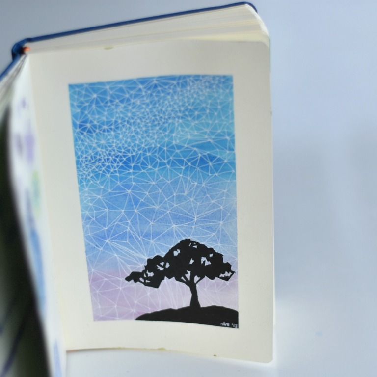
I draw mandalas a lot because they’re just so pretty and I love circles. 😀 This was ALSO a plan/sketch/concept for the next piece of art..

art 5

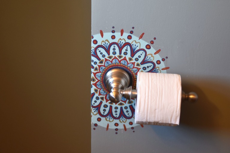
Hee hee, I’ve never done this before. The wall was rather rough and ugly behind the toilet paper holder, and since we didn’t have the wall paint color with which to cover the fresh plaster, Mom asked me to paint a design onto it. It took a while, but I’m pretty pleased with the result, even if it is a little weird. XD (Also it’s painted on a corner, which is why the picture looks cut in half.)

art 27

Goodness, most of these pieces are actually plans for something else! XD I might actually like this sketch better than the finished piece, unfortunately.

art 6

And now we’re ready for my new sketchbook which I also got for Christmas! I got to draw the logo for Dad’s business card/website, which was pretty neat. These were just practices (AGAIN); I ended up mostly tracing an edited picture to get the desired effect. Oh well, I kind of like the practices

art 8

YAY, REAL ART. I was inspired by the first mushroom picture as well as the illustrations in a beautiful set of books (which I also got for Christmas). I think it turned out pretty cute, although I’m not normally a fan of earthy color schemes.

art 9

On the left we have the picture I drew for this Art Lab episode, and on the right we have a few lonely-looking watercolor bubbles.

art 10

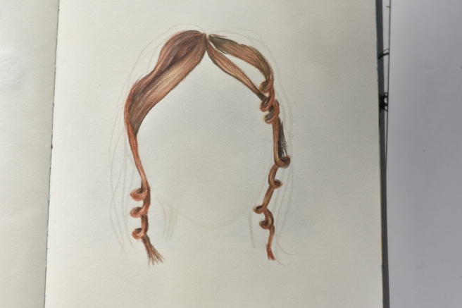
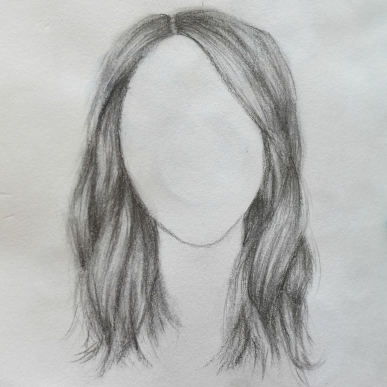
Guys, I am not good at drawing hair. I can draw eyes and most of the rest of the face okay, but the hair is always pretty boring and lackluster. Therefore I attempted to improve my skills with this great video, and I think I did… but they still need improvement. XD That’s okay, I’ll get there eventually. If I keep working on it, that is.

art 11

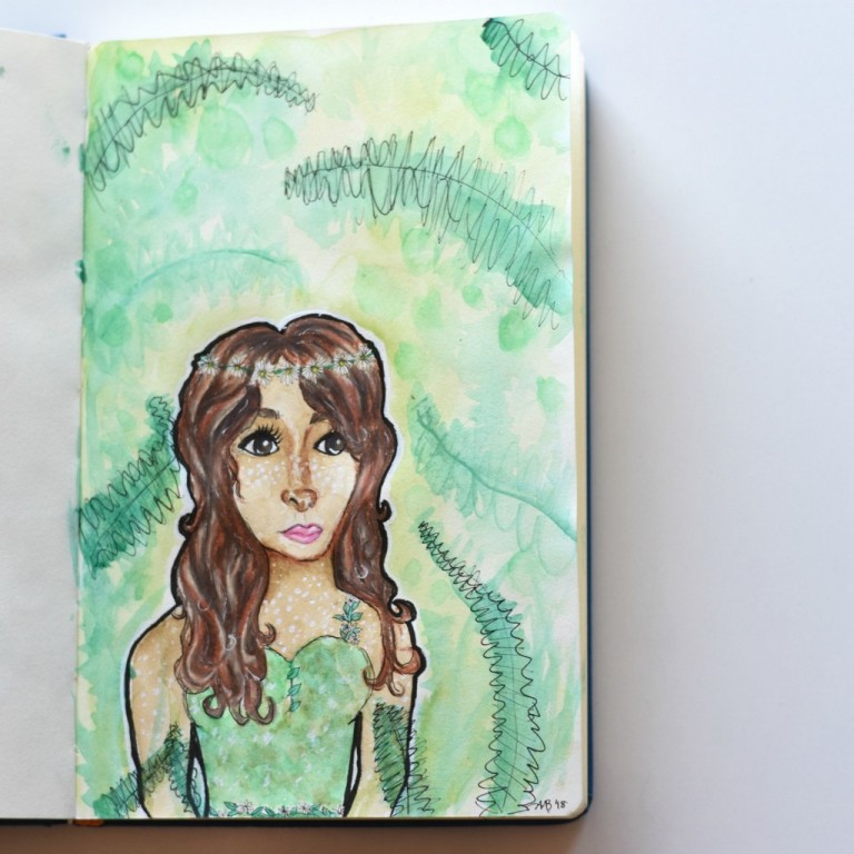
And here is the finished piece of the pencil-sketched girl I showed you a while ago. The idea was to make a girl who looks like a fawn without actually using any non-human features like deer-ears or antlers. It didn’t really work. XD The face got kind of skewed and I rushed the background which didn’t turn out well, but everything else is… tolerable. If you cover up her mouth she looks better. 😛

(By the way, that’s a great drawing tip: if you’re drawing something (particularly a face), covering up parts of the picture helps you see which feature is throwing everything off. I think it’s the mouth and chin here.)

art 1

Megan requested this camera for a blog project (picture by Megan). I rather like it because it’s PURPLE and it’s A CAMERA. 😀

art 14

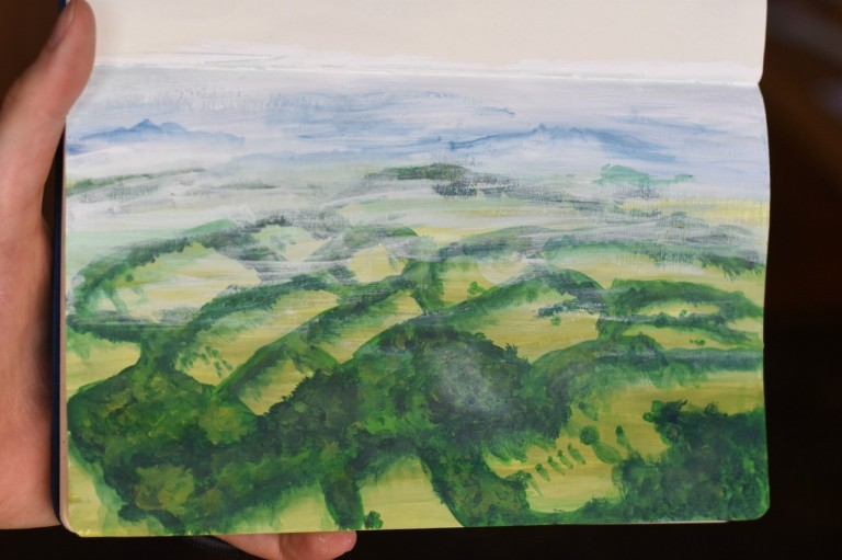
I drew this from a gorgeous aerial view of Ashdown Forest, the inspiration for The Hundred Acre Woods. The photo was prettier. XD

art 12

We have now come to the end of the sketchbooks so far, and will turn to various other artworks. First, envelopes. I absolutely LOVE decorating envelopes for my pen pals, and I think I prefer the recent envelope art I made to the stuff in the sketchbook.

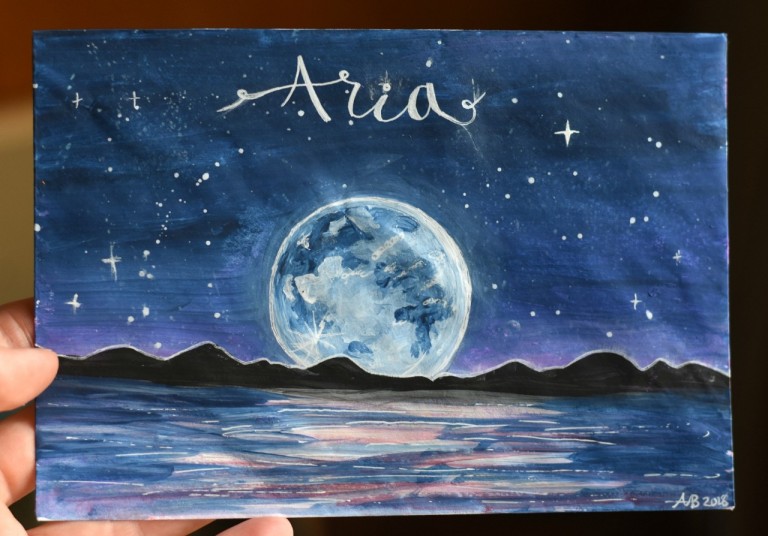
Ooh, this is one of my favorites! Adding touches with the white gel pen really helped bring the scene together.

art 13

I was trying to decide how to decorate this envelope when I saw the pretty pattern on my Chemistry notebook and decided to use it as inspiration. What do you know, something nice can come of even Chemistry. XD

art 28

I made this envelope after reading The Laws Guide to Nature Drawing and Journaling, which has some great art tips and tutorials in it! (For instance: did you know that the three primary colors are not red, blue, and yellow, but magenta, cyan, and yellow?! I was astonished! But he showed and explained how it makes perfect sense.) I think it’s neat how a few pen lines can transform some abstract watercolor blobs into a landscape.

art 17

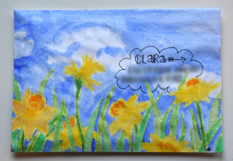
I outlined the daffodils with some lovely oil pastels my dear friend sent me, and then used the watercolor resist technique to fill them in. The colors are so bright and cheery, aren’t they? That’s why I love daffodils. 🙂

art 22

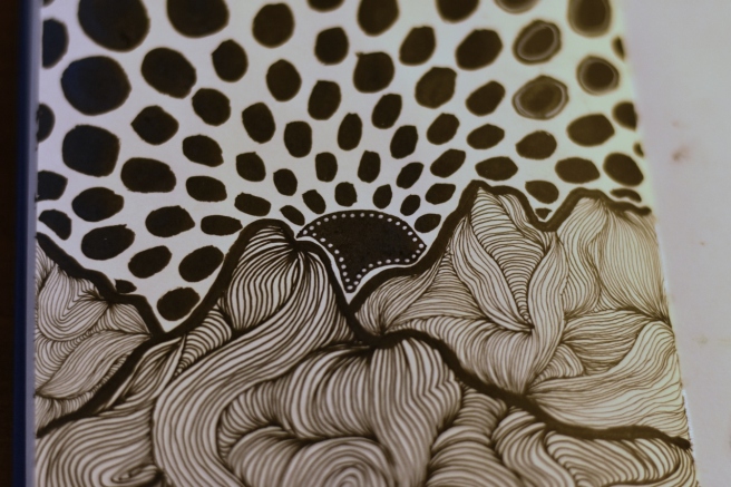
Ooh yes, another one of my favorites! ❤ I like the bright, summery colors and almost vintage-poster-like quality the sun rays give it.

art 18

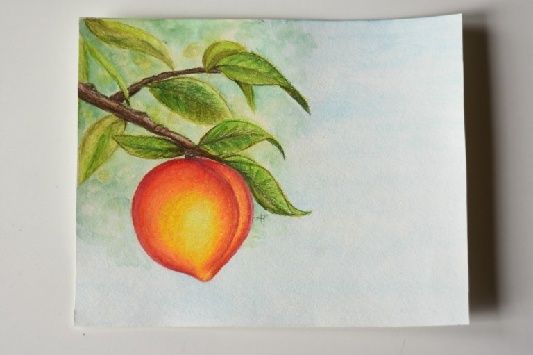
My mom liked the envelope so much that she wanted me to make a real picture to frame, so I did!

art 15

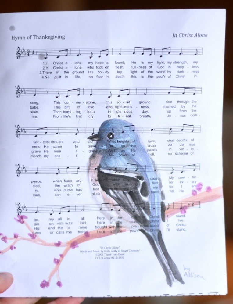
Okay, this is kind of strange, but Megan wanted me to draw on a church bulletin for one of her friends (don’t ask XD). I believe Megan took these three pictures. I like how the music notes show through the watercolor in this one. 🙂

art 23

This, um, didn’t work TOO well because I didn’t have enough time to finish the faces (particularly Megan’s on the right :[] )… but it was a good challenge to try, anyway.

art 24

I like this one better. 😉 Our friend loves snakes, so I drew this one, also loosely from the Nature Journaling book.

art 25

I made the following art for the most recent edition of Christ’s Light Magazine. 🙂

art 26

DSC_3702 (2)

DSC_3704

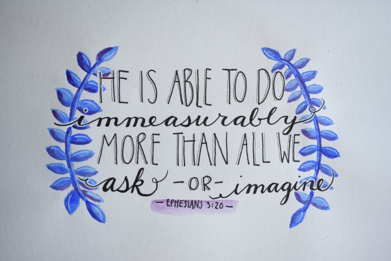
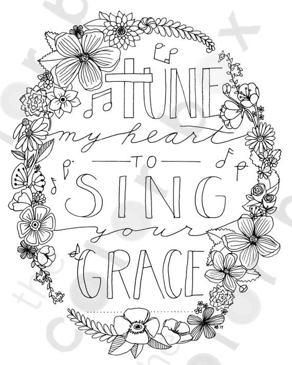
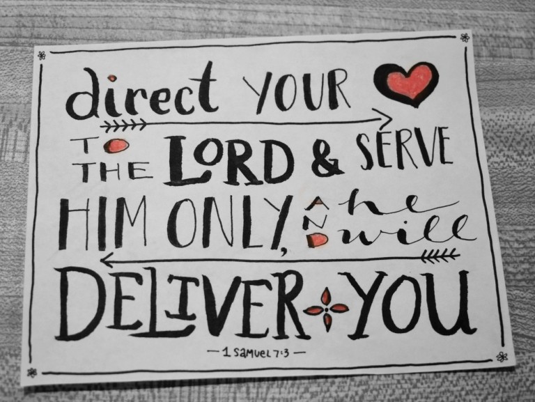
Here are a few more quotes I copied, for my pen pals. (The next few pictures are black and white because I took them in a rush and the lighting was HORRIBLE. XD)

art 19art 20art 21

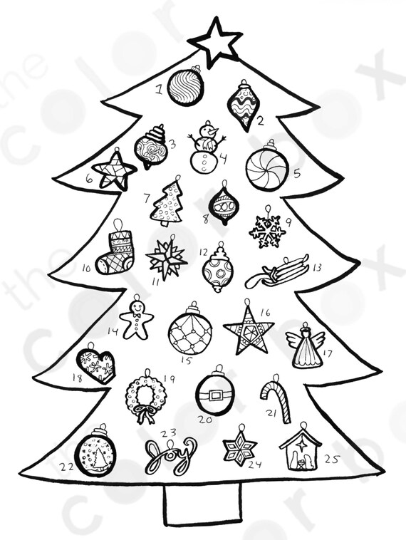
And last but not least…

art 16

And that’s all for now! Which piece of art was your favorite? Which do you prefer making: sketchbook art, envelope art, or hand lettering?

Thanks for reading, dears, and have a lovely day!

***Allison***

P. S. Also in case you’re wondering, I’m planning the post about the old letter next! I would have done it this time, but it’s taking a loooong time to translate. XD Stay tuned!

Hand Lettering + Font Inspiration

Hello, dears!

Unfortunately I couldn’t make my Art Lab post on Friday, but I have time (and data XD) to do it today! In this post I’ll show you a few tips and tricks on lettering, plus show you plenty of font inspiration to copy or use to think up your own fonts. (Because I usually run out of ideas after, like, three fonts. XD) So. Ready? GO!

Technique: Hand Lettering

Hand lettering is super fun, and also very useful for when you want to spiff up an envelope or gift tag or any number of things.

Fonts

Let’s start with one of my the most common and prettiest fonts in handlettering: fake calligraphy. Lovely name, isn’t it? 😛 That’s because it allows you to get a calligraphy-like effect without using any special calligraphy tools. It’s also super simple to write. See?

lettering 1.jpg

Step One: Write out your desired words in the neatest cursive you can.

Step Two: Find the downstrokes. Downstrokes are the places in a letter where you move your pen down the paper, like the little pink arrows show in the picture.

Step Three: Widen and color in the downstrokes to get the look of a calligraphy pen. Ta-daa! Pretty, isn’t it?

This is a great base font, especially when paired with a simple sans or serif.

DSC_3220.JPG

So basically sans doesn’t have the little “tags” on the ends of the letters and serif does. I like writing all caps sans and all lowercase serif. 🙂

And now, here are a bunch more simple fonts I wrote out to look through and use as inspiration or copy yourself. Which is your favorite?

Accents

Now that you got some fonts under your… um, pen XD, it’s fun to add little accents and flourishes to fill in the space beside the lettering. Here are a few ideas to get you started, and you can find a bunch more on Pinterest and the “Doodly Accents” section of PicMonkey. 🙂

DSC_3221

Inspiration

Still need some more ideas to get your creativity flowing? Here are a few of my recent (and not-so-recent) lettering pieces.

You can hand letter with any medium you wish! Here I used my watercolor brush pens which are super fun for lettering.

envelope 8
Quote from Jane Austen’s Emma

For this one I used a blue notebook marker + a blue ballpoint pen. I love adding vines to letters, but it does take a bit of time and patience. 😉 Another fun thing to do for fonts with thick, solid bars of color like below is to add zigzags or circles or other patterns inside the bars for more interest.

DSC_2629
Quote from Nancy Pearcey’s Total Truth

This is the first page in my second bullet journal. I like how the mix of colored pencil and ballpoint pen looks together. 🙂

Not quite the right season for this, but hey, it’s lettering! XD I think it looks really neat to overlap some letters, like I did with the ‘y’ and the ‘o’. Also a little extra line of a different color beside the downstrokes adds a shadow effect and makes it look more special.

art (1280x1280)

And lastly, a lovely Bible verse that I copied completely in blue ballpoint pen. (By the way, these Pilot G2 pens are practically THE BEST PENS EVERRR. They write super smoothly and you can get them in a range of point sizes.)

Bible journal 5 (1272x1280)

That’s all I have for today, so hopefully you’re inspired by now. 😀 If you did make some hand lettering inspired by this post, we’d love to see it! Check out how to help us fill our art gallery here.

***Allison**

The Art Lab, Episode 38: Spaghetti Mountains

Hey, guys! How’s life? Mine’s good, and currently smells like pizza baking in the oven. (It’s movie night with homemade pizza. 😉 ) Wait, that was the timer… HOLD ON.

Okay, we’re good. Ha, that was an interesting coincidence. ANYWAY, less food and more art now, eh?

Oh wait, I forgot about the title. XD Maybe we’re not done with food yet… Today I want to show you how to draw “spaghetti mountains,” what I decided to call this certain doodling technique. 😛 I think it looks so neat in the end, and it’s quite fun and relaxing to draw.

Art Inspiration:

Pointillist Line Drawings of Mountains by Christa Rijneveld

{via}

Isn’t this gorgeous? I love it! I made a similar piece using this as inspiration, and also made you guys a little tutorial if you’d like to try it yourself. 🙂

Materials Needed:

  • Paper, an ATC, canvas, etc.
  • Black pens or markers (I used varying sizes of Micron pens + a black brush pen)
  • A white gel pen (optional)
  • Some time

1. Draw some jagged lines for mountain ridges with your thickest pen (I made the lines thicker later). Make some ridges in the background and foreground.

art 1 (915x1280)

2. Take your second thickest pen and start filling the first mountain with “spaghetti.” XD Draw some curvy lines that all start and end at the same point, and follow each other closely. Like so.

art 2 (1280x854)

3. Add more spaghetti in a different direction, and connecting to the noodles you already drew.

art 3 (1280x854)

4. Keep adding more spaghetti in all different directions until you fill the whole mountain ridge.

art 4 (1280x854)

5. Now for the ridge behind it. Use a slightly thinner pen to show perspective, because things (like spaghetti) look smaller when farther away.

art 5 (1280x854)

6. Keep it up! After you finish that ridge, move onto the one behind, using a thinner pen each time and making the lines close together. Doesn’t it look so neat thus far?

art 6 (1280x1280)

7. Add a sun behind the last ridge. I left a white space, but you wouldn’t have to. 😉

art 7 (1280x854)

8. Next we’re going to make the “rays” of the sun. Using your thickest pen, fill in the space above the sun with rows of dots or ovals.

art 8 (1280x854)

9. Make the dots in each new row bigger than the last…

art 9 (1280x854)

10. Ta-daa! You’ve filled the whole page!

art 10 (1280x956)

11. You can definitely leave it like that, but I added a bit more embellishment with a white gel pen. First I colored in the sun black, (weird, I’ve never seen a black sun before, have you? XD), and then rimmed it with dainty white dots.

art 11 (1280x854)

12. And lastly, I added some white circles to the black dots, just to break things up a bit.

art 12 (1280x854)

13. Ta-daa! You’re finished!

art 13 (856x1280)

What do you think? I think… strange but neat. 🙂 I hope you get a chance to try this, because it’s quite fun and I love the end result.

Thanks for reading, dears! Now go make some art. 😉 Oh, and if you DO make art inspired by this post, we’d love to see it! Check out this page to see how you can help us fill our gallery.

Have a great day, guys! I hope I haven’t made you too hungry… XD

***Allison***

Sketchbook Tour + More

Heyyyy, guys! Goodness it’s been far too long since I’ve done a recent art post. I have been sprinkling in a few pictures for CPC and Art Lab and such, I guess, but today I want to do a round-up of (most of) the pictures I’ve drawn in my sketchbook since the last art post, along with miscellaneous other art. I hope you enjoy browsing through the pictures! 😀

My current sketchbook is almost filled with drawings and crinkly painted pages, so I put a new sketchbook on my Christmas list. 😉 Filled up sketchbooks are so satisfying!

DSC_0061 (1280x853)

Alright, I’m going to go in chronological order because it’s the easiest. XD Just note that I did make a few more drawings than this, but I didn’t want to you every single one or the post would get even more ridiculously long than it is. 😛 Anyway, this first drawing is just a fun, stylized, pen-and-colored-pencil doodle. I rather like the quote.

DSC_0034 (1280x853)

One night I was bored so I decided to try the three marker challenge (drawing a picture with only three colors) with Sharpies. I like some parts of it, but… well, it’s certainly not my best work, heh heh. Oh dear.

DSC_0037 (1280x853)

Um, this is a super strange drawing of a mini world on someone’s finger??

DSC_0039 (1280x853)

Now this drawing I actually like. I drew it from a picture in one of Loren‘s posts which is sadly eluding me. HELP. If anyone knows which one it was, could you tell me please? Thank you muchly. UPDATE: Katie found the post for me! Thank you SO much, Katie. 🙂 Here it is.

DSC_0041 (1280x853)

I told you I liked the quote… XD I was trying out sketching with a colored pencil instead of a normal pencil and I like how it turned out!

DSC_0042 (1280x853)

WARNING. VERY CREEPY DRAWING AHEAD. Okay so apparently I have a REALLY hard time drawing deer (at least without a reference). SORRY GUYS. I did draw some better deer, but that will come later on.

DSC_0043 (1280x853)

*Sigh* Two bad drawings in a row? DON’T WORRY GUYS, IT GETS BETTER THAN THIS, I PROMISE. Anyway, this was a drawing that I tried to do for a CPC story (which you can read here), but it, um, didn’t turn out. But hey, it goes to show that although bad art is inevitable, that doesn’t mean you should give up. ART IS TOO AMAZING TO GIVE UP.

DSC_0046 (1280x853)

Ahem. Oh yes, I drew this little flurry for an online magazine I contribute to! Some are good and some are bad, but hey, you can tell they’re snowflakes. Does anyone else have a hard time making snowflakes symmetrical?

DSC_0049 (1280x853)

I like how this looks so far (it’s a vast improvement on some of my other hair drawings), but I don’t know if I’ll ever finish it. Oh well. 🙂

DSC_0050 (1280x853)

I really like this little guy, hee hee! Megan and I ordered a shirt for my brother that said “I FROGET” since that’s the punchline to one of his favorite terrible jokes which I cannot remember at the moment. XD There are plenty of online sites where you can design your own t-shirts, so I made the art and Megan did the rest of the designing.

DSC_0052 (1280x853)

Now we’re getting into some Christmas drawings. (By the way, CAN YOU BELIEVE IT’S DECEMBER?! I CAN FINALLY DO CHRISTMAS STUFF.) These next two I also made for the aforementioned magazine. I used my watercolor brush pens for this one…

art (1280x1280)

And acrylic paints + a white gel pen for this one. I love how the painting turned out!

DSC_0054 (1280x853)

Here we have a lovely bad quality picture of a NeedtoBreathe quote, also for the magazine…

art 2.jpg

This is just a random Thanksgiving doodle with my watercolor brush pens again…

art 3.jpg

A strange-looking hawk I drew using one of my brother’s other shirts as a reference. 😛

DSC_0060 (1280x853)

And now we’re caught up with my sketchbook! Next we have the “Beyond the Sketchbook” part, a.k.a miscellaneous drawings.

I drew this wrapping paper for our cousins’ birthday because they put these pets on their list (though they obviously knew they wouldn’t get them 😉 ).

DSC_2614 (1280x853)DSC_2615 (1280x853)

Ooh, I really like the next one! I saw a photograph like this on Pinterest (right here) and thought it would be a fun challenge to draw. It was! It turned out a bit streaky, but I’m pretty proud of the lips, which are usually hard for me. XD

art 1.1 (1040x1280)

I’m pleased with this one too! I drew this for the custom art in my recent giveaway, from photos Gracie gave me. Isn’t Gracie’s cat so pretty? ♥ I love her blue eyes.
art (1280x1007)
This card was for my grandma who was recently in the hospital. I’m happy to say that she’s home now, though, and recovering well! ♥
art 1 (1183x1280)
Megan wanted me to draw this card for one of our friends. We always like to debate about… well, a lot of things, so we gave her a handy reminder of the right way to say and use things. 😛 (Note: the border is scrapbook paper – I didn’t draw that part, heh heh.)
art 1 (999x1280)
OH, YAY! Next is my favorite of all of these pictures! Probably one of my favorites I’ve ever done, just because it took SO LONG to draw. XD My friend Aria commissioned me to draw a vintage-looking NYC poster from some photos she took while she was there, plus various other details she wanted, like song lyrics from one of her favorite songs for the border.
NYC poster (1068x1280)
I believe this is the biggest art project I have ever done, both in size and effort. :O
NYC poster 1 (1280x853)
Aha, here we have the better deer picture. XD I painted this for my Etsy shop, The Color Box Studio, where you can buy the original.
DSC_4193 (1280x853)
And lastly we have two coloring pages, also in my Etsy shop. I want to start making more of these because they’re fun to use and inexpensive to buy, not to mention you can print them out as many times as you want!
I made this as a custom page, but after she orders it I plan to make it available to everyone (for a lower price). 🙂 You can see the listing here.

coloring page colored

And this is the newest addition, and Christmas countdown coloring page! You’re supposed to color an ornament each day. I rather like how it turned out. 🙂
Advent 5 (1280x1280)

Phew, you did it! Thank you so much for reading this super long post – I hope you enjoyed! Which piece of art was your favorite? ARE YOU EXCITED FOR CHRISTMAS?

***Allison***

P. S. LOOK, IT’S SNOWING! ON MY BLOG! I love that effect. 🙂 If you’re reading this through email or your Reader, you’ll have to actually visit my blog to see it. 😉